DESIGN DIARY 022
My saved links folder is basically a second brain that doesn’t really sleep nor has a memory. Every time I go in there and find things I cared enough to save, I am constantly surprised. Here are twelve projects that made me stop mid-scroll. Some are new, and others aren’t, but all of them stuck with me for one reason or another.
A Naples Apartment Redecorated Based on Color Psychology
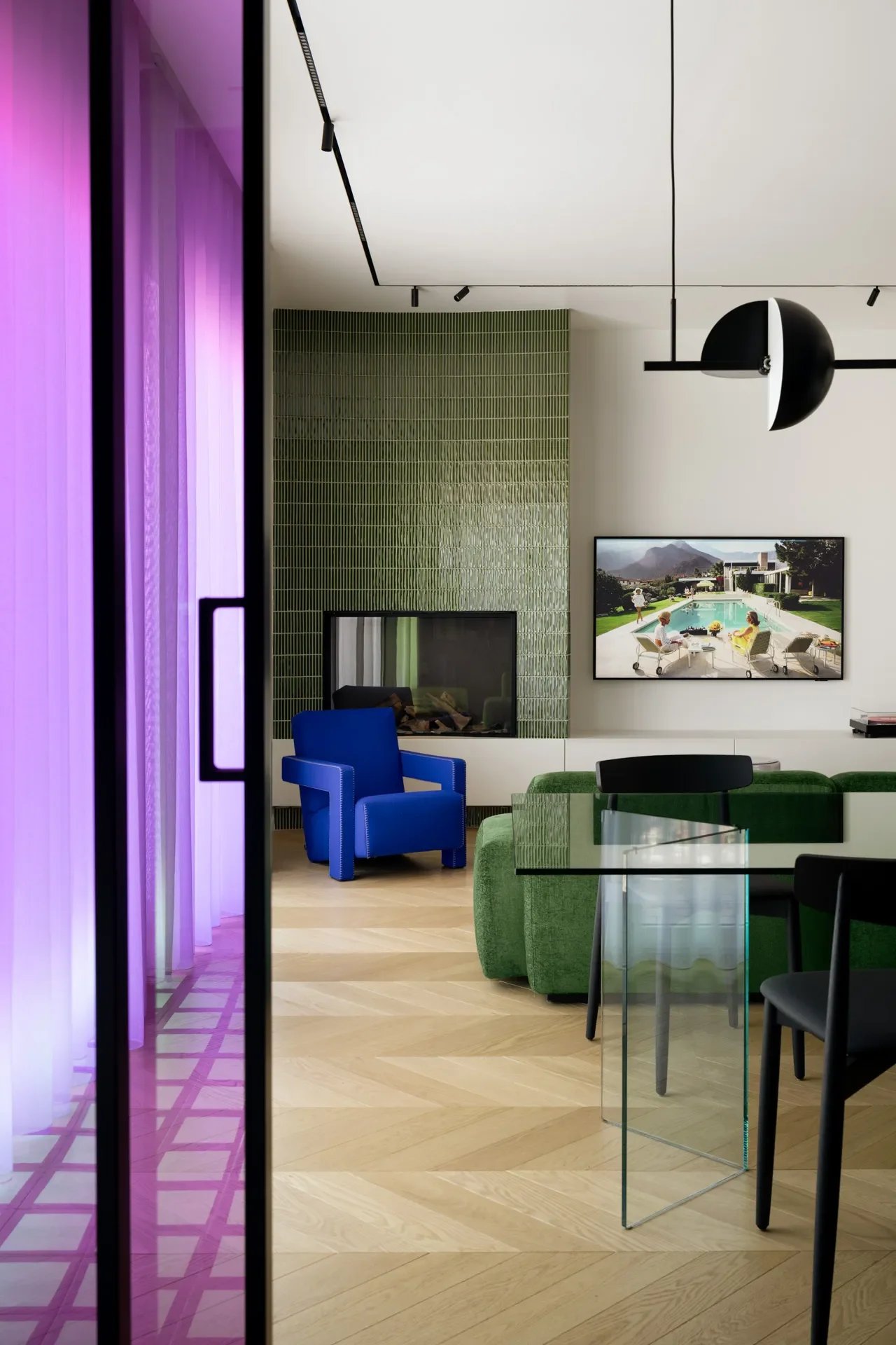
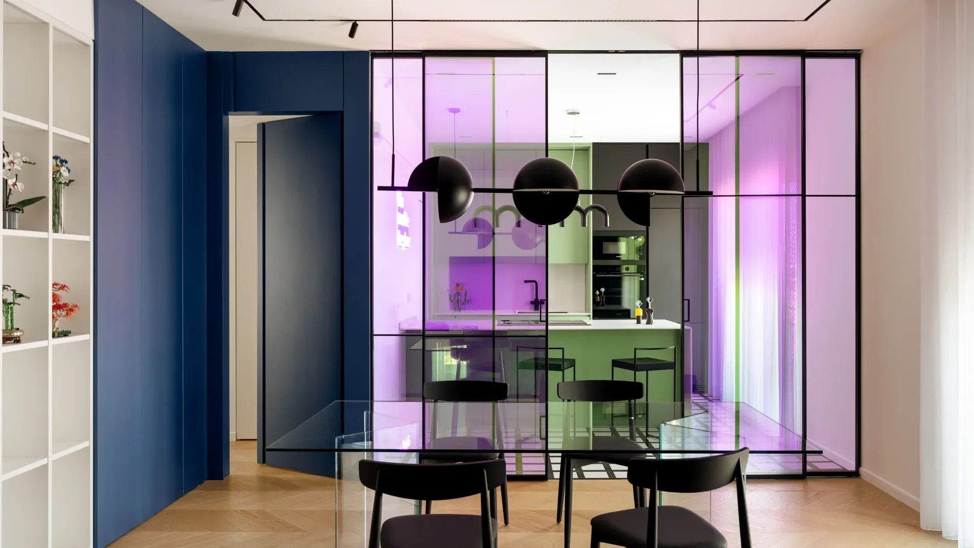
I remember growing up reading about color psychology in magazines. You know the articles that would tell you what colors to use and what not to use, depending on the room. But this couple in Naples, both of whom happen to be physicians, used their knowledge of color psychology to guide their apartment redecoration. It wasn’t some mood board exercise. They applied actual science, considering what colors do to cortisol levels, attention, and how a room feels at 7 am versus 10 pm. The results are really not what you’d expect from two people who spend their days under fluorescent hospital lighting. Honestly, that tracks. Who would know better what bad light does to a room? (Architectural Digest)
Small Footprint Solutions in Asia
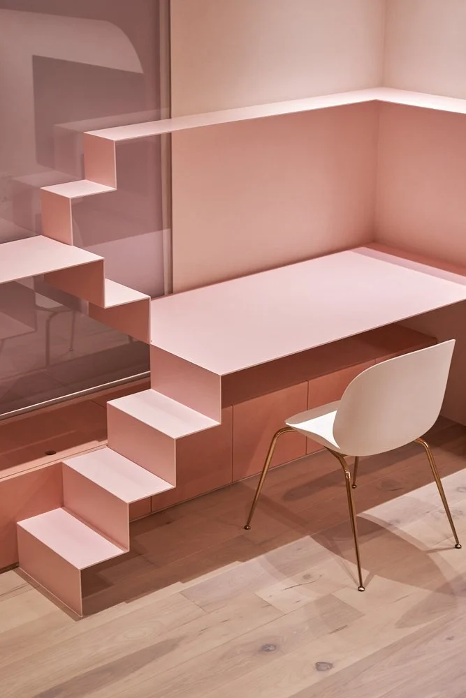
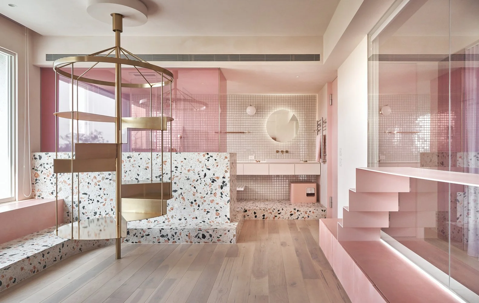
ArchDaily’s editorial on stair solutions in small-footprint Asian homes makes the case that when every square foot is spoken for, the staircase stops being a circulation and starts being the room. I immediately started thinking of the posts online that are almost poorly designed and constructed, where people have to ask, “What would you put here?” Something that seems entirely like a Western world problem. Architects in Taiwan and Vietnam are building stairs that double as bookshelves, daybed platforms, hidden storage, and thresholds between zones. The examples featured are the kind of thing that makes you look at your own hallway differently. (ArchDaily)
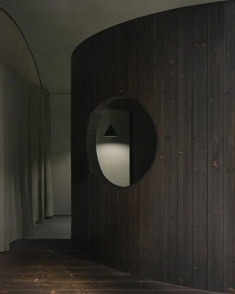
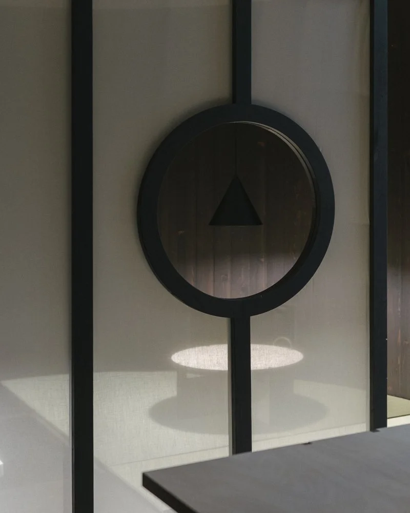
Bar di Bello
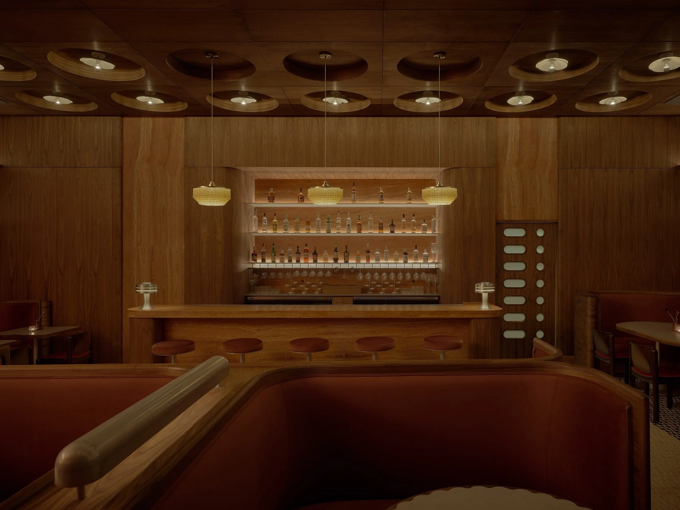
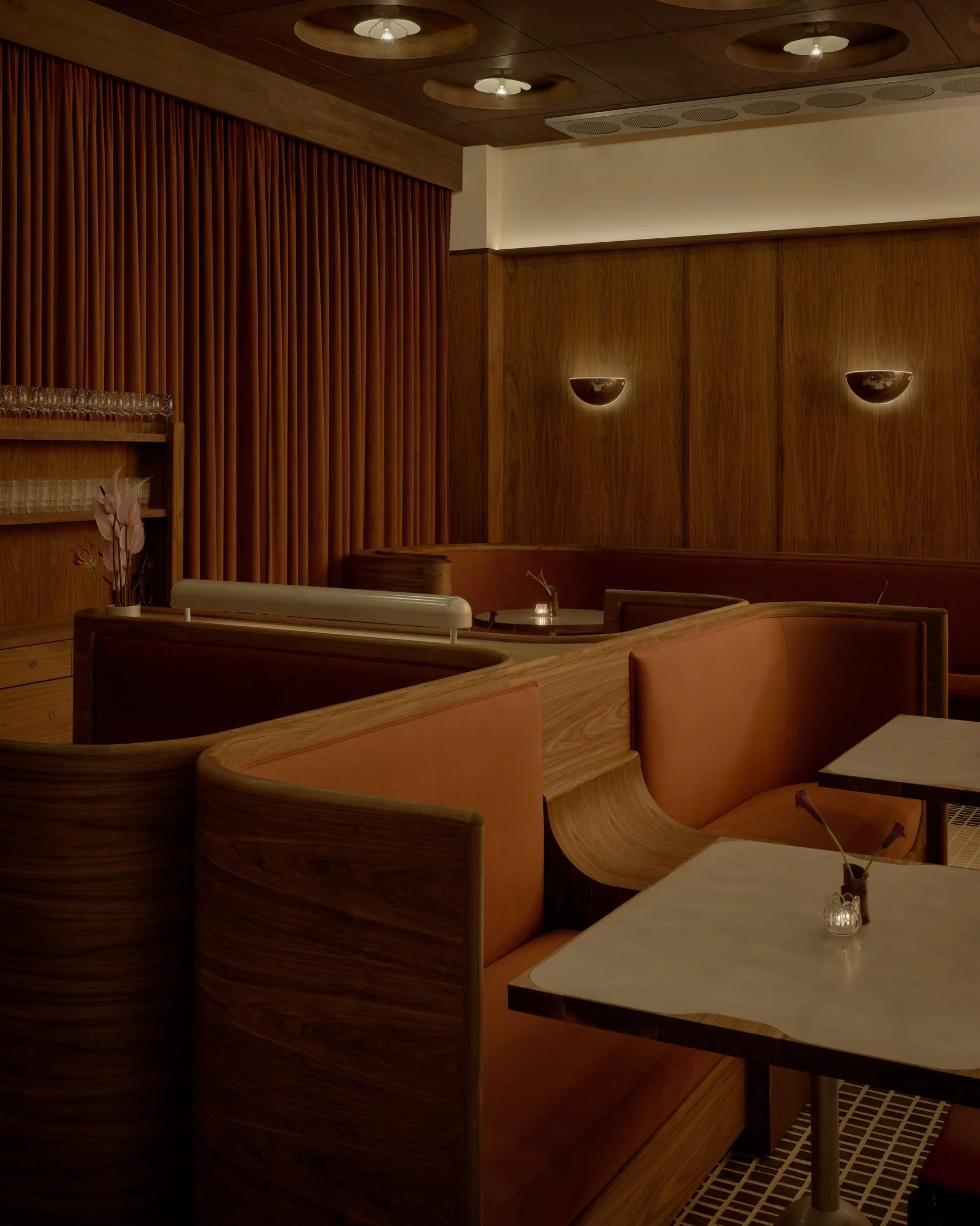
Bar di Bello opened in Silver Lake this spring, and when I saw the photos, I haven’t stopped thinking about it. Studio 22RE built out a space that references Milanese design and mid-century Italian modernism without feeling like a costume. They used walnut millworker, a red travertine bar, Vico Magistretti chairs, Afra and Tobia Scarpa sconces, and a kitchen door with frosted glass lozeng inserts that are honestly a vibe. Designer Dean Levin said the idea was to make a room where you walk in and immediately want a martini. Mission accomplished. (Dezeen)
Lina Ghotmeh’s Pink Labyrinthine
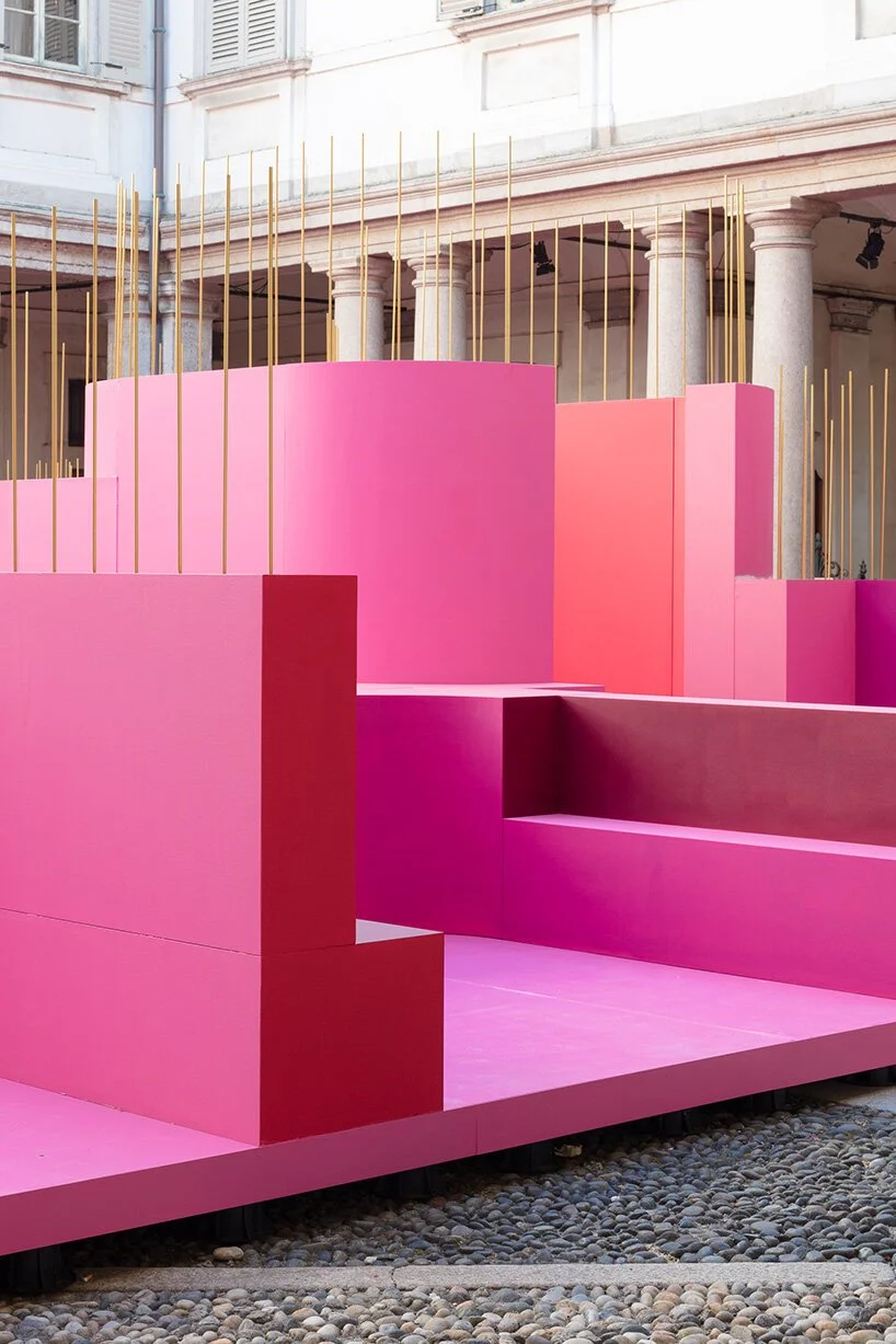
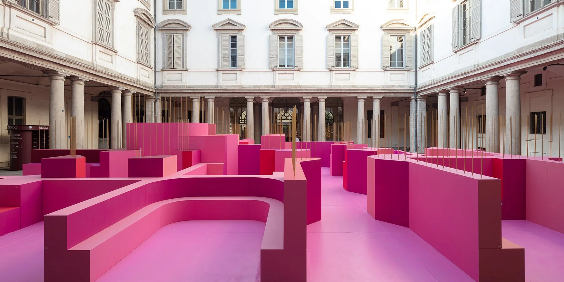
For Milan Design Week, Lina Ghotmeh filled the entire Cortile d’Onore of Palazzo Litta with a pink labyrinth. The installation uses MDF modules in varying shades of rose and magenta curving through the baroque courtyard where Napoleon once threw parties. Metamorphosis in Motion was her first site-specific solo outdoor work in Italy, and she built it to stop people from moving. It contained seating areas, a meditative zone, a sound space, and even a curated scent of cypress, cedar, and olibanum. During a week that is almost entirely focused on spectacle and velocity, Ghotmeh made a room that asks visitors to slow down, which I think is either the bravest or most obvious thing you could do, but seeing how crowds lingered suggests she was absolutely right. She chose pink not as provocation but to evoke something softer: empathy and tenderness, which honestly does work really well against the baroque stone architecture. (Designboom)
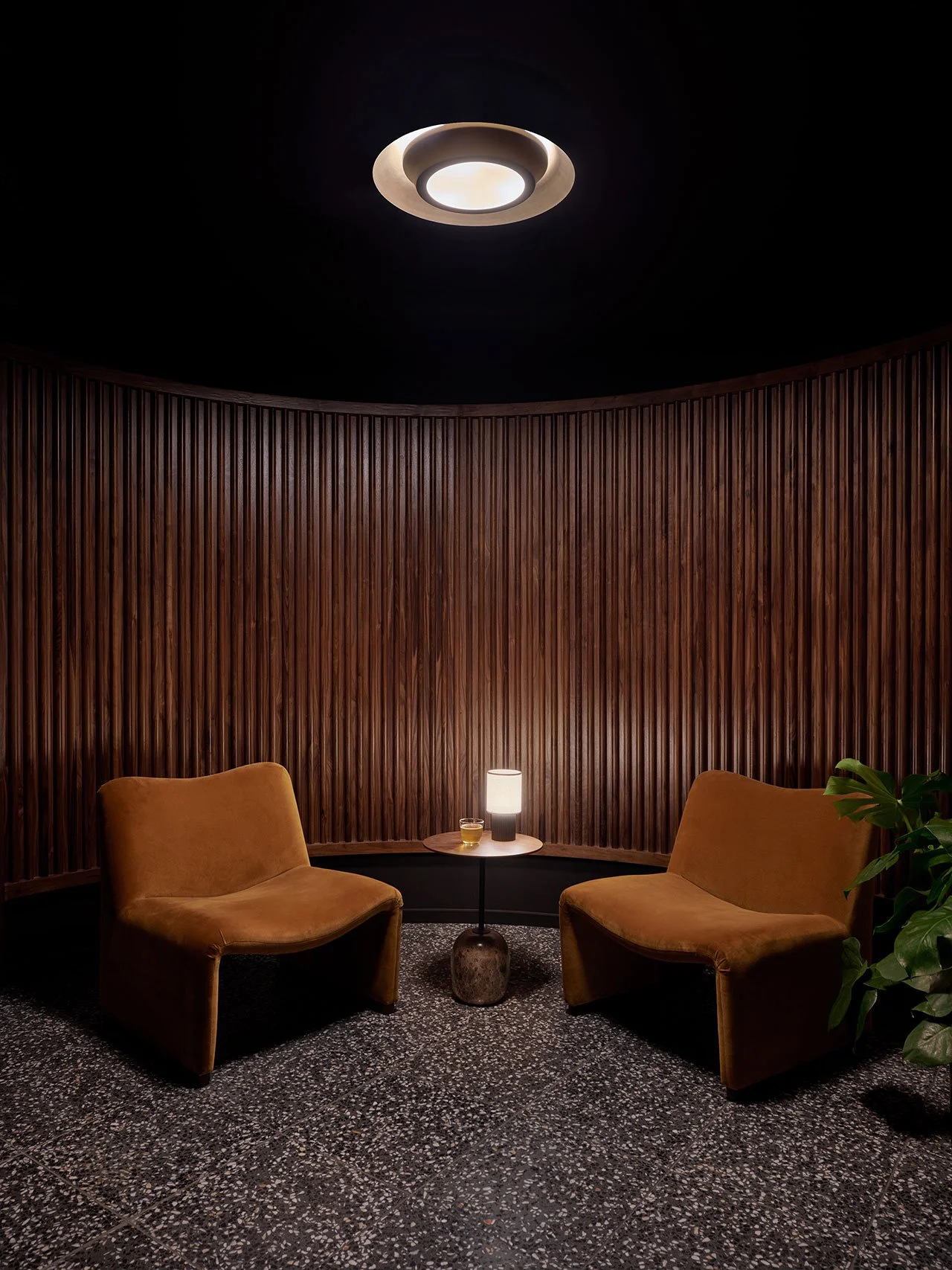
Bambi
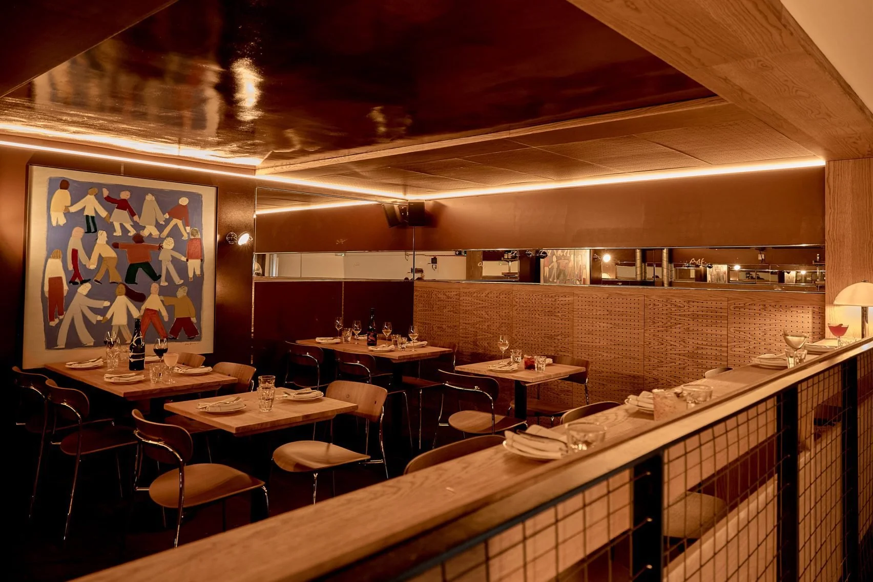
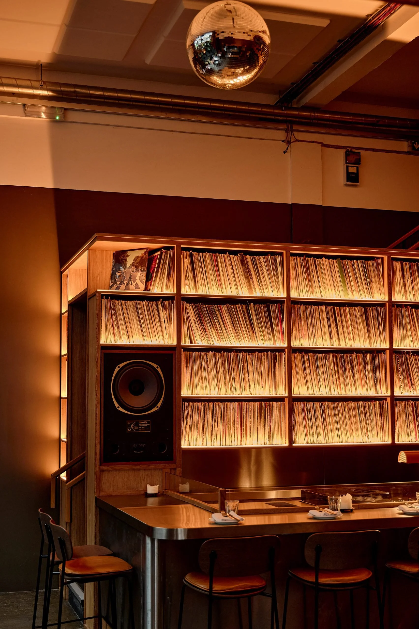
We know I love a good listening bar lately, and Bambi really isn’t an exception. Bambi, the London Fields listening bar, doubled in size this spring, expanding into the warehouse behind its original room. Designer Nicola Weetch made one decision that I keep returning to: she left the floor exactly as it was. Beat up, scuffed, and worn in from years spent as a nightclub. The whole point was to make a space that didn’t feel new. A space that felt like you found it rather than someone who installed it. For a place dedicated to a social activity like music, a worn-in floor really is the perfect choice. It gives me that vibe of what the floor at a concert venue probably has. Stainless steel throughout catches and throws light from the vinyl-only DJ booth while oiled oak, felt-linen curtains, and Alec Doherty’s primary-colored illustrations on the walls all add to the experience. All resident DJs play exclusively on vinyl. The booth itself is strictly two turntables and a rotary mixer - digital is absolutely not an option. It’s a room with principles built by someone who just seems to get how to experience music. (Dezeen)
Ekadea Studio
Ekadea Studio is a 50-square-meter ceramic workshop in Milan that utilizes shadows as a design material. AACM built curved walls that rise continuously from the floor and lack sharp transitions and hard corners. They also included perforated wooden structures that alternate between solid and open surfaces so light enters just so. The vaulted ceiling catches the light and slows it down until it’s nearly powder. Niches in the walls hold small tools and objects used in ceramics, and a tatami threshold marks where the potter’s wheel lives. The architects said they wanted a space where time seemingly stretches out. I’ll take their word for it, but honestly, the photos are convincing enough. (ArchDaily)
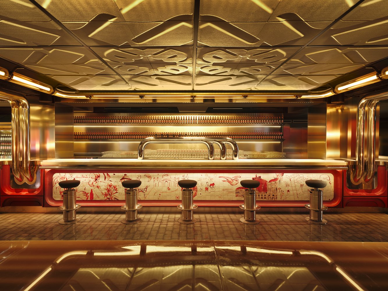
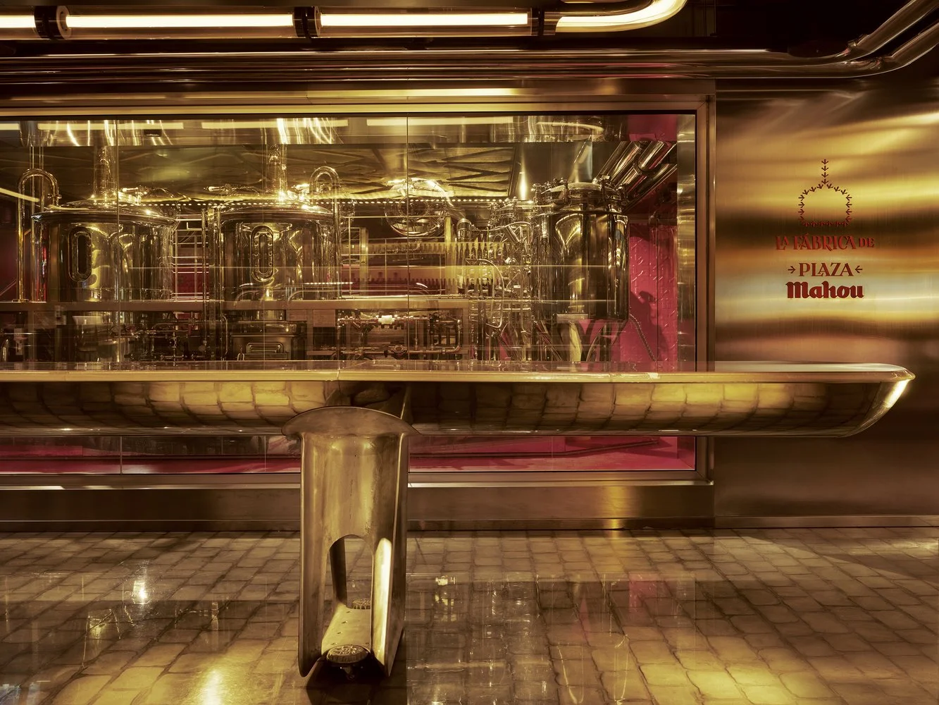
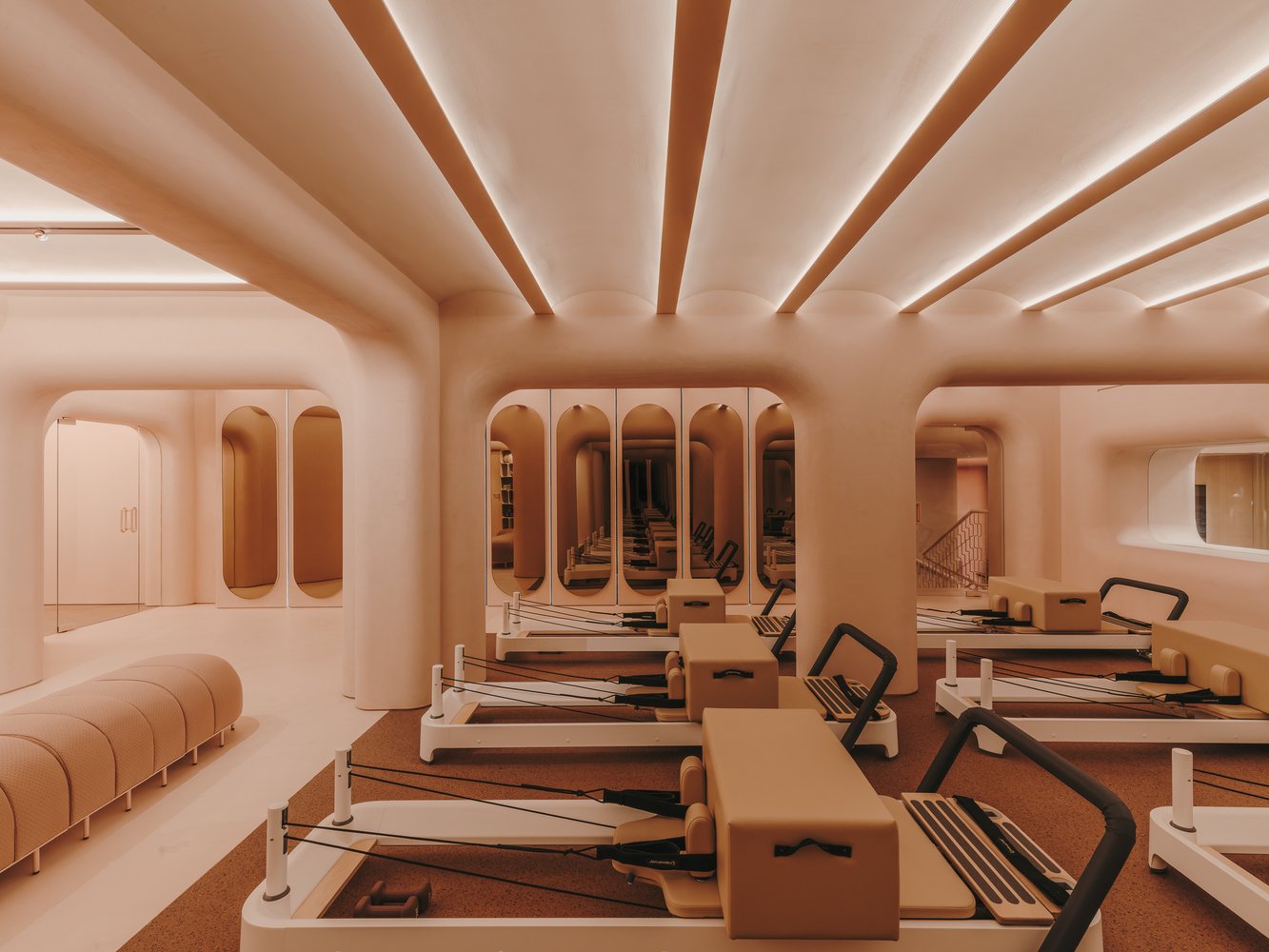
Plaza Mahou
We’ve all seen bars inside of stadiums, and they all seem to have the same look and feel. Plaza Mahou is the first brewery-branded space in Spain that actually brews beer inside a sports stadium. Yes, inside. External Reference led by Carmelo Zappulla, built over 1,000 square meters inside the Santiago Bernabéu, and is a restaurant with a covered terrace, with direct views of the Real Madrid pitch. Not to mention it’s a working microbrewery behind glass that you enter through an immersive tunnel of digital projections. It is unabashedly and completely metal and red. It’s Mahou. It’s Madrid. The organizing concept is the plaza - an open yet intimate gathering space that Spanish social life runs on - and the whole thing leans into that without feeling ridiculous. (ArchDaily)
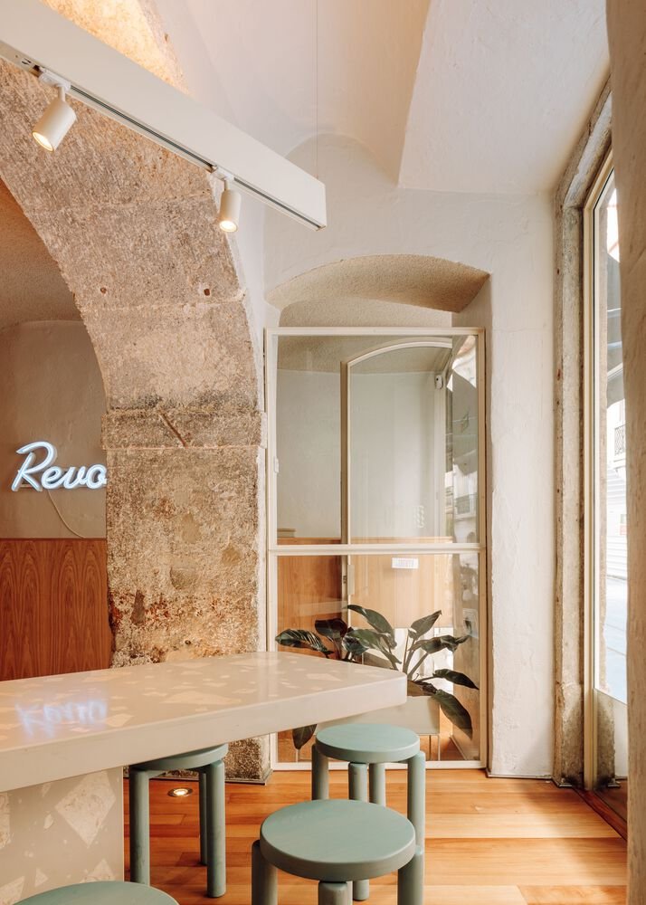
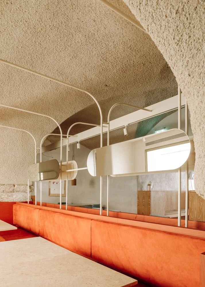
Ofício -Tasco Atípico Restaurant
A tasca is a traditional Portuguese neighborhood restaurant with counter seating, no tableclothes, and food that tastes like someone’s grandmother made it. Spacegram took a 180-square-meter vaulted space in Lisbon’s Chiado and made it contemporary. The old chairs stayed but were upcycled by stripping the dated faux-leather and yellow wood and reupholstering them in cool velvet, which is frankly a better move than throwing them out. Arched lighting plays off the existing vaulted ceiling, and a long communal table cuts down the middle. What I like about it is the impulse wasn’t to clean-slate the entire space, but rather to figure out what was already there and keep talking to it. (ArchDaily)
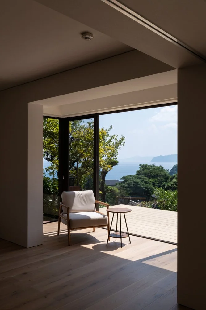
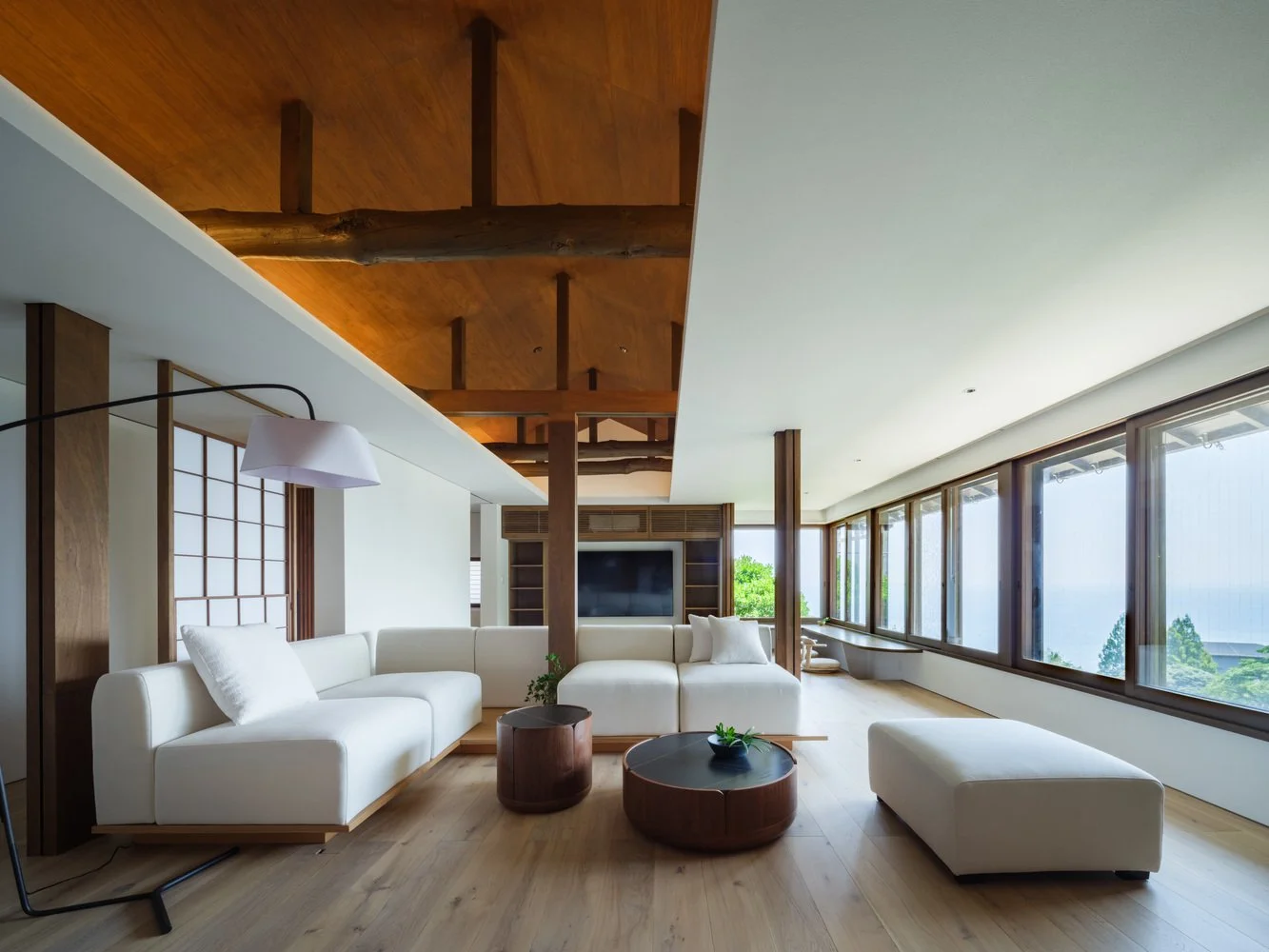
Atami House
During a structural assessment of a traditional Japanese home in the coastal town of Atami, the architects at Noforma found a beautifully aged set of timber beams sitting above a false ceiling. Nobody had touched them in many years, and the entire project reorganized itself around that discovery. They pulled out the original layout of the home, which was a series of small tatami rooms divided by shoji screens, and opened everything into one single space where those beams now run overhead. A sunken hori-kotatsu anchors one corner facing the ocean, and rattan louver partitions and original shoji doors move on hidden tracks allowingng the floorplan to shift from open to private depending on what the day needs. The town’s name translates to “hot ocean,” a reference to thermal springs rising from the seabed, and the bath was kept accordingly - it isn’t some secondary amenity. Atami is located forty minutes from Tokyo by bullet train, and it sounds like a gorgeous place to visit. (ArchDaily)
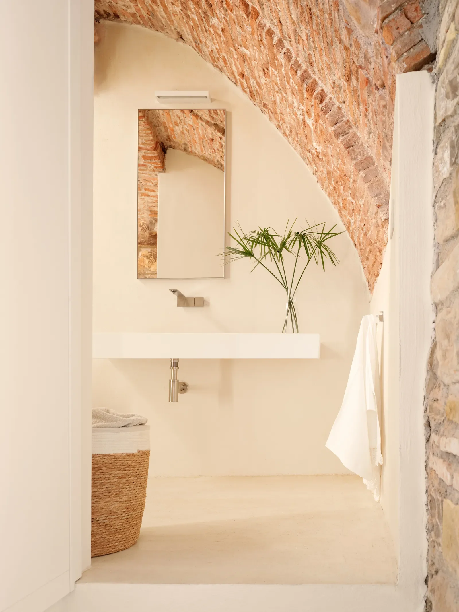
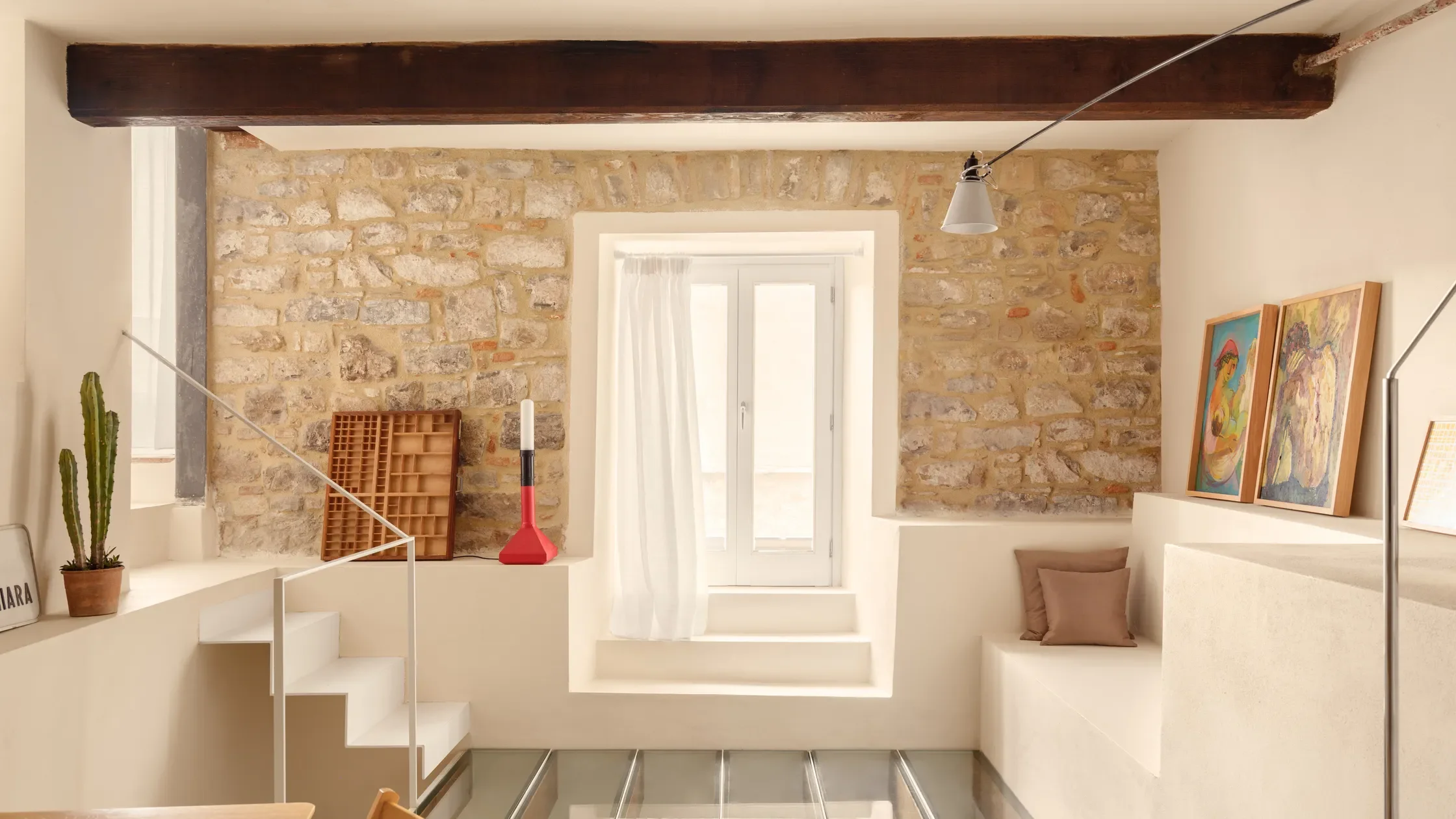
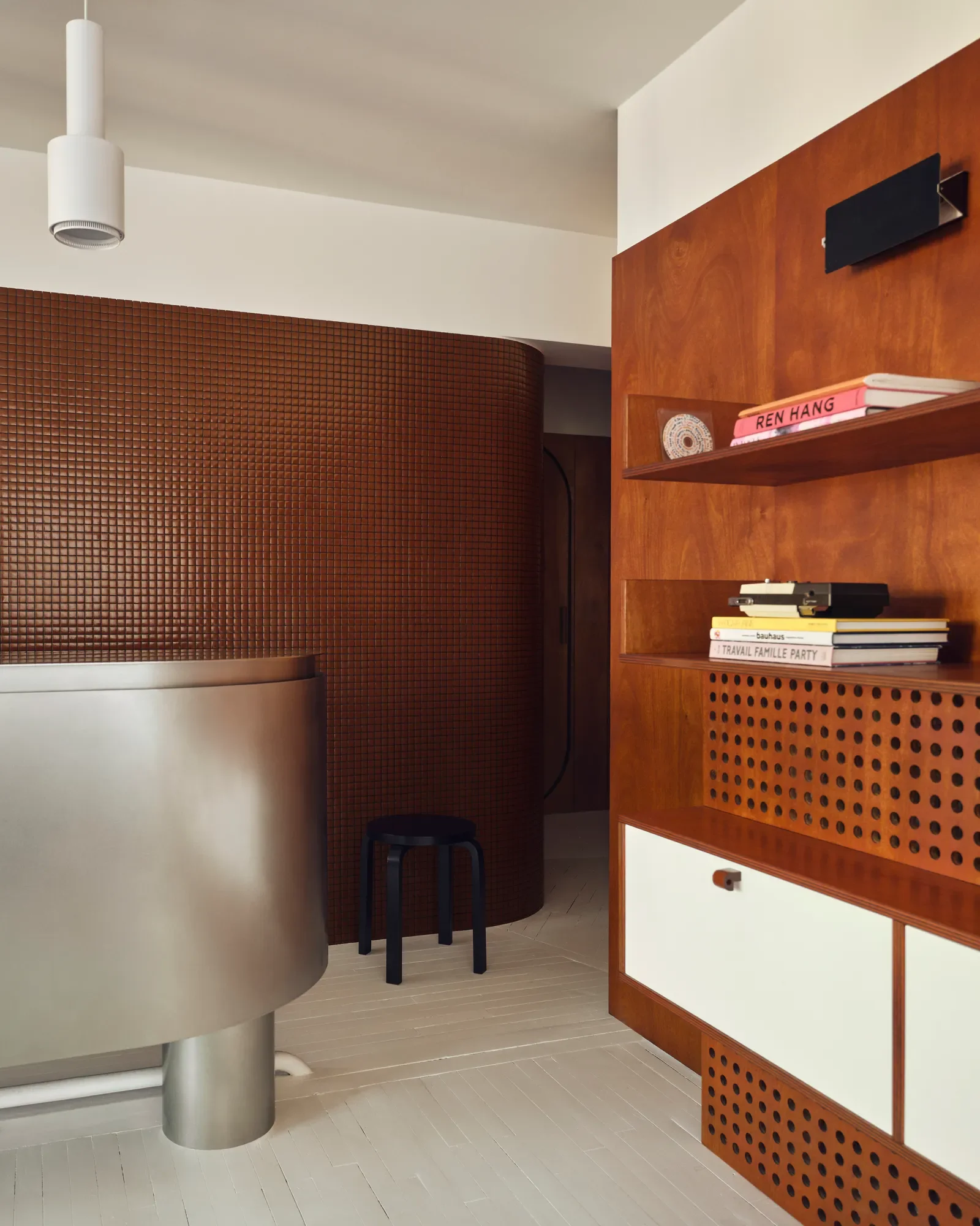
A 592-sq-ft home in an ancient Italian home
In the ancient Italian town of Imperia, there is a 592-square-foot home that occupies six levels, and the second I read that I needed to sit with it for a second. Not six rooms, but six levels. The vertical stacking of life that only works when a building’s bones are old enough and the architect is clever enough - and someone actually pulled it off. The home itself dates back to the 17th century and isn’t a grand space. It’s actually the same typical modest home found in many of the villages in this area, with stone walls, chestnut beams, and multiple levels. During the renovation, they even uncovered a cistern, originally used to collect water, which eventually was turned into a study. One really cool feature is that the homeowner added a few decorative elements of her own, including Barite stones from Switzerland, which are said to have a high barium content that shields against X-rays, gamma rays, chemicals, and corrosion. It activates the third eye and crown chakras and helps people tap into their psychic abilities. (Architectural Digest)
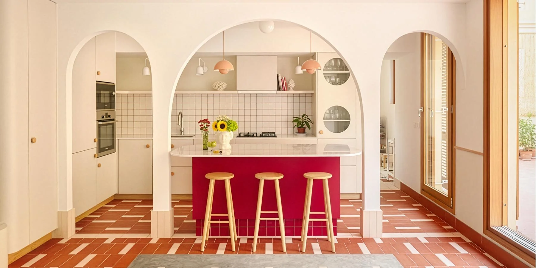
Villa In Recco
In November of 1943 Recco, a Ligurian coastal village, was almost completely destroyed by British bombers targeting a railway bridge. The eastern promontory where this villa sits is one of the few parts of town that survived. That’s the ground this project was built on, literally. Gosplan and Giordano Hadamilk Architects spent four years reworking a fragmented collection of mismatched spaces into a single 730-square-meter residence overlooking Baia dei Frati, letting the terraced gardens and Mediterranean scrub drive every decision. A pool sits flush to grad,e almost like a waterline, and a glass loggia pulls the house into the park. I, personally, am obsessed with the staircase and how open and airy the entire place is. Absolute perfection. (ArchDaily)