THE SPRING COLORS YOUR WARDROBE NEEDS RIGHT NOW
Spring is getting closer, so it’s time to start phasing out the winter beige. Every year, without fail, the fashion world brings us a fresh set of colors that show up on runways at Fashion Week and the racks at Zara. Some you’ll love immediately. Others take a little convincing. But all of them are worth knowing about. So let’s talk color. Specifically, the colors that are going to be everywhere this spring and why they deserve a spot in your wardrobe.
Spring Color Trends
Before we dive into my favorite of the colors, here’s a Quick Look at what’s informing the 2026 color palette. The SS26 collections weren’t playing it safe. Prada opened the color conversation with yellow and lime green, all worn in a way that felt brilliant more than try-hard. Alaïa went the bold route with fuchsia and teal while Balenciaga, under new creative direction, made a surprising case for the quieter end of the color spectrum. The result? A season that offers something for everyone. Whether you want to walk into a room and utterly own it, or ease into color with something soft and wearable, spring 2026 has a shade with your name on it. Here are five colors worth paying attention to.
Alaïa
Patou
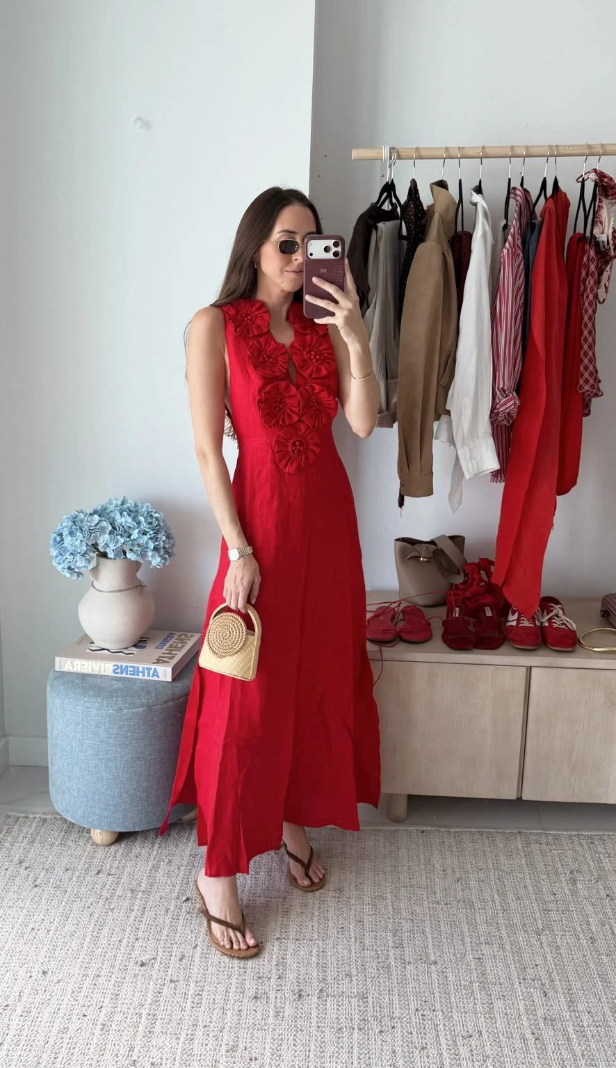
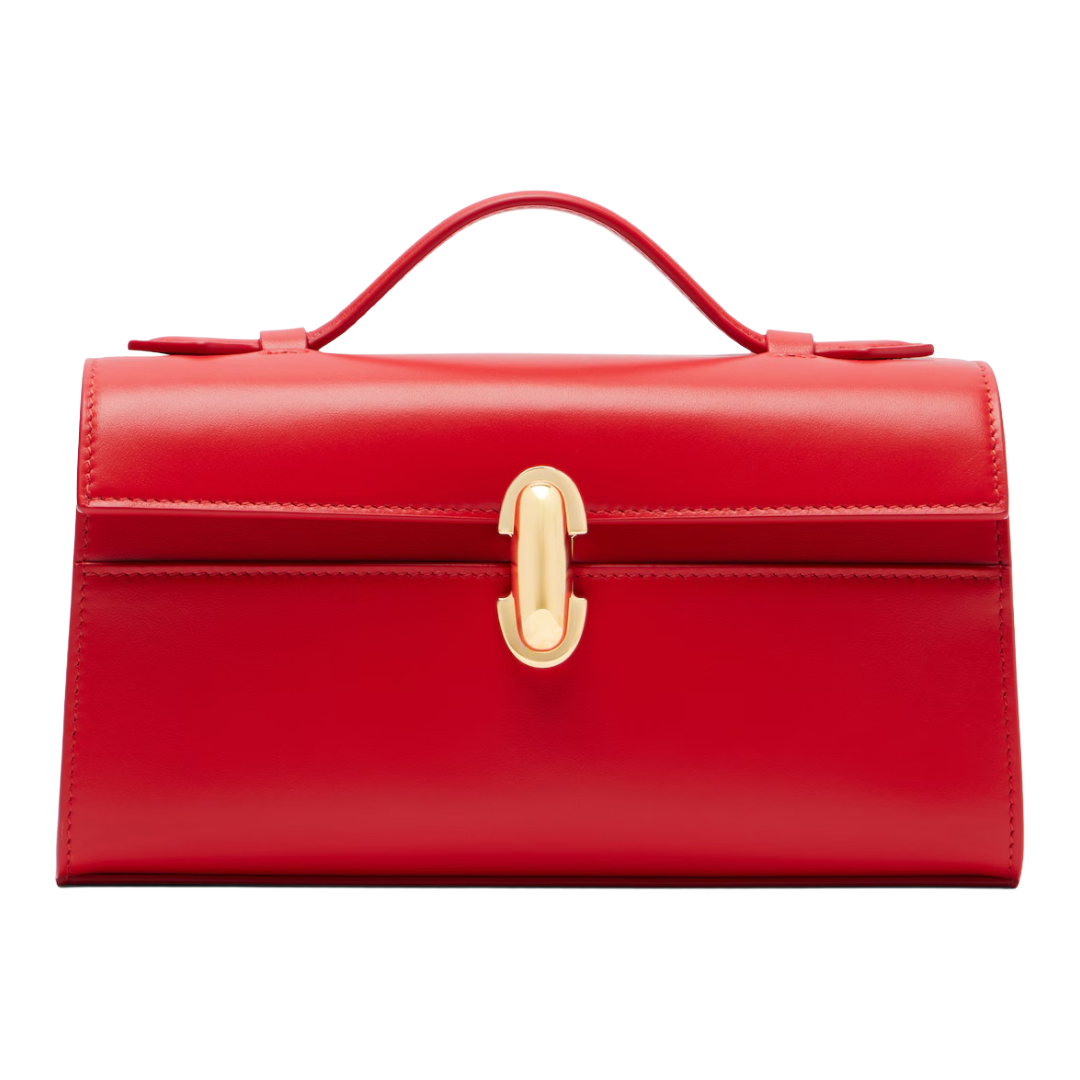
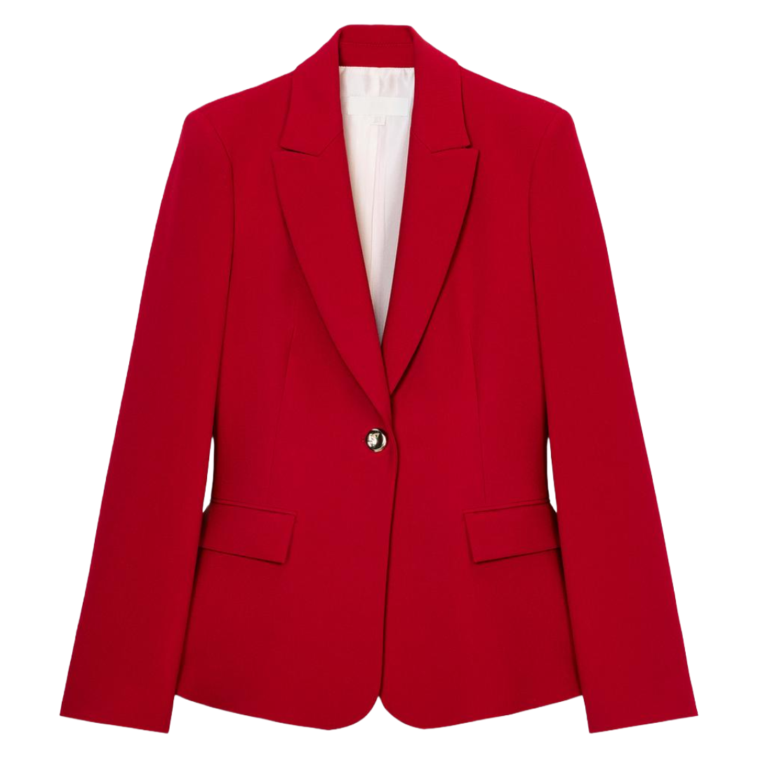
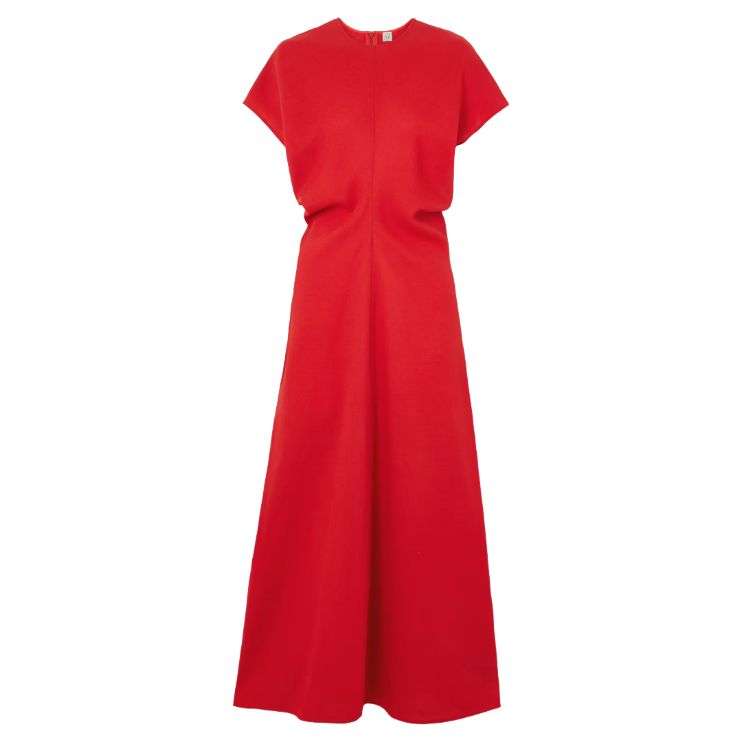
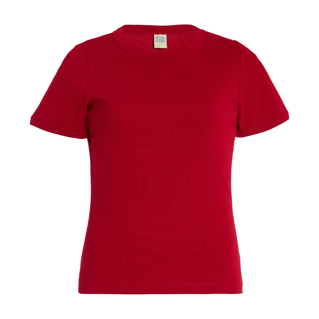
Red Hot
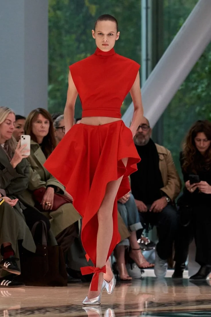
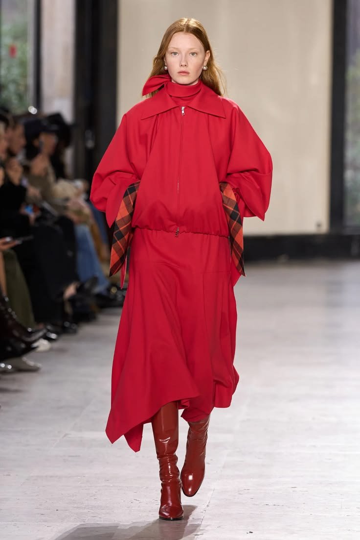
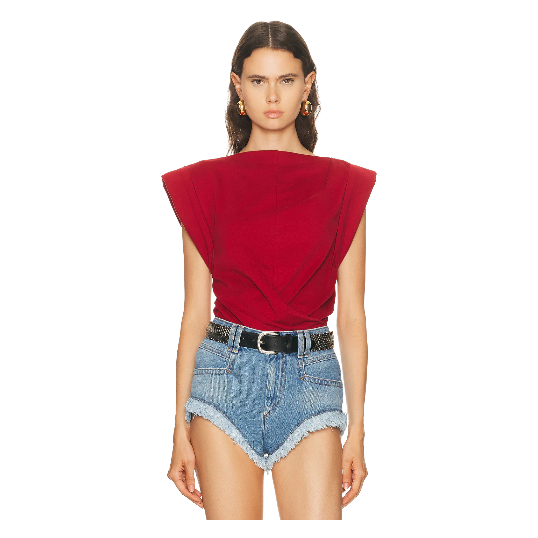
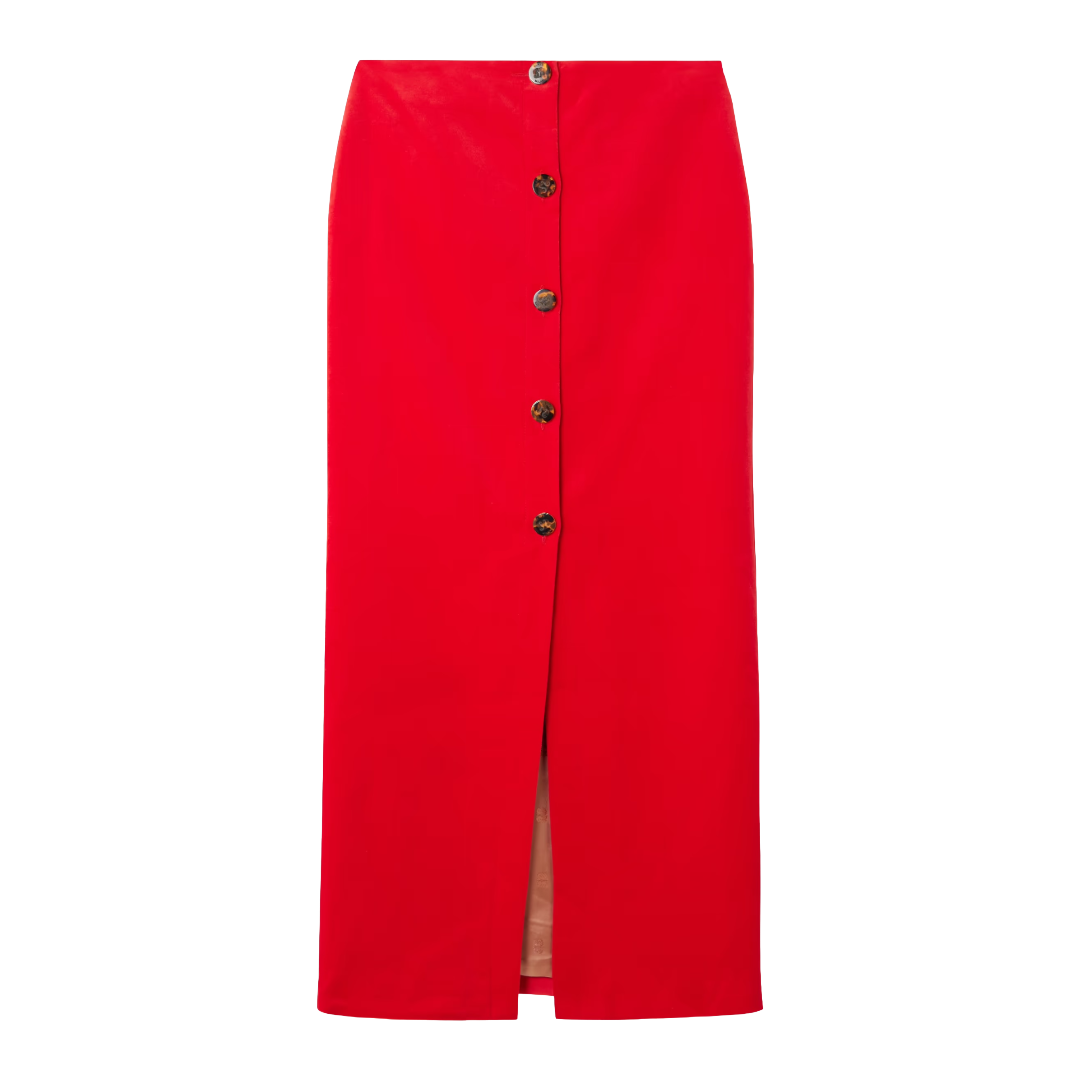
Red isn’t new. It’s never not having a moment, but this spring the particular shade that’s making waves sits somewhere between cherry and tomato. Okay, I couldn’t really find one cohesive, agreed-upon name for the shade. Either way, it’s fiery, saturated, and impossible to ignore. If you picked up a red knit recently, you were ahead of the curve. Hang on to it because this color isn’t going anywhere.
What makes red interesting this season is the texture play. The fabrics, making the color pop from matte suede and silk to corduroy, give the shade depth and dimension rather than brightness. Designers like Prada and Tory Burch showcased the shade in more preppy-leaning silhouettes like polo tops and midi skirts, while Stella McCartney leaned more city with matte leather trousers. The versatility is genuinely the best thing about it: red plays well with neutrals and holds its own against the other bold colors. It’s the rare shade that works as a statement and a building block.
Tom Ford
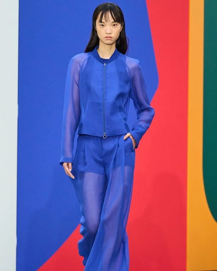
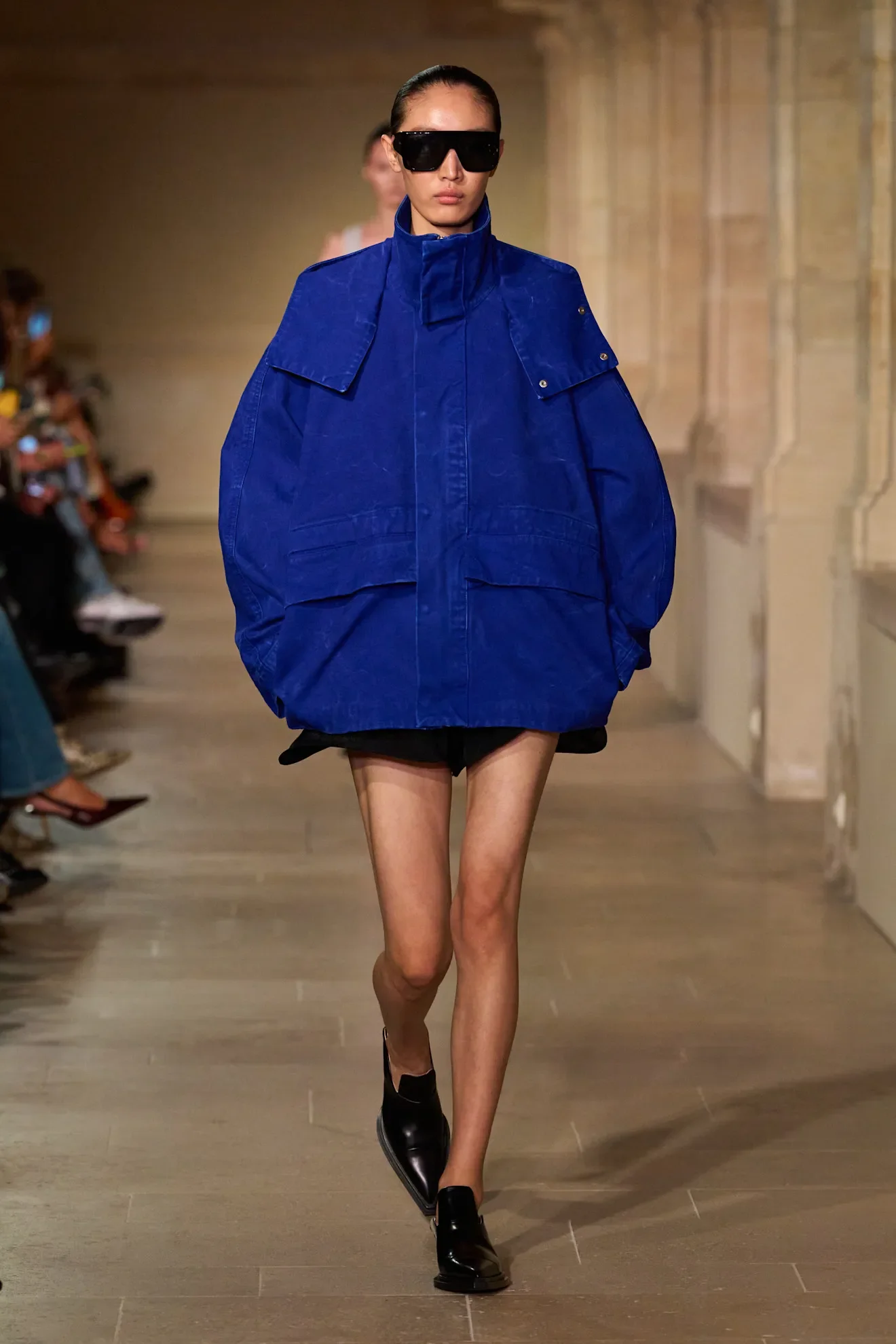
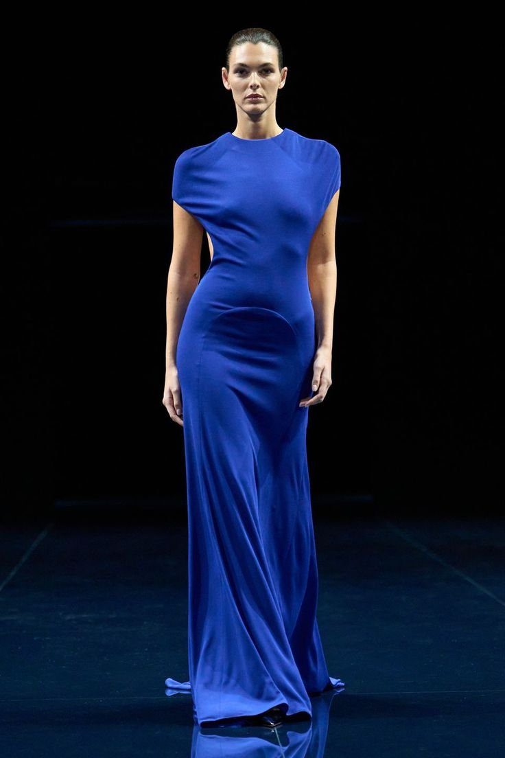
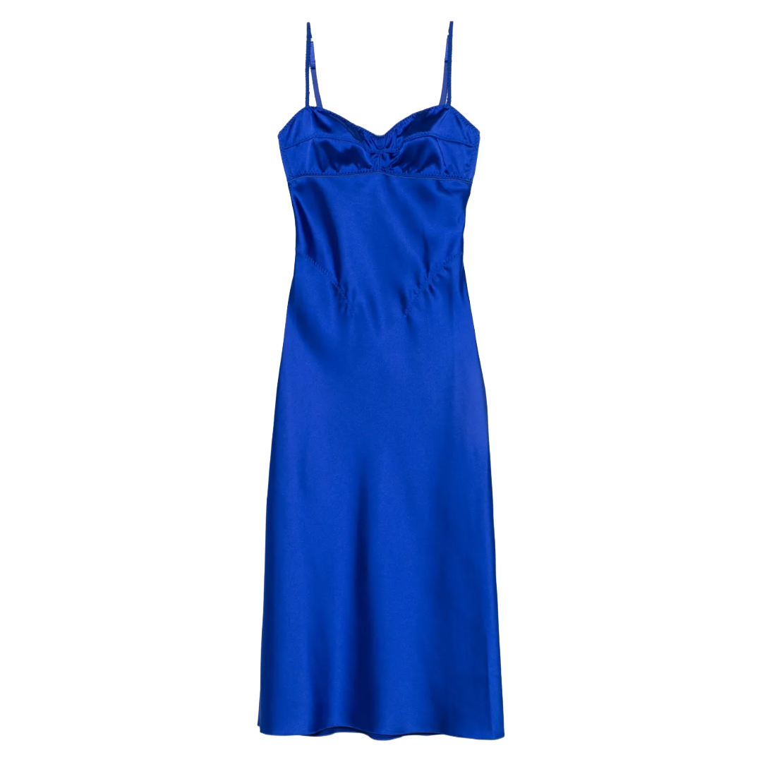
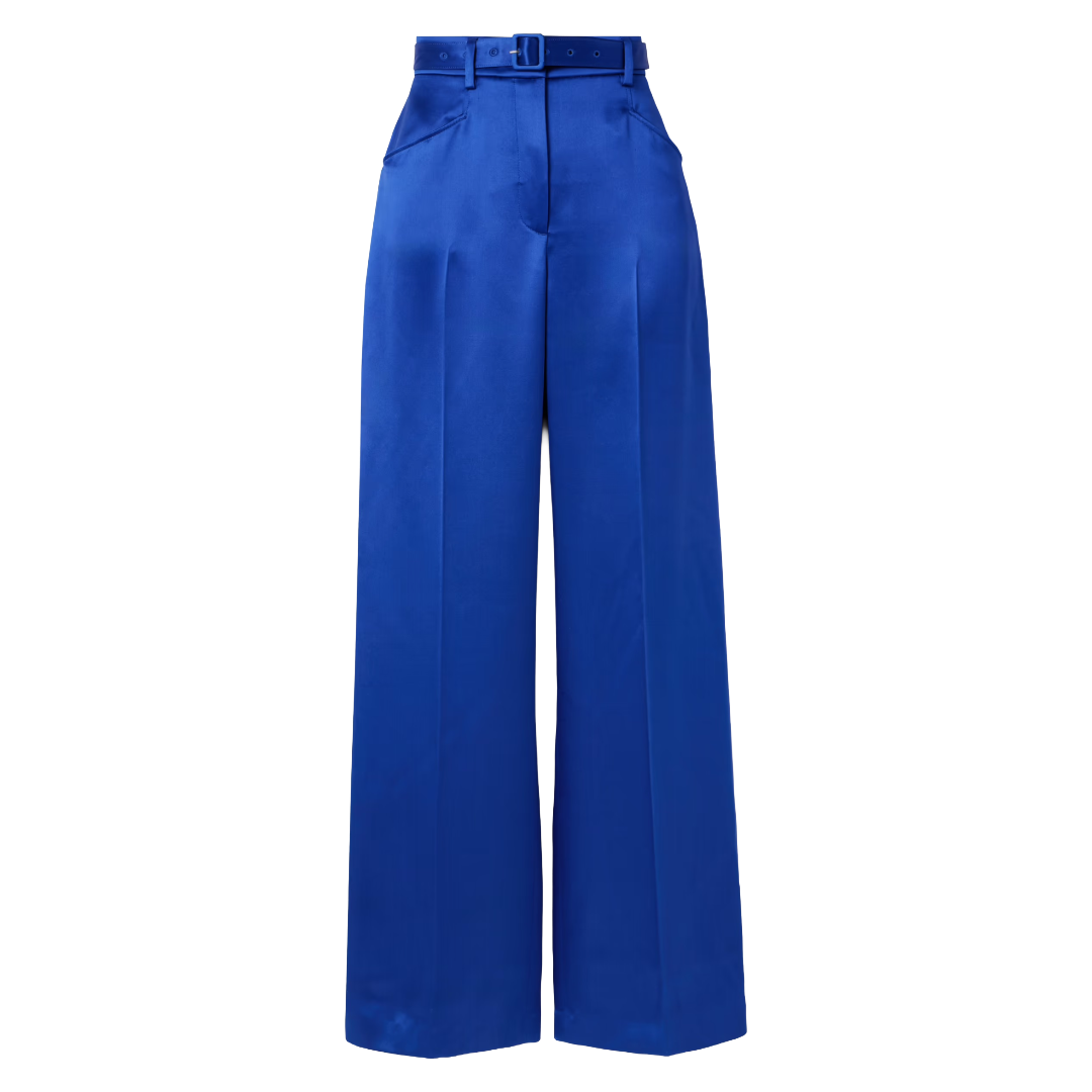
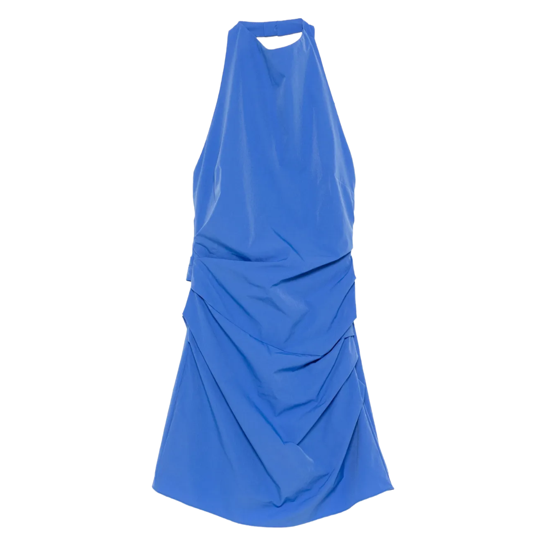
Cobalt Blue
Jewel tones have been fairly absent from the fashion conversation for a few seasons now, which makes cobalt’s runway comeback feel genuinely exciting. This rich, saturated, primary-leaning blue will make you wonder why you’ve been living without it. It’s the kind of blue that makes coats, soft dresses, and cropped jumpers have their power moment. Loewe and Victoria Beckham both made strong cases for the color this season, and for good reason. There is something about this shade of blue that is both eye-popping and still grounded. It commands attention without needing to scream. The key to styling is in the balance. Cobalt earns its confidence when paired with simpler pieces that don’t compete. Trust me, this shade is a worthy investment, not just a regrettable impulse buy.
Marc Cain
Zimmermann
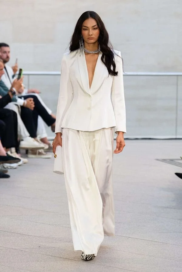
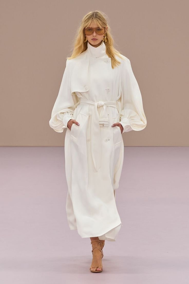
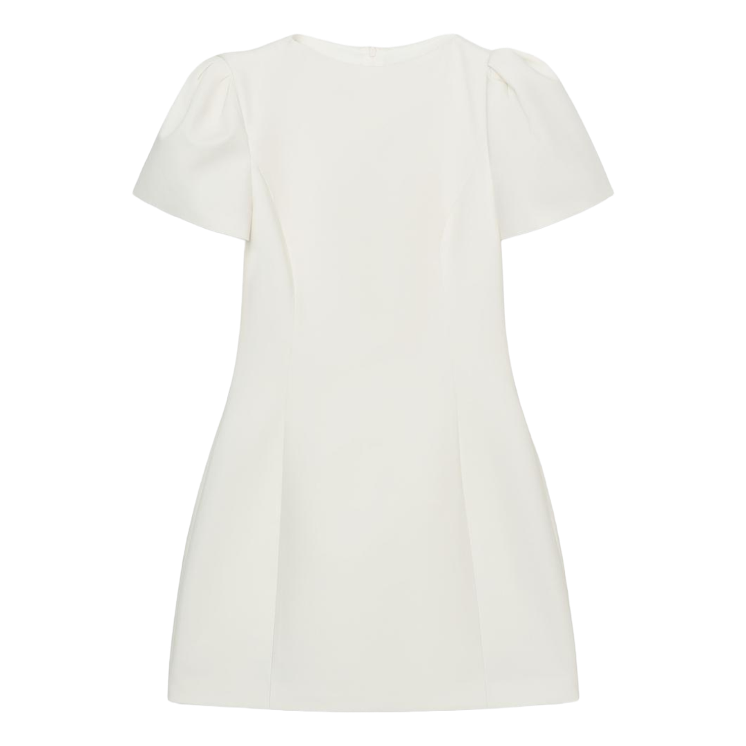
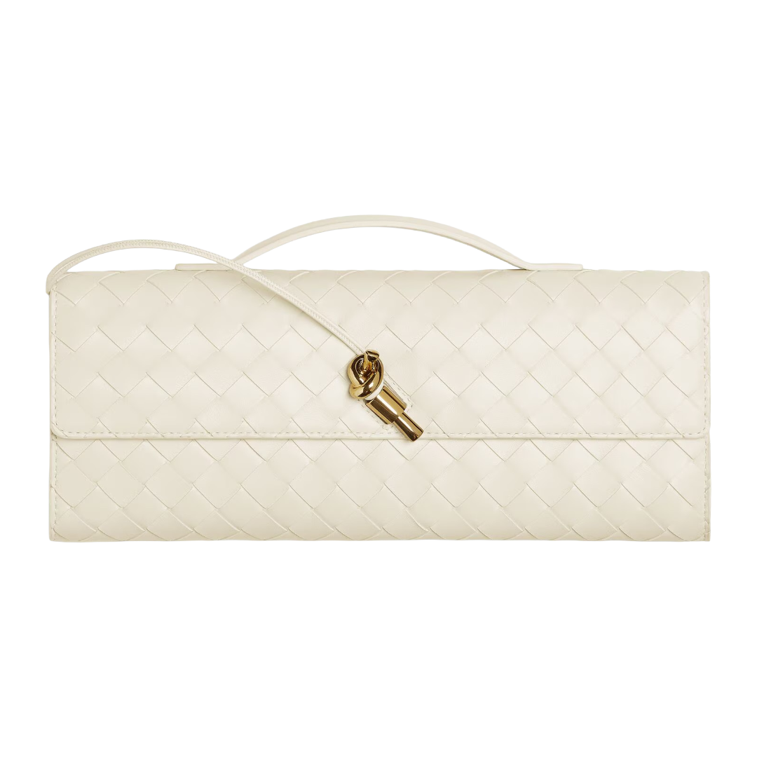
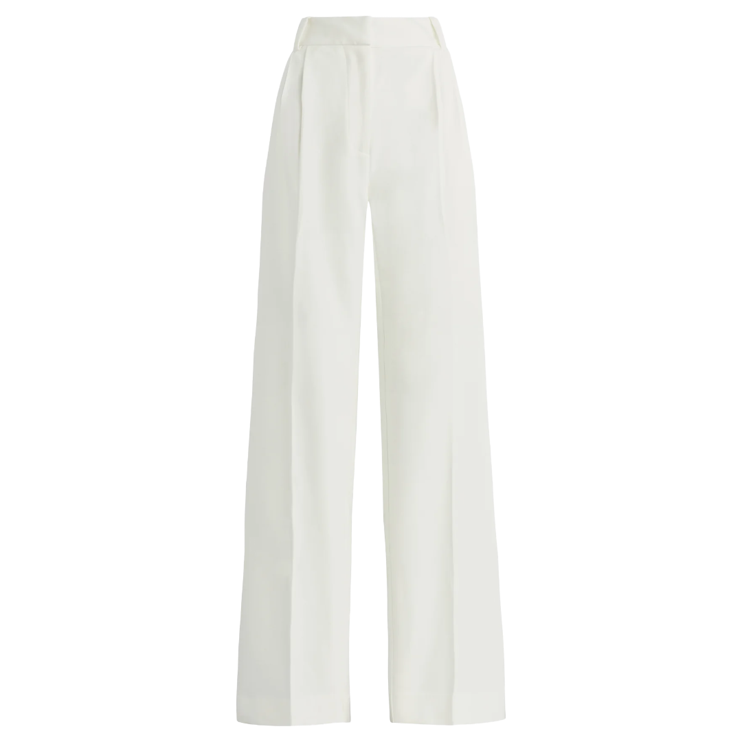
Cloud Dancer
Here is a color with a very official seal of approval: Pantone named Cloud Dancer, a soft, elevated, creamy white, its color of the year for 2026. Pantone describes it as a shade meant to bring calm and quiet reflection into everyday life, which, honestly, feels very on the nose. Now, “white” can feel like a non-color. Too safe even. At Balenciaga, Piccioli used white to prove that a vanilla shade can carry an entire look. Bottega Veneta showed it in a textured oversized tee over a gathered satin skirt. The key is the fabric. Cloud Dancer earns its keep when it’s rendered in something with a little interest, like cashmere, satin, or soft cotton. If you’ve ever been tempted by the quiet power of a head-to-toe white moment, this is your chance.
Stella McCartney

Zimmermann
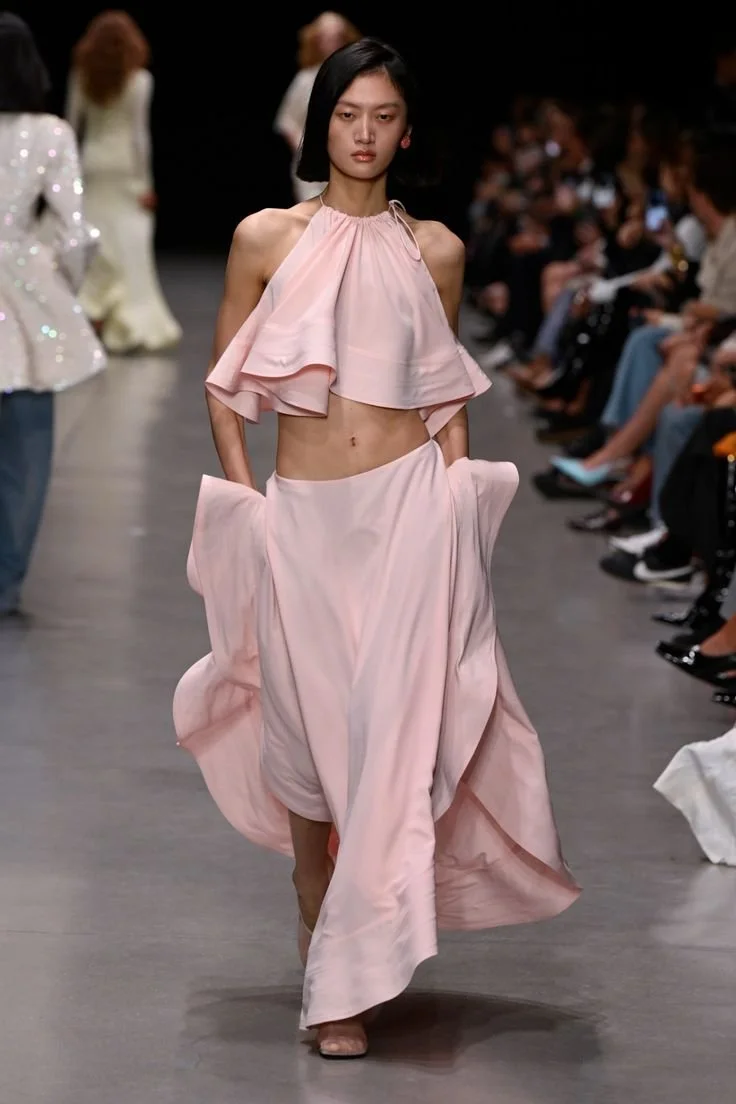
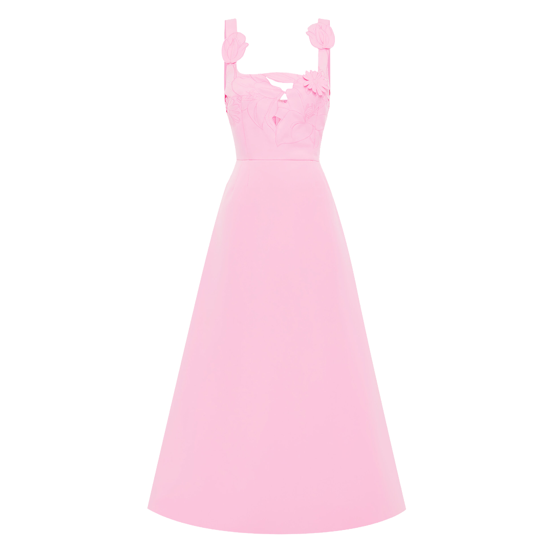
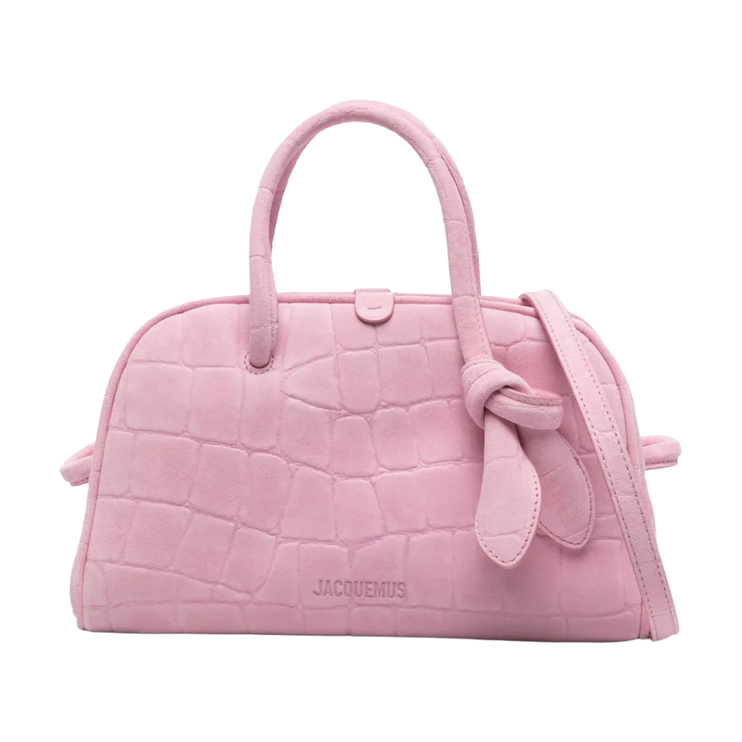
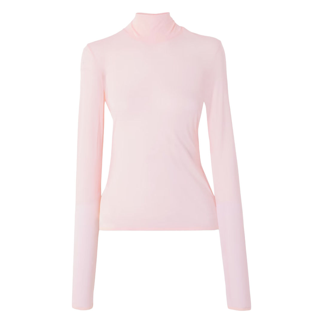
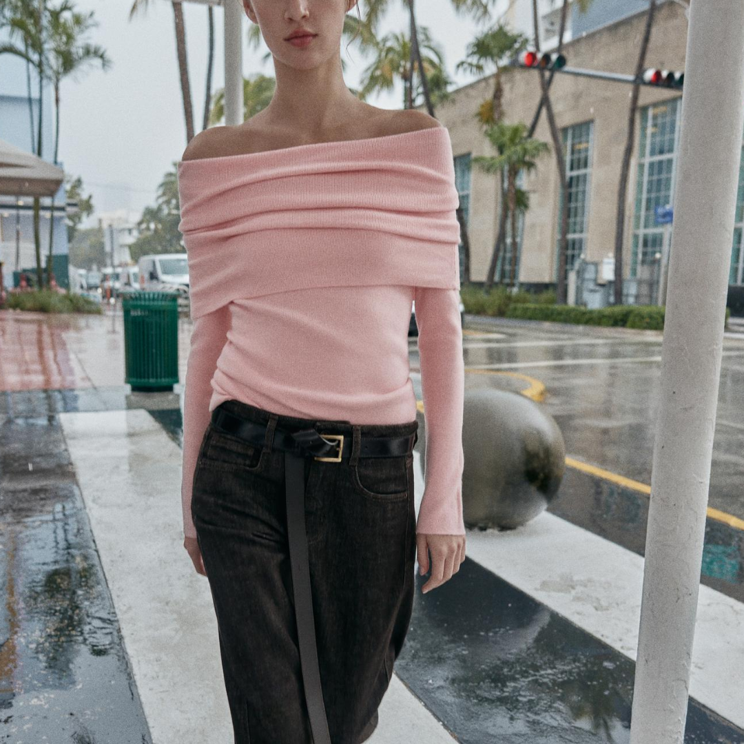
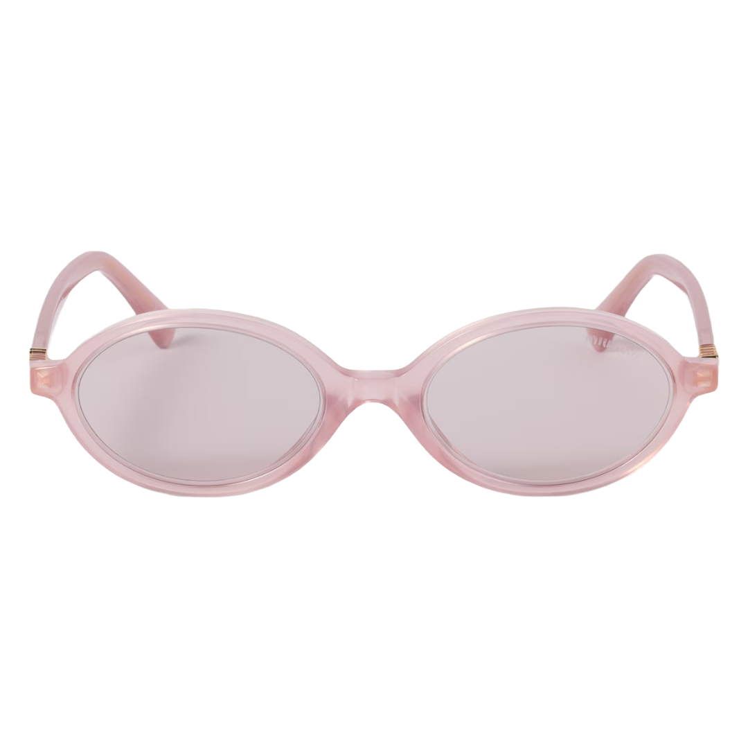
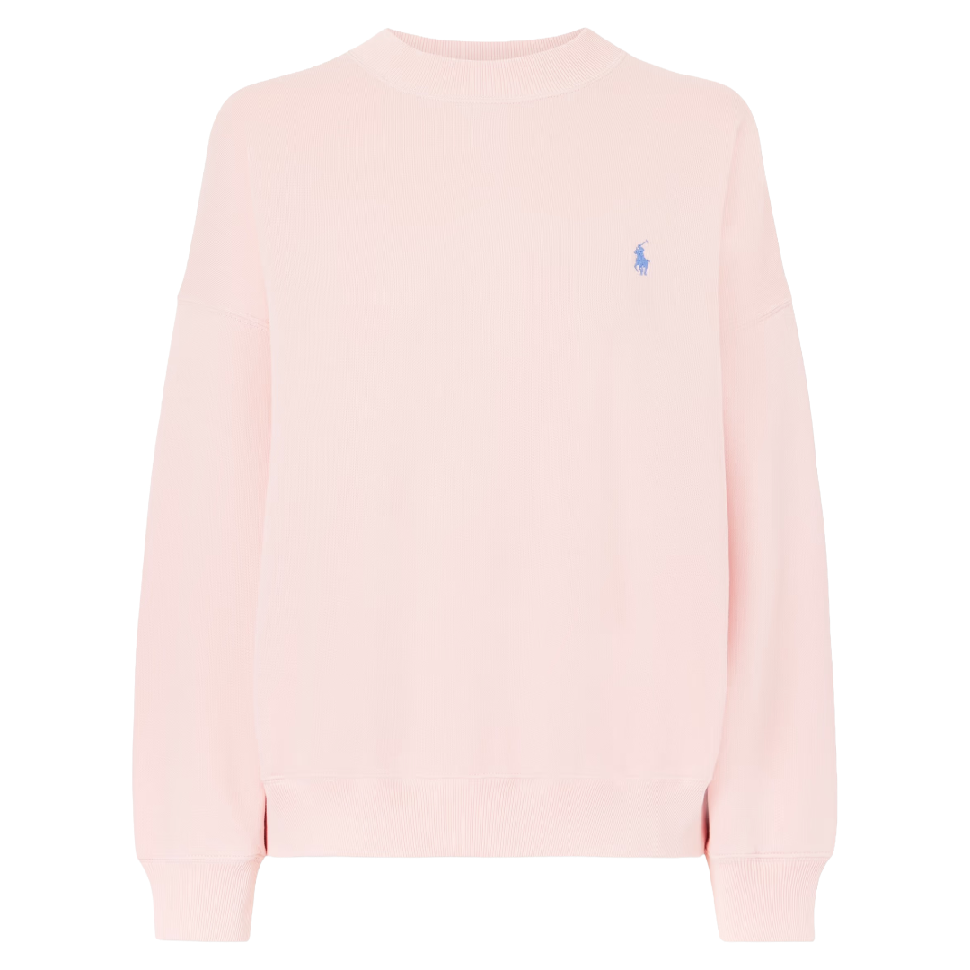
Light Pink
Pink is going through a glow-up again, with multiple shades being spring-ready. But I have been drawn to the ballet-slipper shade that is soft, understated, and almost blush. Delicate and feminine without being loud. The Chanel runway really set the tone with this shade and had one piece that was one of the most-talked-about of the entire season. This shade of pink is much more versatile and extends further than other shades. It works on classic wardrobe staples like ribbed knit, tailored trousers, and simple tees, but elevates them slightly without trying too hard. It’s the type of color that isn’t doing the most but still manages to be incredibly magnetic. If you’re looking for a pink you can actually commit to wearing, this is it.
Nardos
Erdem
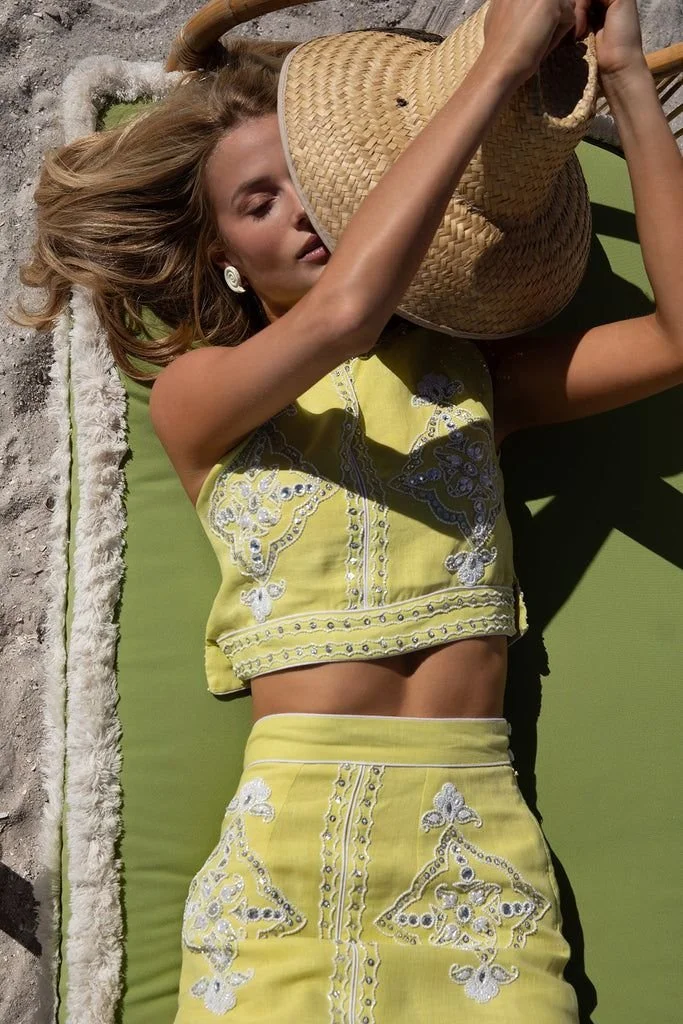
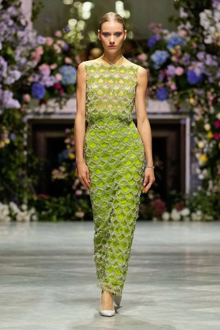
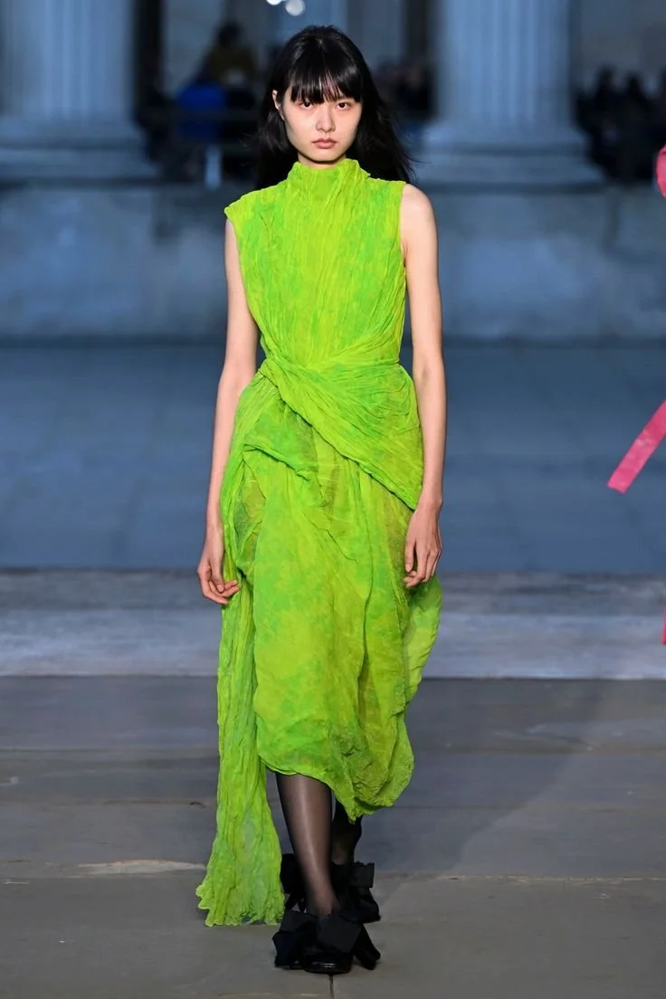
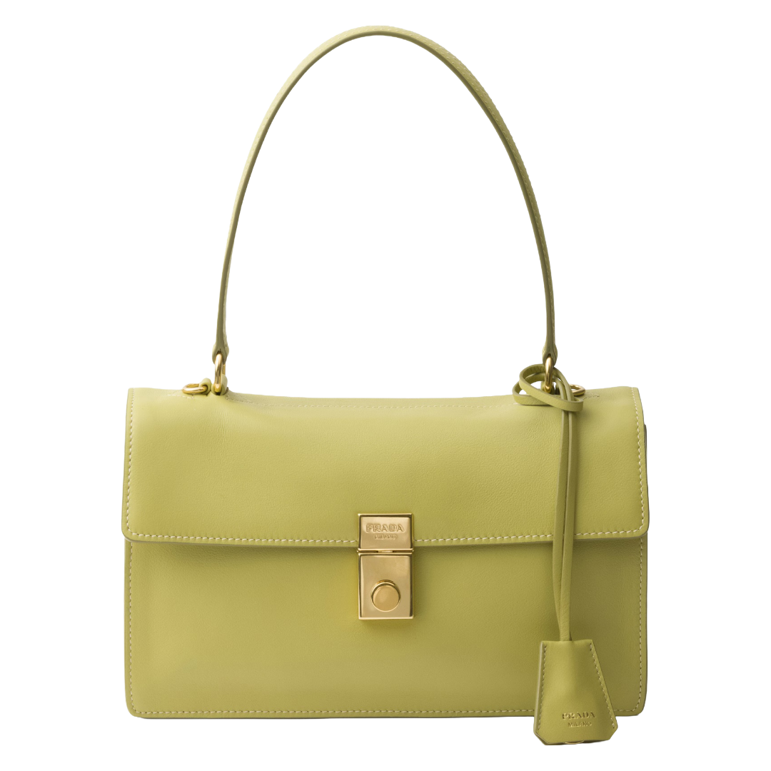
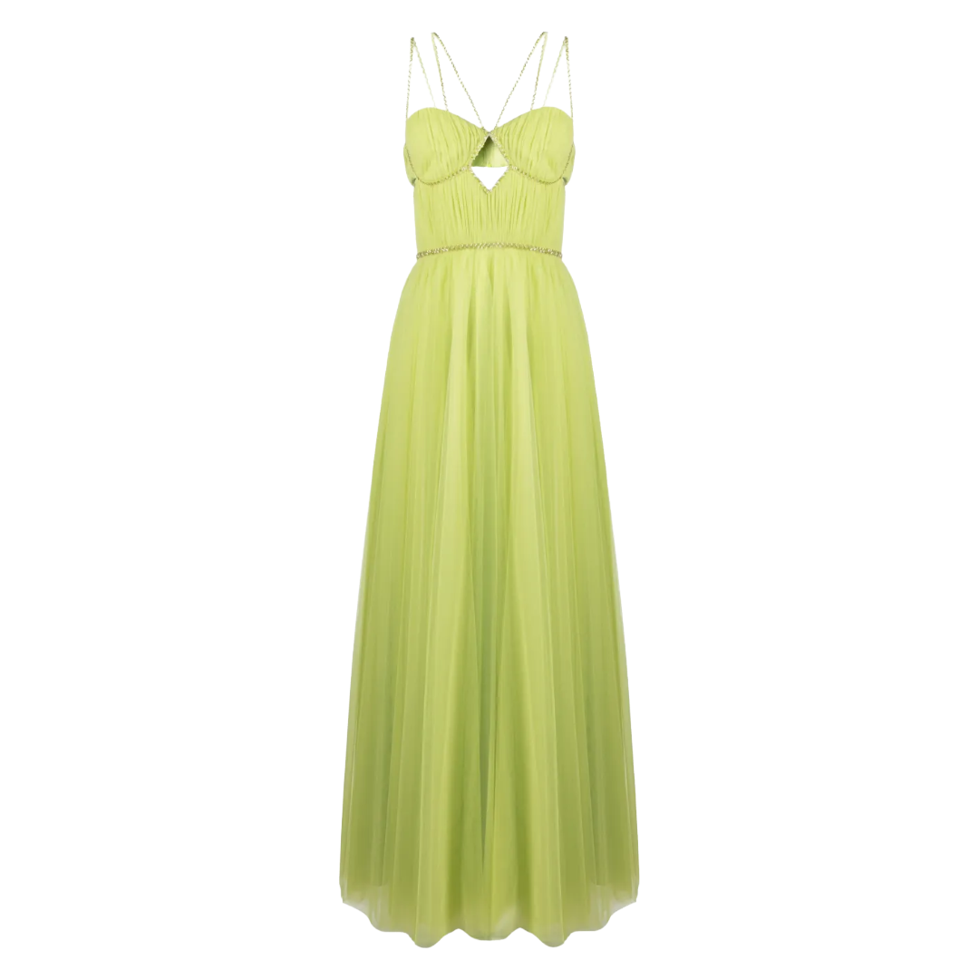
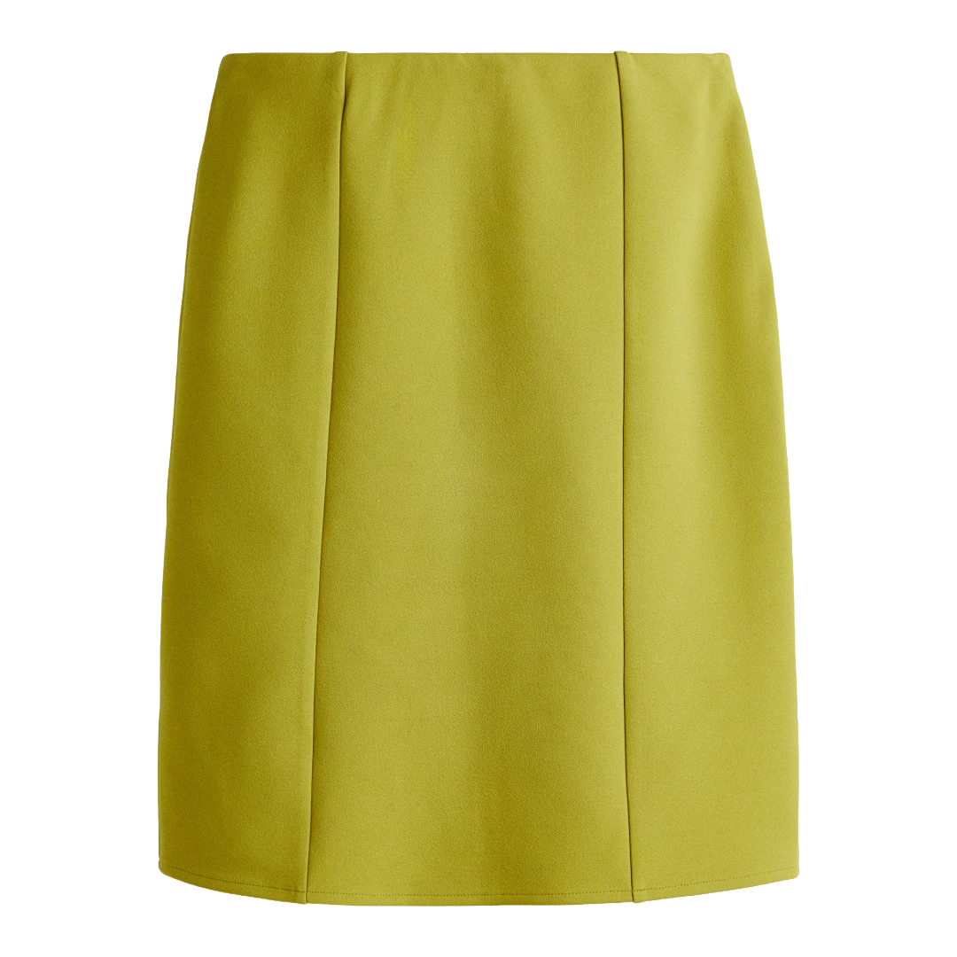
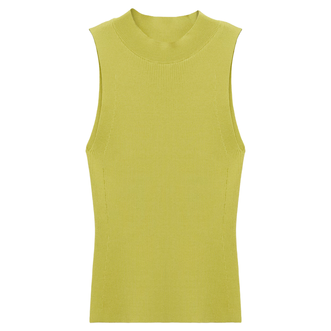
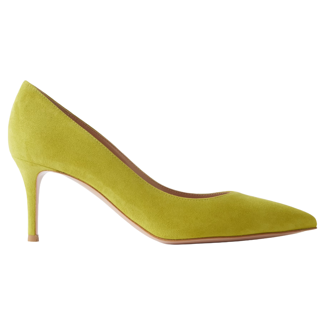
Chartreuse
It took some coming around for me on this one, but give it a chance. It’s not really a color anyone expected to be a trend, but here we are. This yellow-green hybrid lives somewhere between a lime and a Granny Smith apple, and it’s much more wearable than it suggests. I’ve seen people calling it the “older sibling of BRAT green,” so if that was your jam, this won’t be difficult for you to adopt. Prada put it on a few pieces that made even the most skeptical change their minds. Chartreuse carries a sense of optimism and playfulness we could all use right now. Practically speaking, it layers really well with neutrals, especially white, and works across everything from a simple knit top to a statement maxi skirt. Give it a chance. You might just surprise yourself.
The Bottom Line
Spring is serving up a full spectrum of colors from the quiet comfort of Cloud Dancer to the bold statement of cobalt blue. What I love about spring 2026’s color story is how it doesn’t really demand you pick a lane. You can have a moment in soft ballet pink and go bold in cherry red the next. Dip a toe into chartreuse or go full in on cobalt blue. Color should be fun and not filled with pressure, and this spring, there is plenty of room and color to experiment with.