EVERYTHING OLD IS NEW AGAIN
I didn’t set out to create a nostalgia-themed edit, but when I started looking at the list of what I had been bookmarking, I realized almost half of it was something old being rebuilt, reissued, revisited, or repackaged. The Brady Bunch house is opening for tours. Coca-Cola dusted off that Hilltop. American Girl is reminding me how old I am, bringing back the OGs. Even the “new” design drops here are lookalike cousins to things we already knew we loved.
When I think about nostalgia, it’s really two things at once: a personal pull (the stuff we wanted as kids, the stuff our parents owned, the shows we watched on reruns) and a commercial one (brands mining emotional memory because it’s cheaper and more effective than building from scratch). Both are at work here. Some of this is my brain being sentimental, and some of it is 2026’s marketing class collectively deciding that rebooting beats inventing. It’s probably both, actually. And if the weird nostalgia-based commercial on the classic TV channel has anything to say about it, nostalgia is good for our health and social skills, haha.
Anyway, here is what had my attention over the last month.
Sabrina Carpenter x Coachella
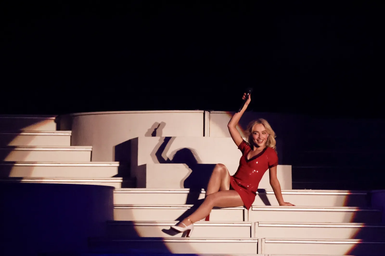
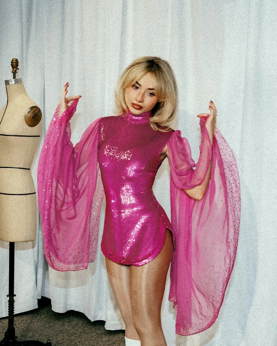
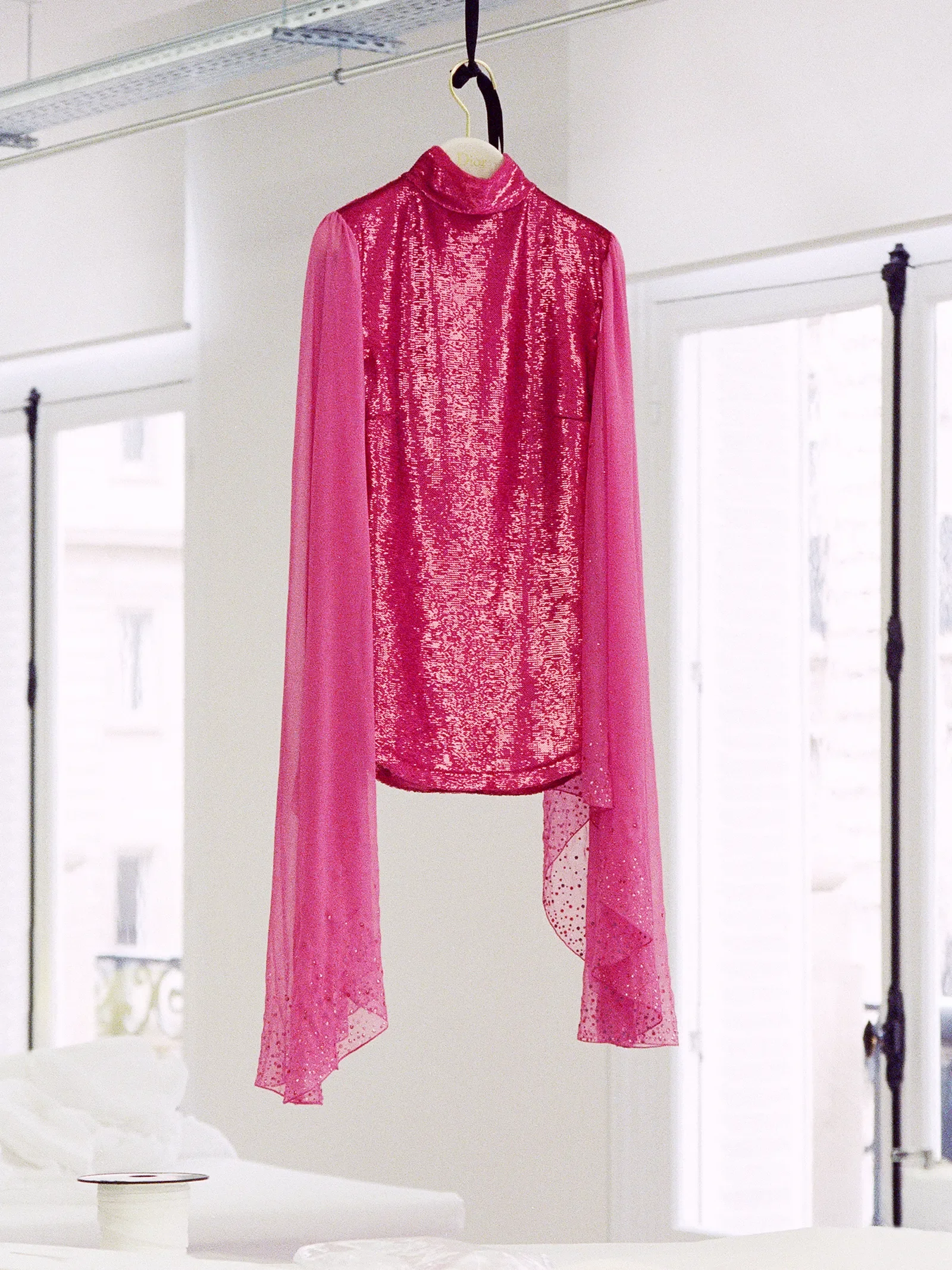
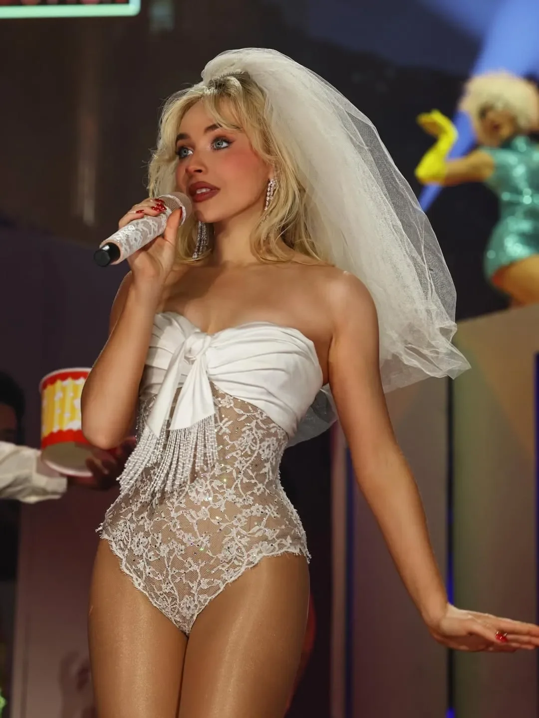
My general thoughts on the current state of Coachella aside, I have to admit Sabrina Carpenter’s set was one of the most creative, well-thought-out, and entertaining I’ve ever seen. Every detail was perfection, including her custom Dior looks. All five looks from both weekends were immaculate. I thought the black lace bodysuit (below) was my favorite, but then Weekend 2 happened. Enter the pink sequin custom Jonathan Anderson-era Dior micro mini dress, ruched at the sides, high-neck, with pink chiffon cape detailing at the shoulders. Gor. geous. But that’s not all. Styled by Jared Ellner, there were custom Stuart Weitzman Luci boots that matched. Sure, the set contained a Madonna cameo for “Vogue” and “Like a Prayer,” which is amazing. But the looks, especially the pink mini dress, are what lived in my mind rent-free for a week. I want the boots. I want the boots in a way that I’m constantly thinking about them more than I should.

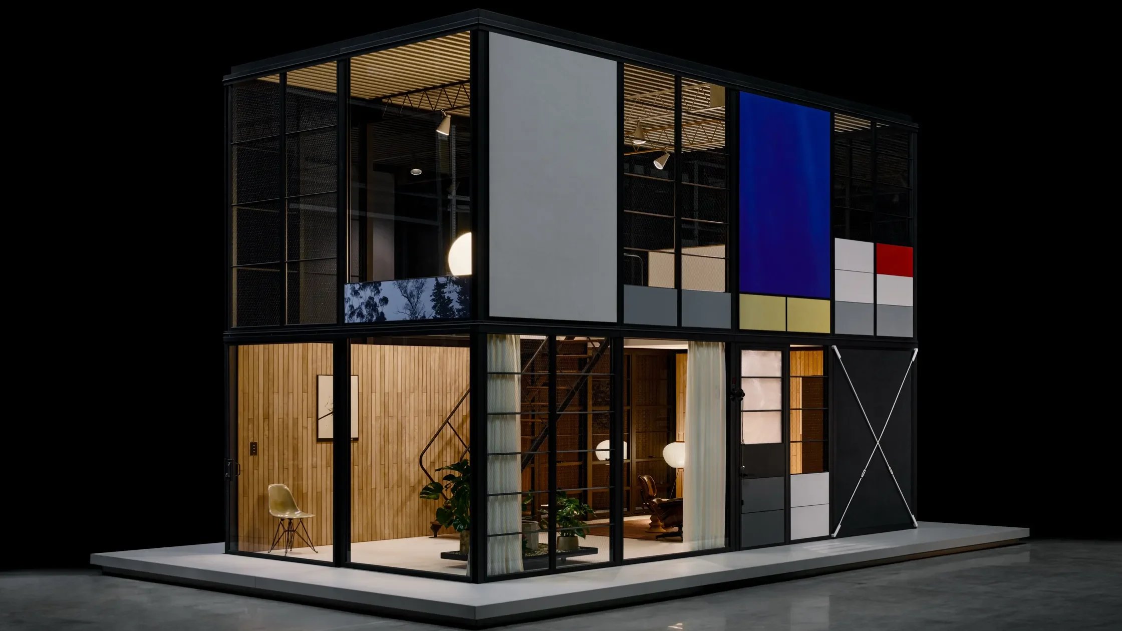
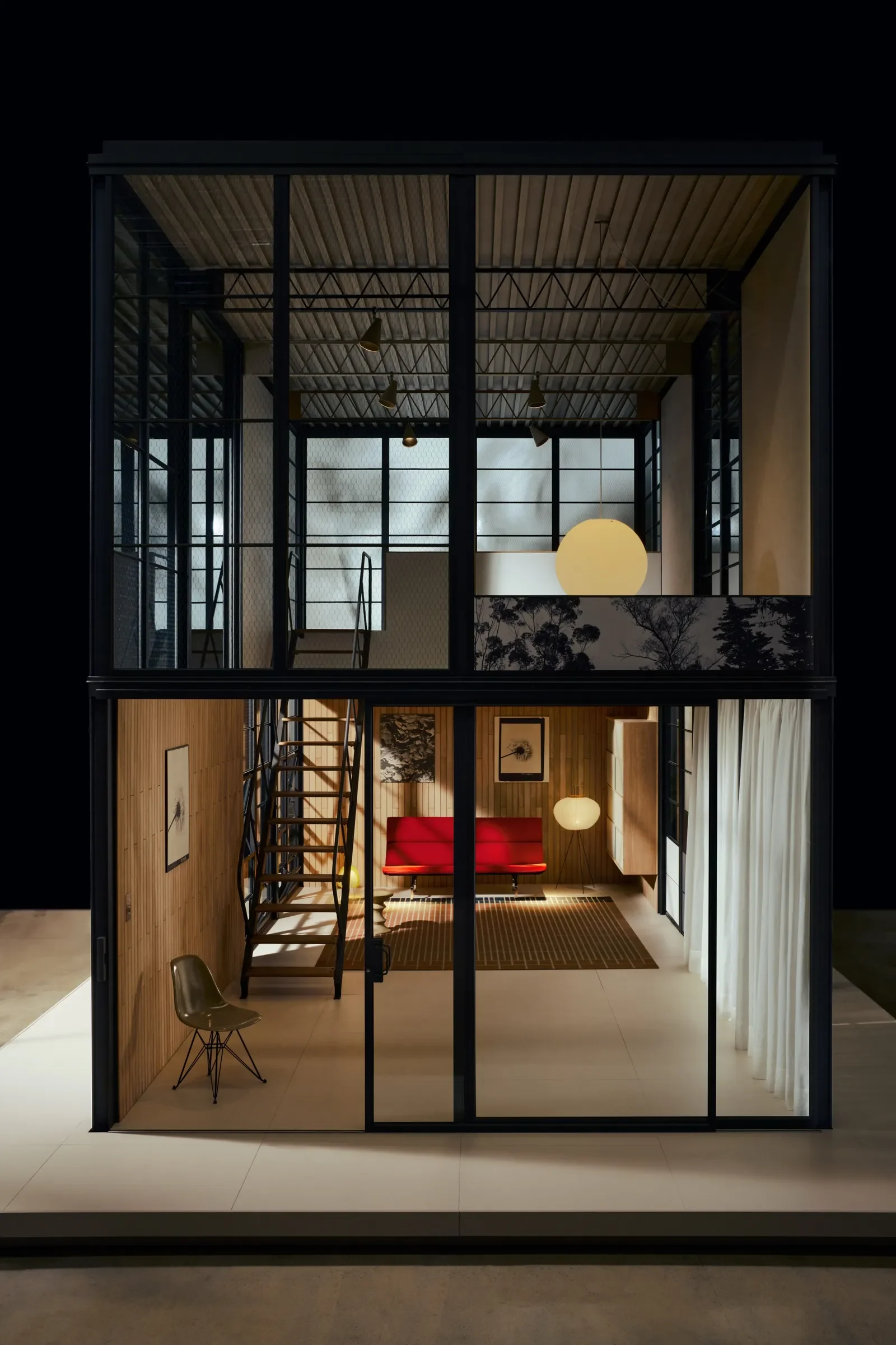
The Eames Pavilion System
The Eames House is one of my favorite places, so you can’t imagine my excitement when I saw the Eames Pavilion System and how it could be the future of modular homes. The Eames Office teamed up with Spanish furniture brand Kettal to make the Eames House buyable. It’s a modular kit of aluminium beams, glass, polycarbonate, and wood panels that can be configured into a home, a backyard studio, a shop, a two-story build, or whatever you want. One-story versions start at around $325 per square foot and go on sale this fall, with Kettal engineers handling on-site assembly.
It’s not a literal copy of Case Study #8. It pulls from the Eameses’ full body of residential work, including a never-realized flat-pack concept they called the Supermarket House. Case Study #8 was structured to be constructed with “off-the-shelf” parts available from catalogs. During the time they were waiting on materials, scarce after WWII, they were working on where to put the home. The general purpose of the home was to be an inexpensive, easily constructed home for a working couple that provided flexible living space for living and working. It is widely considered to be the most successful as an architectural statement and as a functional living space.
It’s fascinating that the concept has developed into the next wave of functional and still beautiful modular homes. It is, after all, renowned for demonstrating how industrial materials can, in fact, create a warm, artistic, and liveable space. Charles and Ray Eames spent their careers sketching universal architecture for everyone and never quite got it to market. Their grandson just did. Who doesn’t love it when a design gets to outlive its designer and find a new phase of life?
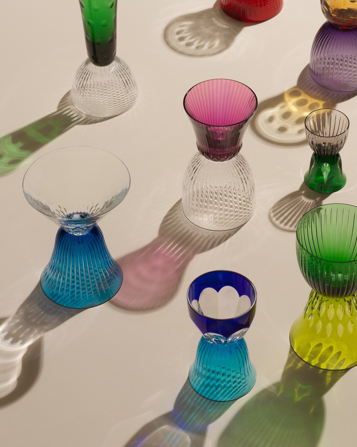
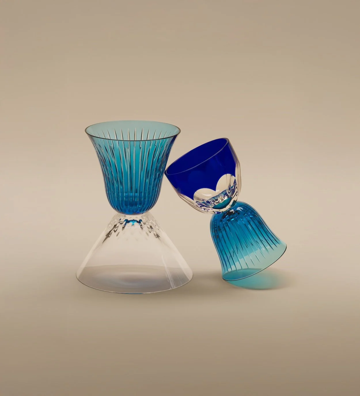
José Lévy Les Endiablés for Saint-Louis
Saint-Louis is a 440-year old French crystal house that’s been part of Hermès for 25 years, and they just recently added new pieces to its long-running Les Endiablés collaboration with Parisian artist José Lévy. These aren’t just any crystal objects. The concept: every piece is reversible. Flip it over, and a vase becomes a candlestick, a cup, a sculpture, or whatever you decide it is. The palette runs chartreuse, amethyst, flannel gray, deep greens, and electric blues. The whole collection is built on the idea that crystal should be playful instead of precious. Crystal is one of those things that takes itself too seriously, so this collection is a surprisingly rare position on it. It’s exactly the kind of object I don’t need and would happily buy. I mean, just look at them.
The Nila Lounge Collection
Zagreb-based Regular Company and Neisako Studio just dropped a lounge collection for Bosnian furniture maker Artisan, built entirely around a chaise longue with a rigid wood frame that holds an unexpectedly soft organic form. I think what makes this interesting is how the upholstery isn’t treated like something you wrap around the chair at the end. It’s treated as a structural component from the start. A small technical decision that makes a huge visual difference. Just look at it. It looks calm and restrained, but everything about it feels deliberate and absolutely not generic. The armrests are also shaped like almonds, which is the type of detail I’d probably blow right past and dismiss as fussy on paper but be obsessed with and fall for in person. It’s just gorgeous, okay.
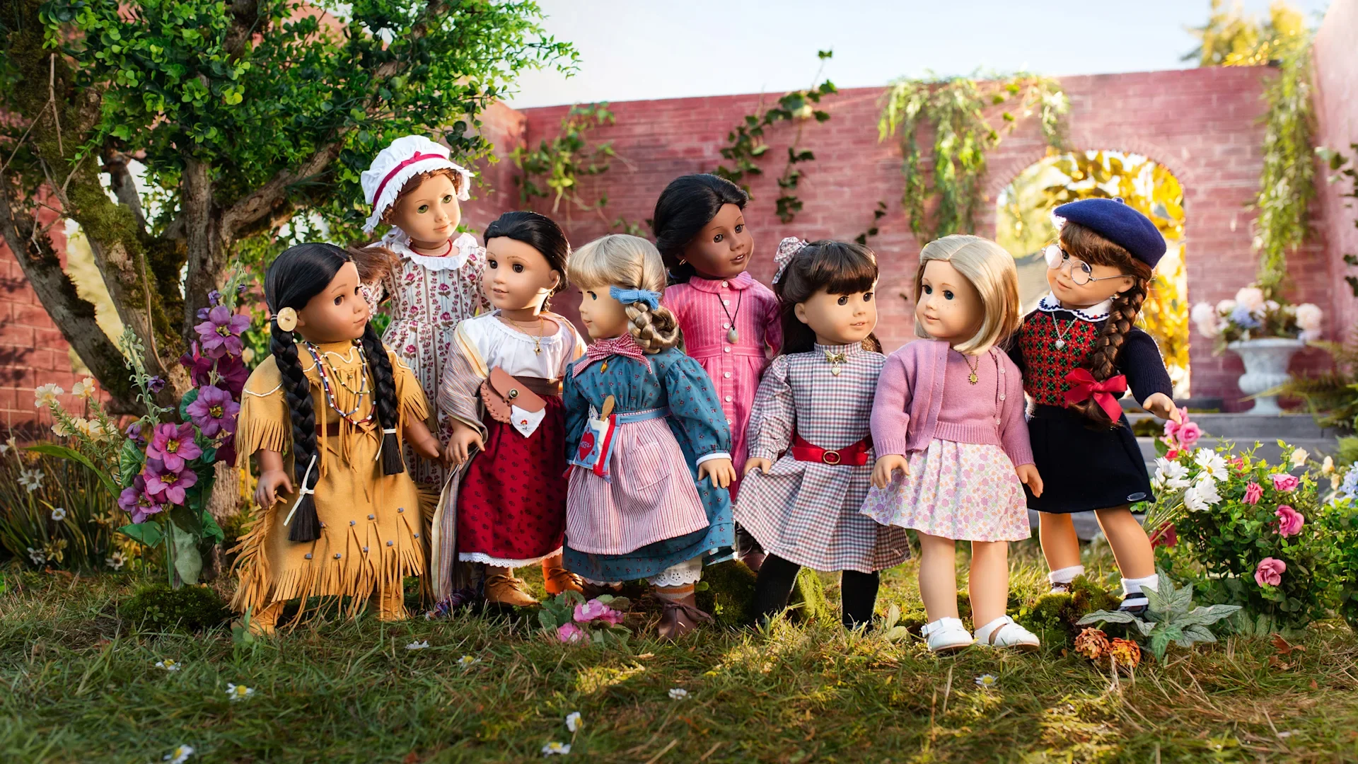
The OG American Girls are Back
This one stung a little bit, I won’t lie. For American Girl’s 40th, yes 40th, anniversary, Mattel is reissuing all eight of the original Historical Characters - Samantha, Molly, Kirsten, Felicity, Addy, Josefina, Kaya, and Kit - in their classic 18-inch format, bundled with their signature outfits, accessories, and books, inside packaging modeled on the original 1986 design. Preorders for the dolls went live back in April, and trust me when I say I considered it.
I wasn’t allowed an American Girl doll as a kid, not because they were expensive or unnecessary, but because my sister and I consistently fought over the catalog and who would get what and refused to share. My parents refused to buy two of anything that could easily be shared, so they decided that if you can’t share or be reasonable (you don’t “need” the matching outfit. You “want” the matching outfit!!), no one gets anything. As an adult, I get it. Working all day at a computer on spreadsheets or in the heat of the day in the trenches of engines, so your brat kids can complain they NEED the full Samantha holiday get-up. Not just the Cranberry Red Party Dress, but the full Winter Story collection with white fur hat, muff, and plaid cape.
I always wanted a Samantha doll. We looked alike. It was a vibe (it still is). When we bring these up today, my mom excitedly replies, “You have adult money. Go to town.” And it’s almost like she was part of Mattel’s engineering, targeting millennial consumers who are no longer the kids with the catalog but the grown women who religiously held the catalog, marking up every page, waiting desperately for Christmas. Whether they are introducing their own kids to the dolls or just leaning into their childhood joy again, Mattel knows what they are doing with this one.
The Analog Comeback
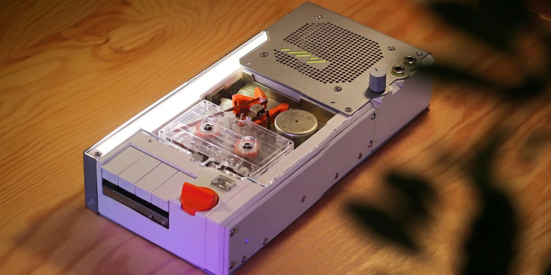
Two things in the “new objects pretending to be old objects” category. Designer Iulius Curt built a portable cassette machine that pulls music off your phone via Bluetooth, records it into a continuously looping tape, and plays it back seconds later. Essentially, your Spotify playlist literally runs through tape before it hits your ears. It’s beautiful: stainless steel housing, acrylic window, and tape visibly moving. It’s like when we would try to record songs off the radio onto blank tapes to curate the perfect mixtape, only without the risk of a radio DJ talking at the wrong moment.
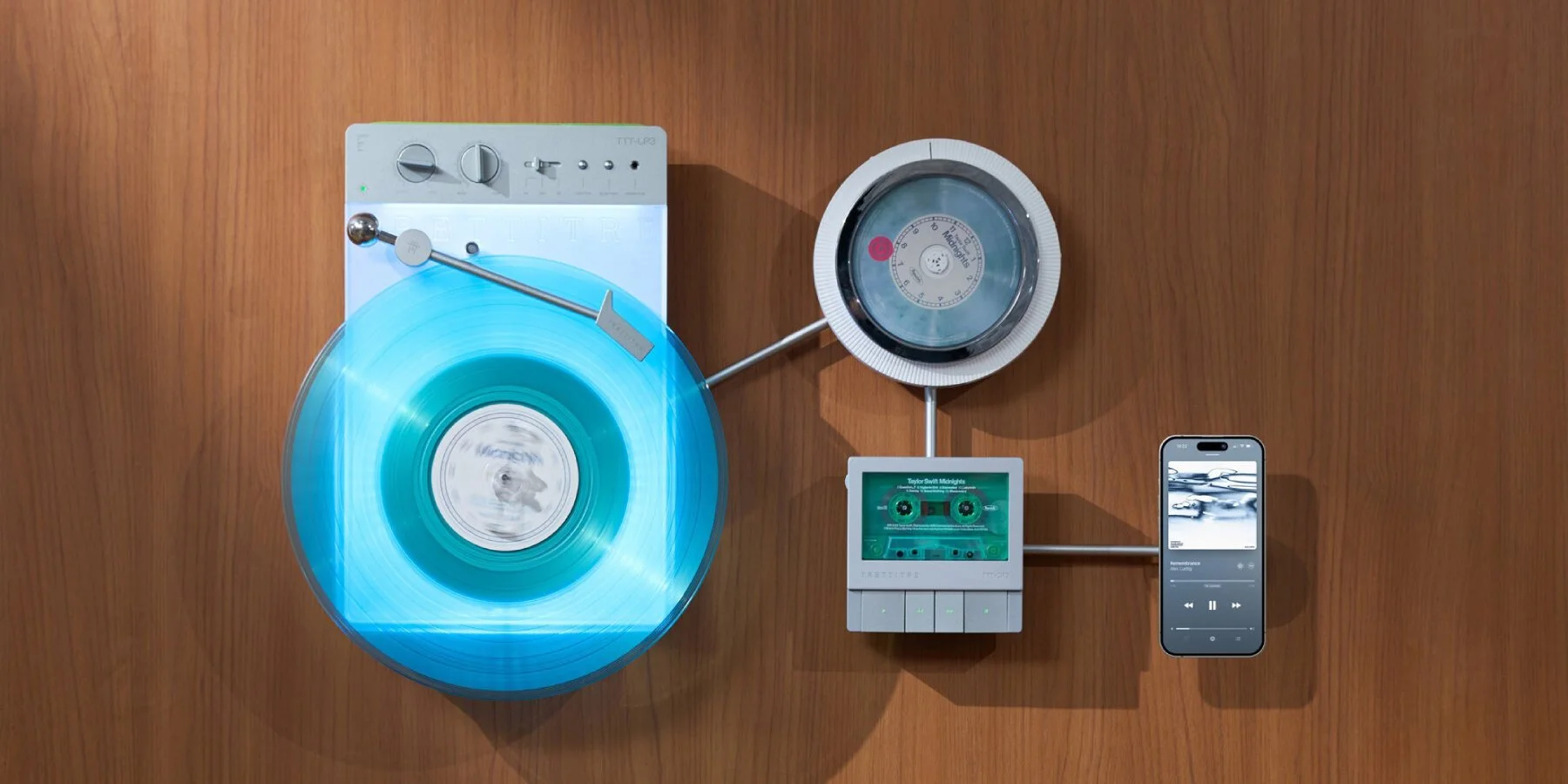
Separately, Italian studio Trettitre released a trio of wall-mounted decks - a turntable, CD player, and cassette - designed as a matched set, with a built-in light that lets them double as a glow-in-the-dark installation piece at night. It honestly just looks so freaking cool and makes an amazing art piece. Nobody needs physical media in 2026, but everyone wants it anyway. That’s the whole case for good design in a digital world.
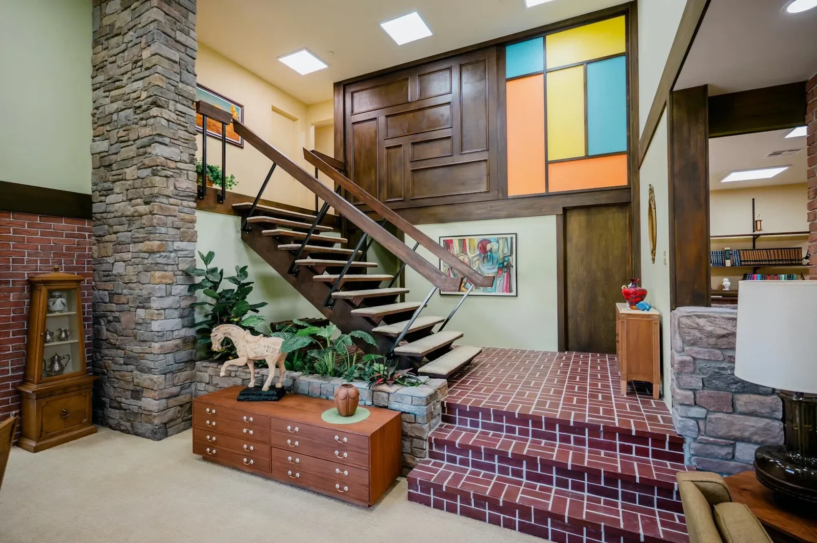

The Brady Bunch House is Now Open
The Studio City ranch home that was used as the exterior for the Brady house on the classic sitcom was privately owned until a few years ago. I’m positive it had no shortage of visitors on the street in the years since the show went off the air (my great-grandparents lived down the street from the exteriors used on The Wonder Years. I know a thing or two about this.), but when the house finally hit the market, there was a bidding war for it. In the end, HGTV won, outbidding Lance Bass, for double the price ($3.5 million). They completely renovated the inside to resemble the home on the show, taking it from soundstage to real life for fans of all generations, old and new. HGTV sold the home after the renovations at a loss, but as of March, it’s officially considered a historical-cultural monument. Beginning this month (May), guests can take semi-private self-guided tours with proceeds going to the Wags & Walks dog rescue. Visitors will get to see the living room, the floating staircase, the kitchen, and the kids’ bedrooms. The tour is for ages 14+ and the last tour run sold out in three days, which is pretty impressive. One thing I know is that waiting to take iconic pictures on the floating staircase has to be as annoying as Marcia was to Jan.
(Architectural Digest)
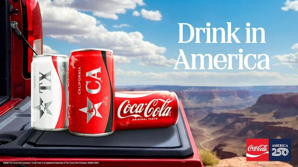
Coca-Cola Revisits the Hilltop
For America’s 250th birthday, Coke rebooted its 1971 campaign “I’d Like to Buy the World a Coke.” This time they’re going with “I’d Like to Buy America a Coke,” a three-minute gospel-inspired anthem with 25 singers from around the country. They debuted the spot during the NCAA championship, and it serves as an anchor to the whole America250 rollout. There are 52 limited edition mini cans - one for each state, plus D.C. and Puerto Rico.
As a marketer, I find this move pretty impressive. The spot is iconic and holds a place in not only the advertising/branding/marketing lexicon, but in the pop culture lexicon. If you watched Mad Men, you know this. It’s actually widely considered one of the best-loved and most influential ads of all time. But honestly, heritage is a moat you can’t build overnight, and pulling this asset out of the archive at exactly the right cultural moment is a pretty big flex. Only a handful of brands could actually pull this off. I don’t always want or like nostalgia marketing, but this move earns my respect. It’s introducing an entirely new generation to the campaign at a time that just makes sense - and not because it is America’s 250th birthday.
The ad was created in an airport when a jingle writer noticed a group of people talking and laughing while enjoying a Coke once the anger over a layover had settled. He started to see Coke in a new light - a drink that refreshed millions of people across the globe every day. It’s a commonality we all share, no matter where we are from. The formula is the same, and for a few short minutes, no matter where in the world we are or who we are with, we are universally sharing a commonality. The jingle was a failure initially, with no one really paying that much attention to it until money was put behind a television ad. The risk paid off, sparking hope and unity with a majority of people. As I said, it’s a reference for marketers everywhere because it proves that knowing the market isn’t all you need. You need to know what the market feels, and right now, it feels like the market is in this same place, looking for unity and hope.
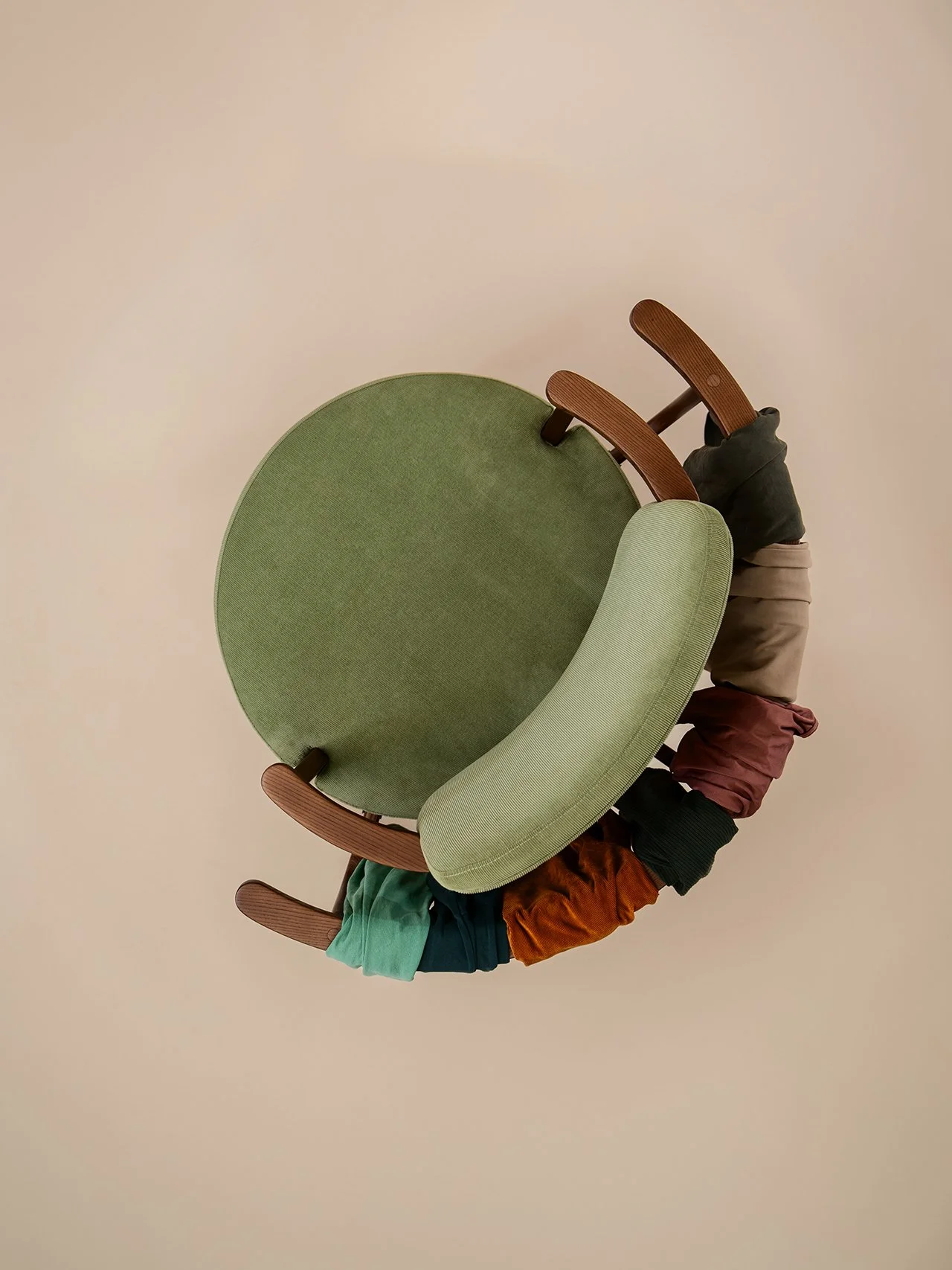
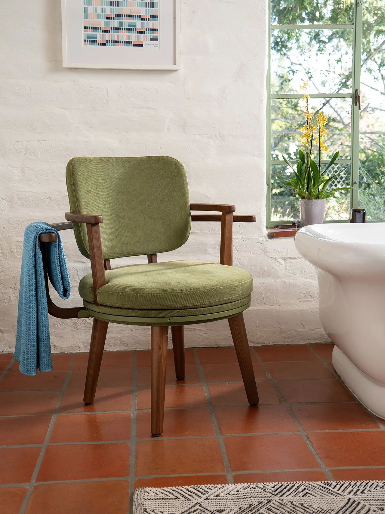
The Laundry Chair
Look in the corner of your room right now. You probably have a laundry chair, am I right? Enter Simone Giertz - a Swedish inventor and founder of Yetch Studio - who designed an olive-corduroy armchair with a 360-degree swiveling rail built into the back. It’s specifically for the clothes that are worn but not dirty. The eternal pile that has colonized every bedroom chair in history. Her prototype went viral in 2024, and she spent a year refining it before a Kickstarter raised over $1.1 million to manufacture it and bring it to life. I’ve said it before: the best product design is the kind where your first reaction is “duh. Obviously.” I mean, why didn’t this exist already?
Neighbors
If there is one show I haven’t shut up about, it’s HBO’s Neighbors. I have honestly never had such a hard time telling these stories to others out loud without them thinking I’m absolutely nuts or making them up. Neighbors was created by Harrison Fishman and Dylan Redford and produced by A24 and Safdie-World. It’s a six-part docuseries about real neighborhood feuds across America. The kind of feuds that start over a gate, a tree, a noise complaint, and my personal favorite, the Halloween contest, and consume years of people’s lives. It premiered in February as HBO Max’s biggest unscripted launch ever with 1.6 million viewers and got a second season almost immediately. How could it not? A dad explaining, in front of his child, his Halloween display is based on a beheading scene of a horror movie, and telling said child it’s fine he sees the scene while the child looks on in horror, all to beat his neighbor at a decorating contest? Absolute cinema.
The reason it works: the show isn’t smug about the people in it. It’s interesting to see what happens when two people cannot agree on what counts as fair, and no amount of city council meetings or Judge Judy appearances will ever get them there. I genuinely was enthralled by it and couldn’t wait for the next episode to just find out what the next feud was going to be. Truthfully, it will be hard to stop watching it once you start, because how could this possibly be real? Yet, it is. And I thought my neighbors were annoying…
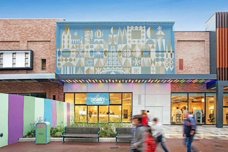
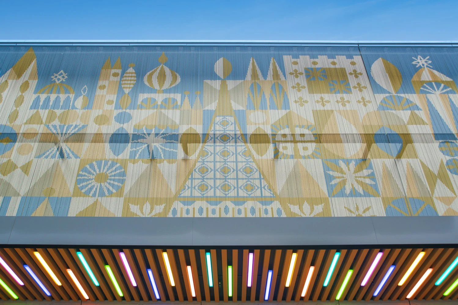
The Pixelated Disneyland Paris Glamour Store
The new Disney Glamour Store at Disneyland Paris has a facade made of thousands of epoxy-coated aluminum chains and creates a pixelated collage of silhouettes. The temples, minarets, and other motifs generate a reinterpreted version of one of Disney's most prominent and one of my favorite attractions, It’s a Small World. It was designed by SRA Architects and Kriskadecor as a tribute to Mary Blair, whose vibrant palette, geometric compositions, and abstract treatment of architecture made It’s a Small World visually what it is and shaped generations of Disney environments.
The facade uses five specific RAL colors and a composition that shifts subtly as the daylight changes. The material choice of aluminum is central to the design for its lightweight and corrosion-resistant properties. It’s recyclable, which starts to align with adaptability for colors, density, and sizes, so it’s a functional infrastructure and can still be an expressive surface. It’s the kind of architectural move where the concept is referential, the execution is technical, and the result is beautiful without tipping towards kitschy. That’s truly a tough combo to land when it comes to a theme park.
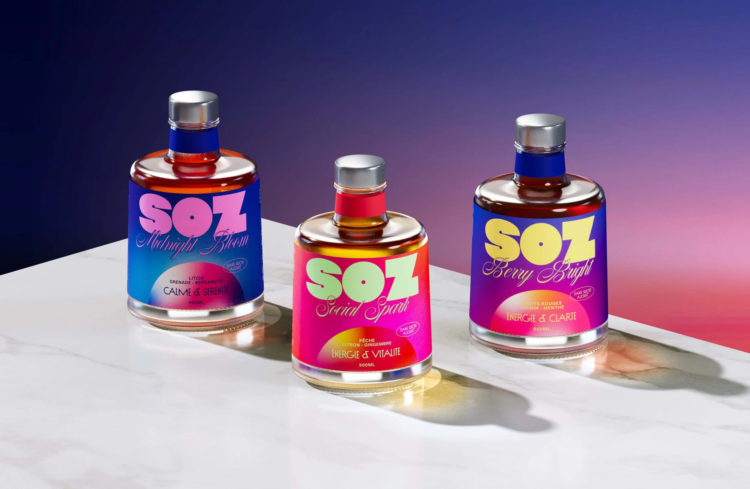
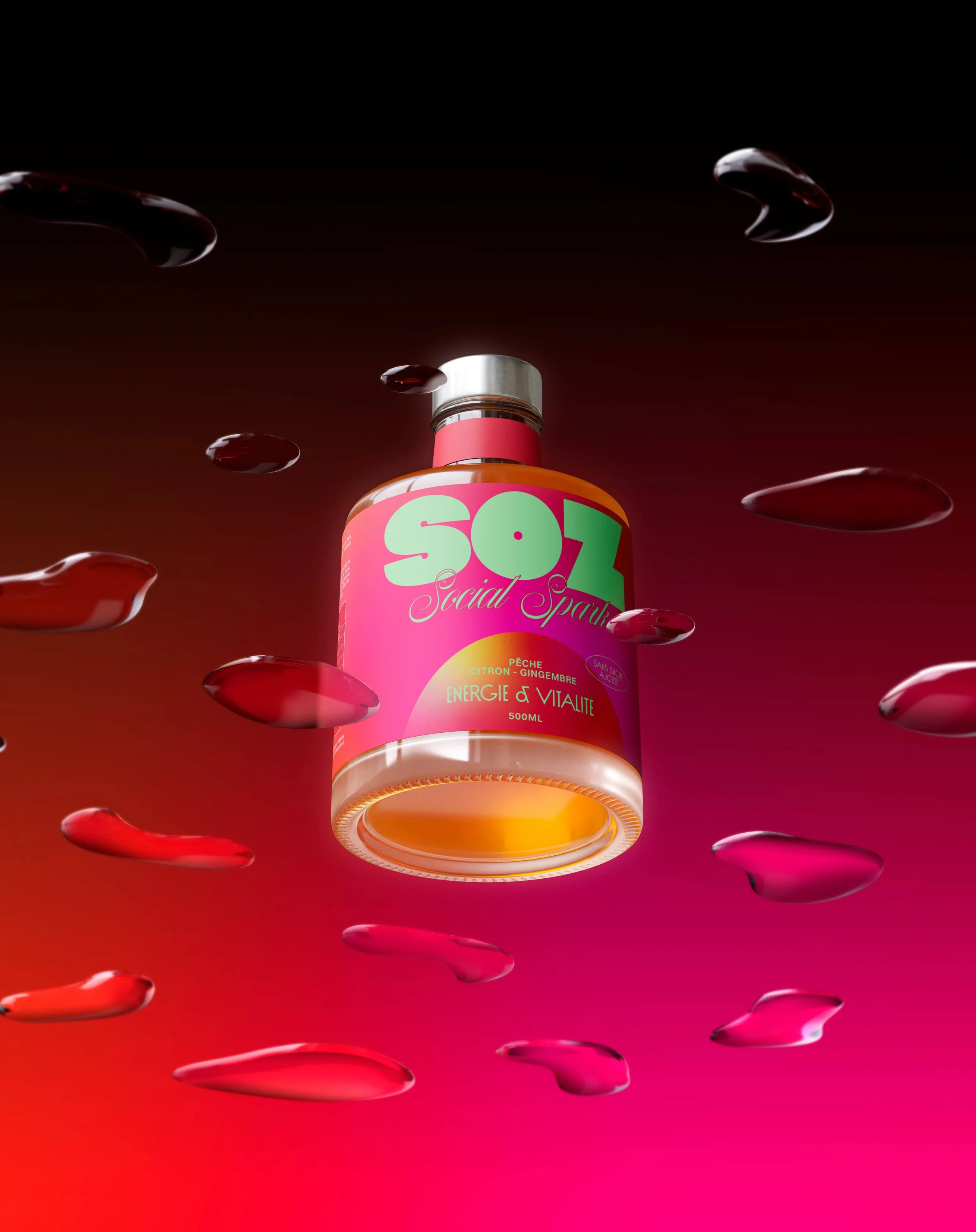
SOZ Mocktails
Honestly, this brand VBL, stopped me in my tracks. I’m obsessed with the color palette and just how unique the bottles are. SOZ is a natural mocktail brand designed by Daniela Barrio, a Peruvian-born, New Zealand-based designer. What makes it stand out is what it refuses to be: the same wellness brand running a muted beige-sage-cream-soft-serif playbook. SOZ goes hard in the opposite direction. It’s giving Miami Vice, disco, loud, glossy, and completely unapologetic. The brief here is that the party doesn’t stop just because the alcohol does, and for once, the visual identity actually matches the claim. I’m loving the wellness without forced calm. Good branding pays attention to the white space everyone else is avoiding, and this one nails it. I’d love to watch anyone try to resist this on a shelf.
The Bottom Line
I’ll admit it: the nostalgia stuff is fun, but the pieces I’m probably still going to be thinking about next month are the unique ones…okay, and the pink boots. Probably. Specificity beats sentiment every time.