DESIGN DIARY 023
This edition of Design Diary has hotels, houses, cafés, a dental clinic, and a shopping courtyard in the middle of Mexico. The thread connecting them isn’t obvious, but it’s not a trend or a palette. It’s more like a feeling. Like whoever made these spaces had a specific point of view and didn’t flinch.
Here’s everything that’s been living in my head and my saves recently.
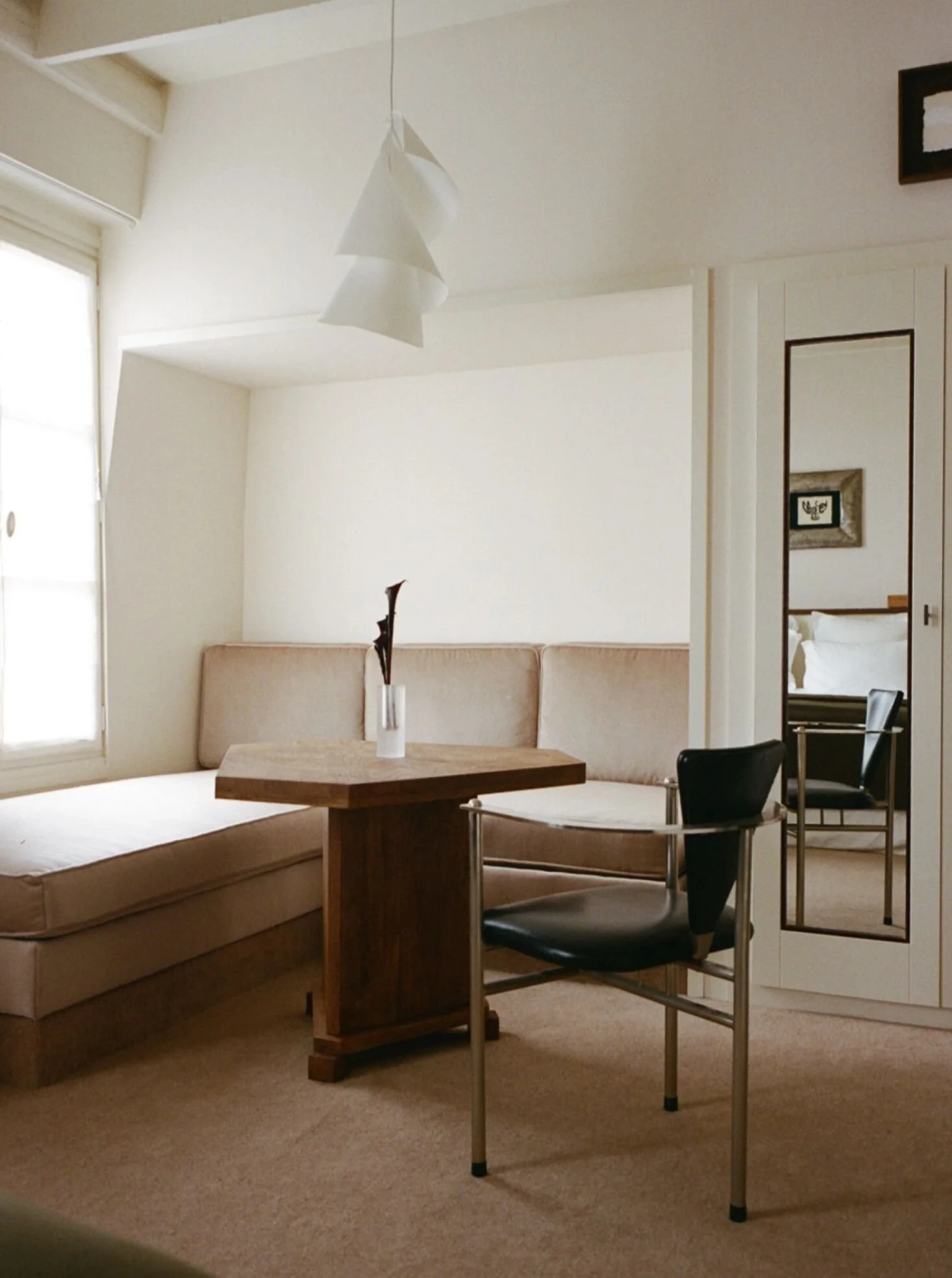
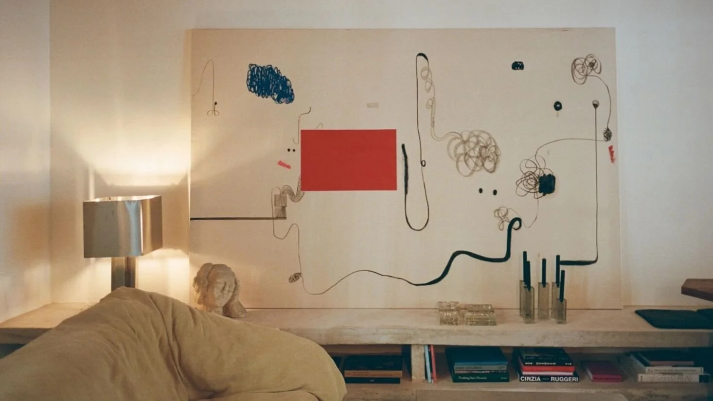
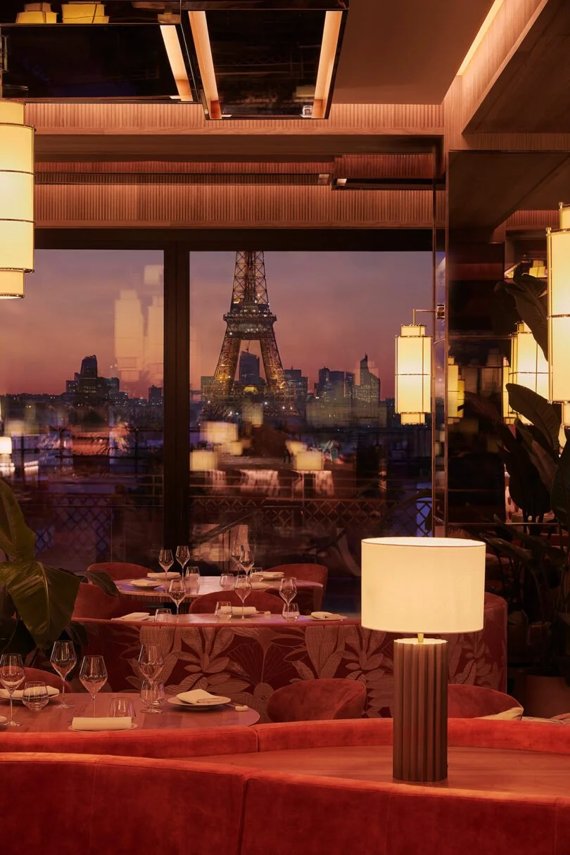
Hôtel Massé - Paris, France
The image of the art combined with the stone stopped me scrolling, but the concept was even more interesting. Two siblings inherit a six-floor Haussmannian building near Place Pigalle, and instead of hiring one studio to execute a vision, they invited an entire circle of architects, artists, craftspeople, and galleries to contribute. No two rooms are the same. Burgundy corridors give way to light-filled spaces with okoumé wood and maritime pine, 1970s carpet, vintage globe lamps, custom cabinetwork by a reclaimed-wood specialist, and a giant Christian Rosa painting on one wall. It’s a hotel, but it reads more like a collection. It’s less designed and more accumulated, which is pretty damn creative.
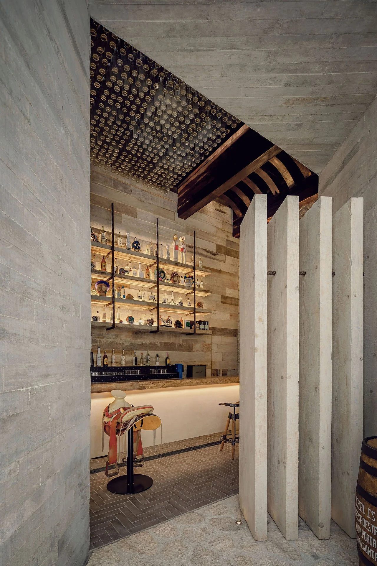
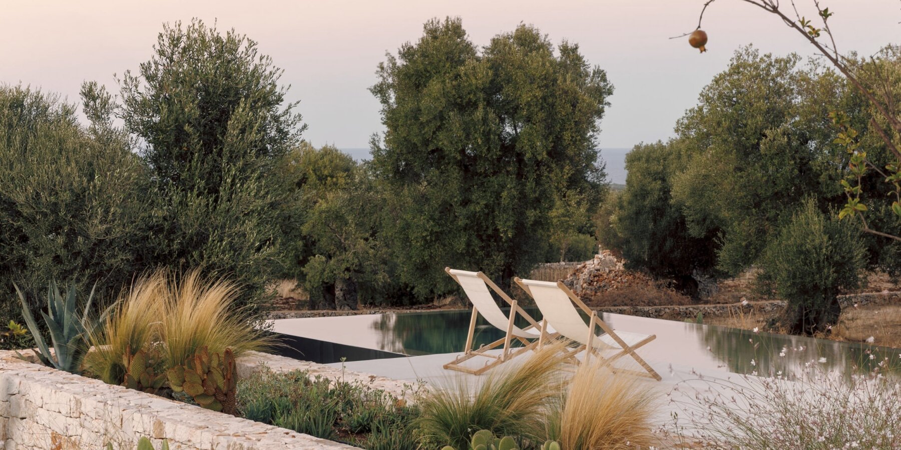
La Casa De La Playa - Riviera Maya, México
I’ve been watching the Riviera Maya resort world for a long time, and the operating mode is usually: bigger, louder, and more swim-up bars. La Casa de la Playa, Xcaret’s 63-suite adults-only property, goes in the exact opposite direction. The architecture uses natural stone, Mexican craft, and local materials throughout, like handwoven textiles, hand-painted Talavera ceramics, and live bromeliads from the resort’s own greenhouse. And then there’s the thing that made everyone stop: each suite has a live jellyfish aquarium mounted in the room. Yes, jellyfish. Jellyfish are bred on-site in a marine lab that guests can actually tour during their stay. It’s a completely absurd detail that somehow doesn’t feel gimmicky at all. It feels like someone genuinely asked, “What would make these rooms unlike any other room out there?” and then committed to the first answer they came up with. → Design Milk
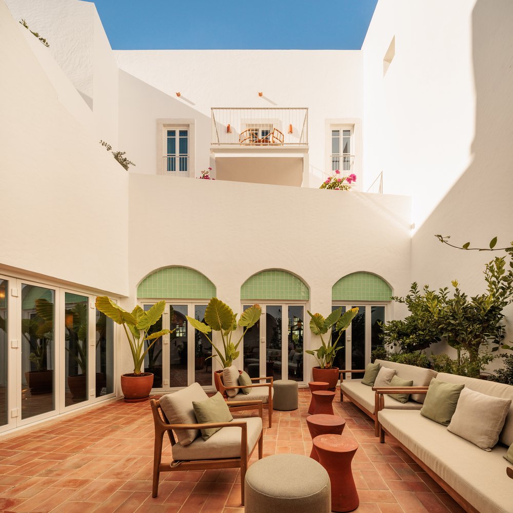
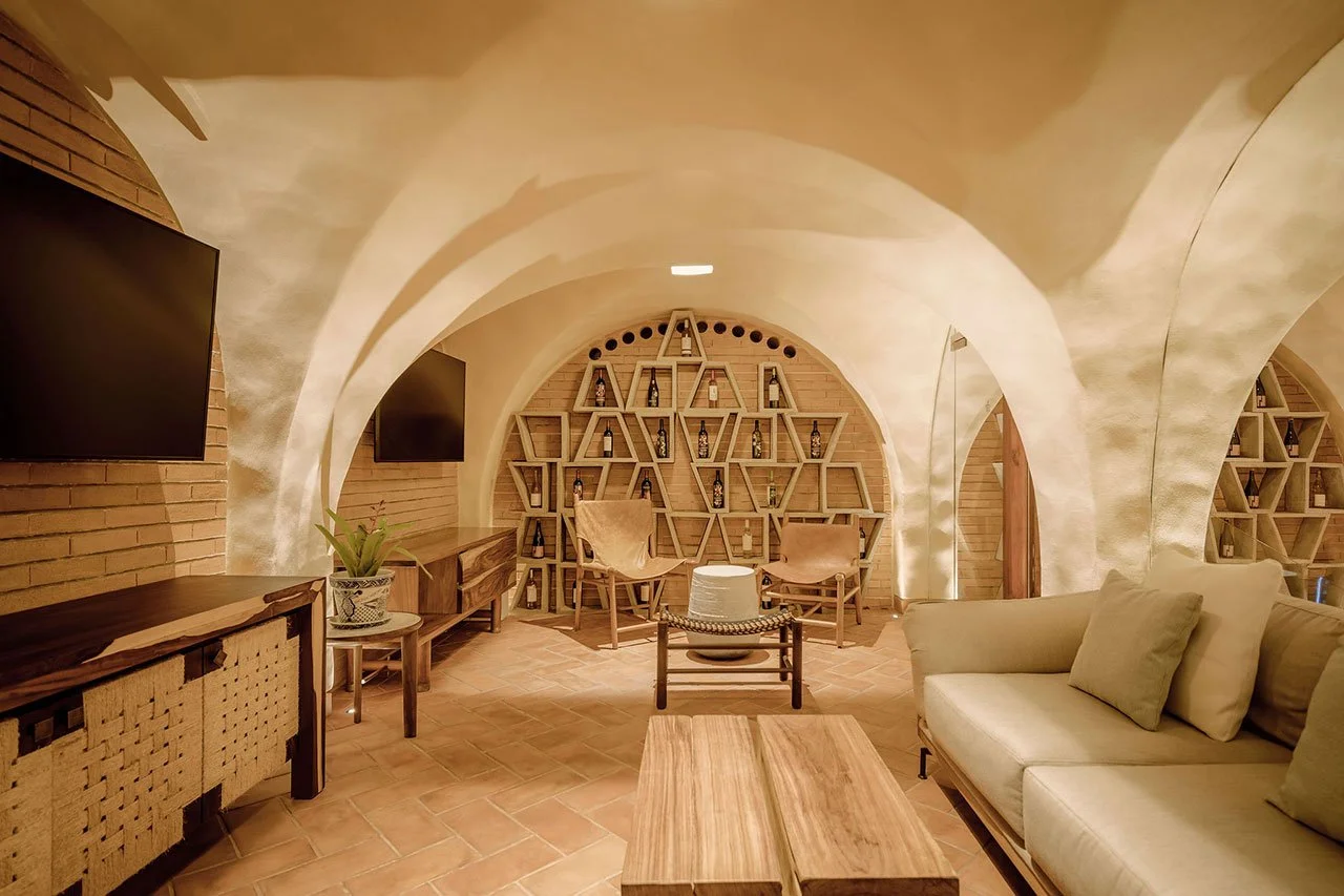
Hotel Palácio de Tavira - Tavira, Portugal
Fragmentos Studio took an 18th-century palace, the former Palácio dos Tavares, and turned it into a 36-room hotel without turning it into a museum. Original stone staircases and whitewashed thick walls stayed. A new “medina” wing was added, a labyrinthine structure inspired by the region’s Moorish past with hidden terraces and two rooftop pools. The interiors use local craft in a way that doesn’t feel like a folk art exhibit: Santa Catarina terracotta tiles, Burel wool rugs, and textiles by Algarve artist Vanessa Barragão. It looks like it belongs to Portugal specifically, not just to “Mediterranean luxury.” That’s harder than it sounds. → ArchDaily
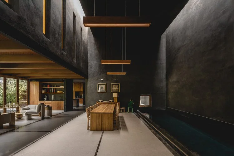
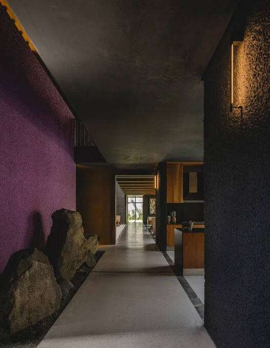
Casa Ceniza (House of Ashes) - Mexico City
The name alone. TACO taller de arquitectura contextual designed this 626-square-meter Mexico City home, which is a massive, closed geometric form, walled off from the street entirely, that opens inward into a private world of patios, water, and planted terraces. From the outside: nothing. From the inside: a whole landscape. That tension between public blankness and private richness is one of my favorite moves in architecture. There’s something almost theatrical about it. You don’t announce yourself. You reveal. → ArchDaily
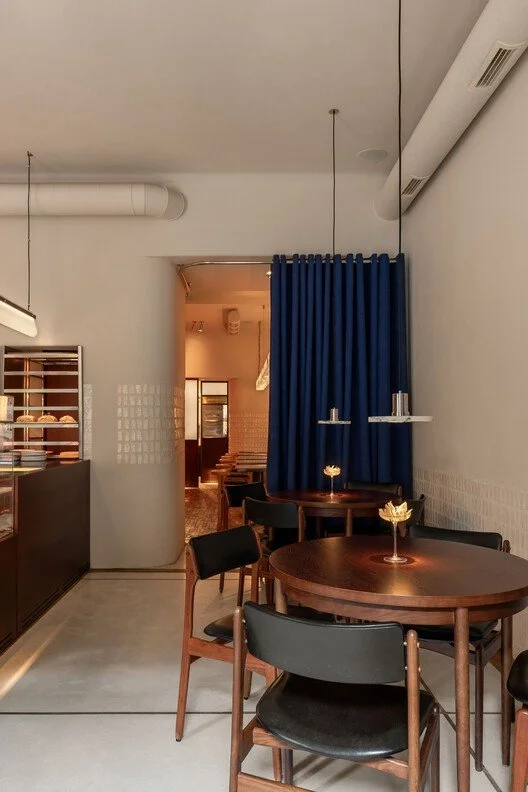
Mitte Café 2.0 - Lviv, Ukraine
Mitte started in 2021 as a 36-square-meter café inside a residential building in a then-new Lviv neighborhood. The two brothers who opened it were first-time restauranteurs and their café worked so well that it became a community anchor. Now, LIS Design Studio has returned to give it a second iteration. What makes this save-worthy beyond the aesthetic is the context: a studio in Lviv continuing to design and a café in Ukraine continuing to operate and expand. That’s the work happening. The space is clean and warm, with a kind of restrained intimacy that makes you want to stay longer than you planned. → ArchDaily
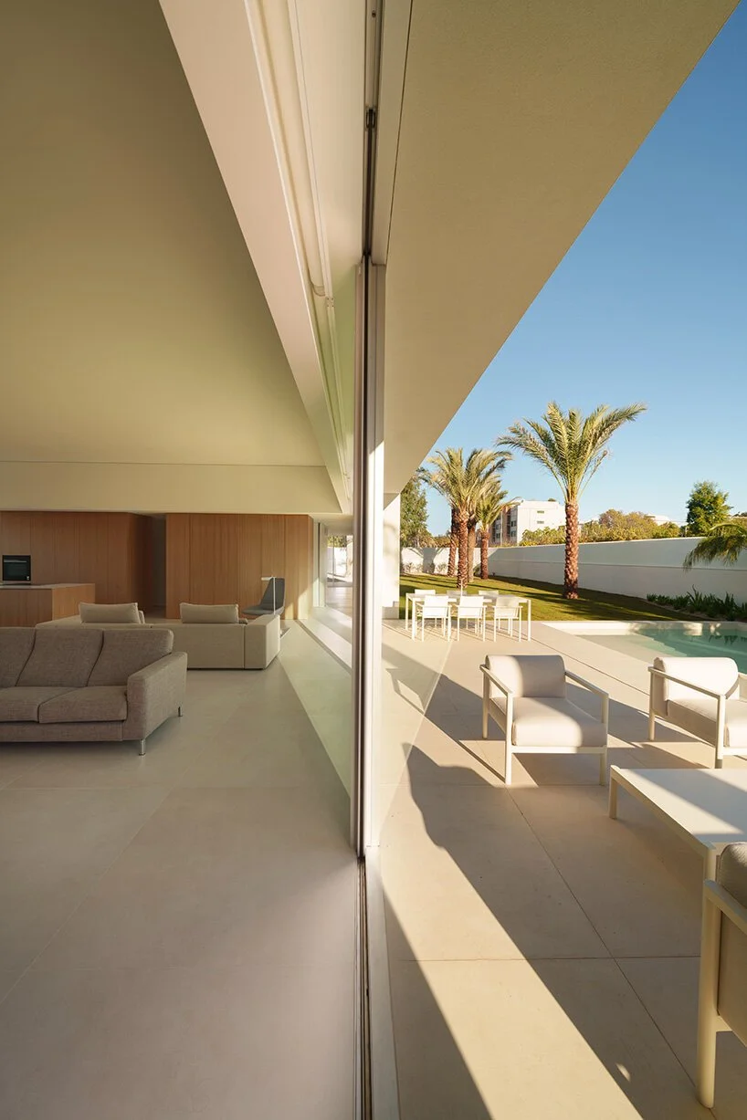
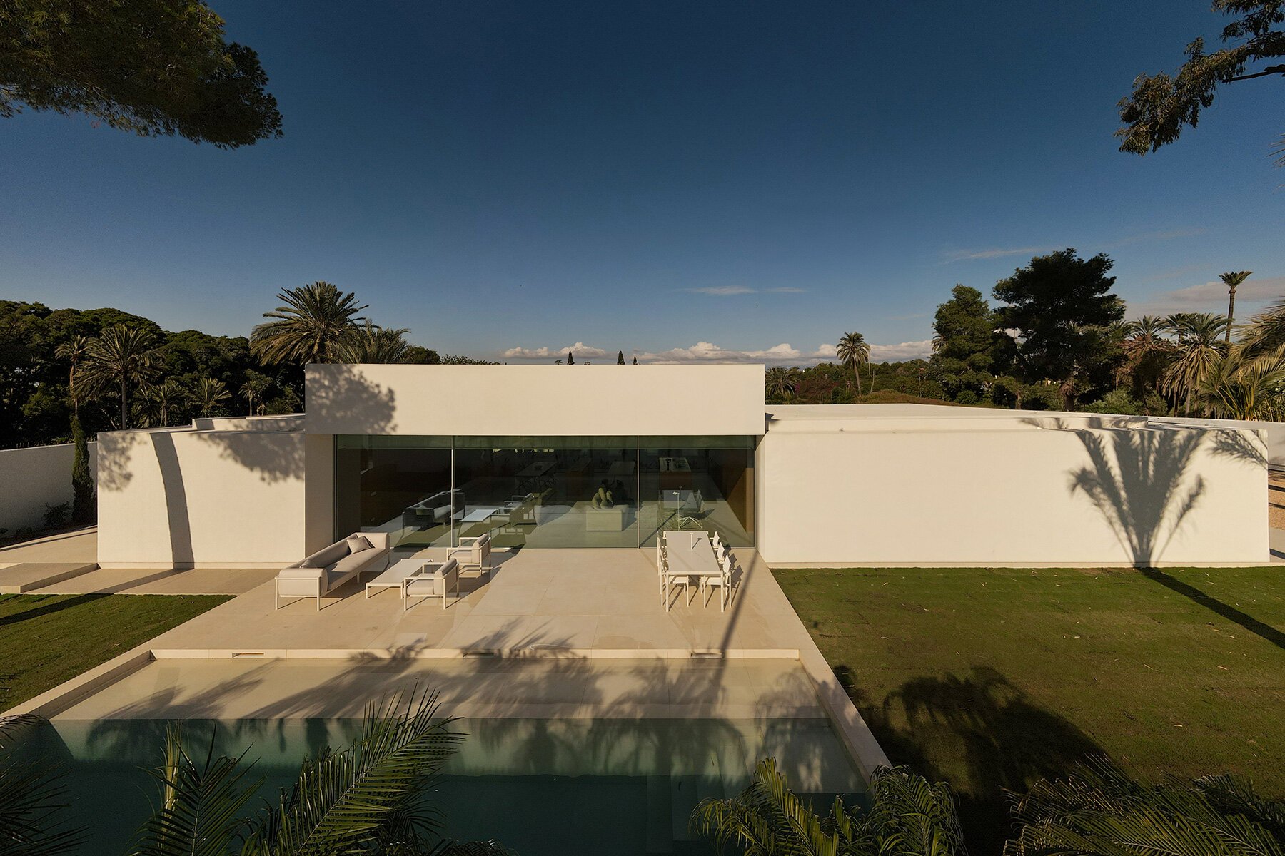
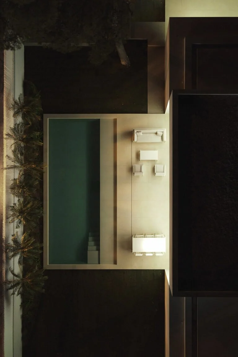
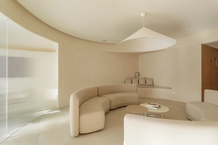
Cano House - Alicante, Spain
Fran Silvestre Arquitectos organized this Alicante house into three distinct zones - night, day, and sports. The main living volume hovers above them both, lifted off the ground and edged with a deep perimeter frame that gives it the look of something untethered. The two lower volumes sit underneath it like a foundation that doesn’t want to announce itself. It’s rigorous in the way that Spanish modernism tends to be: nothing is there by accident, nothing is decorative without also being structural. I’m a sucker for hovering volume. I can’t help it.
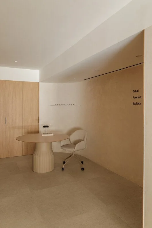
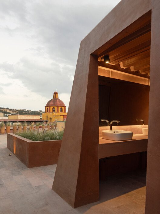
Dental Seny - Dénia, Spain
This is the part where I put a dental clinic in the Design Diary, and I’m not sorry. David Hernandez Arquitectura renovated this 150-square-meter clinic in the coastal town of Dénia with the premise that architecture can change what it feels like to sit in a waiting room. The materials are warm - oak veneer panels, clay tile cladding sourced from the Monsterrat massif - and the layout was rethought from the patient’s perspective rather than the clinical workflow. The result looks nothing like a dentist’s office. It looks like somewhere you’d actually want to sit. Which is, when you think about it, a low bar that almost no one clears. → ArchDaily
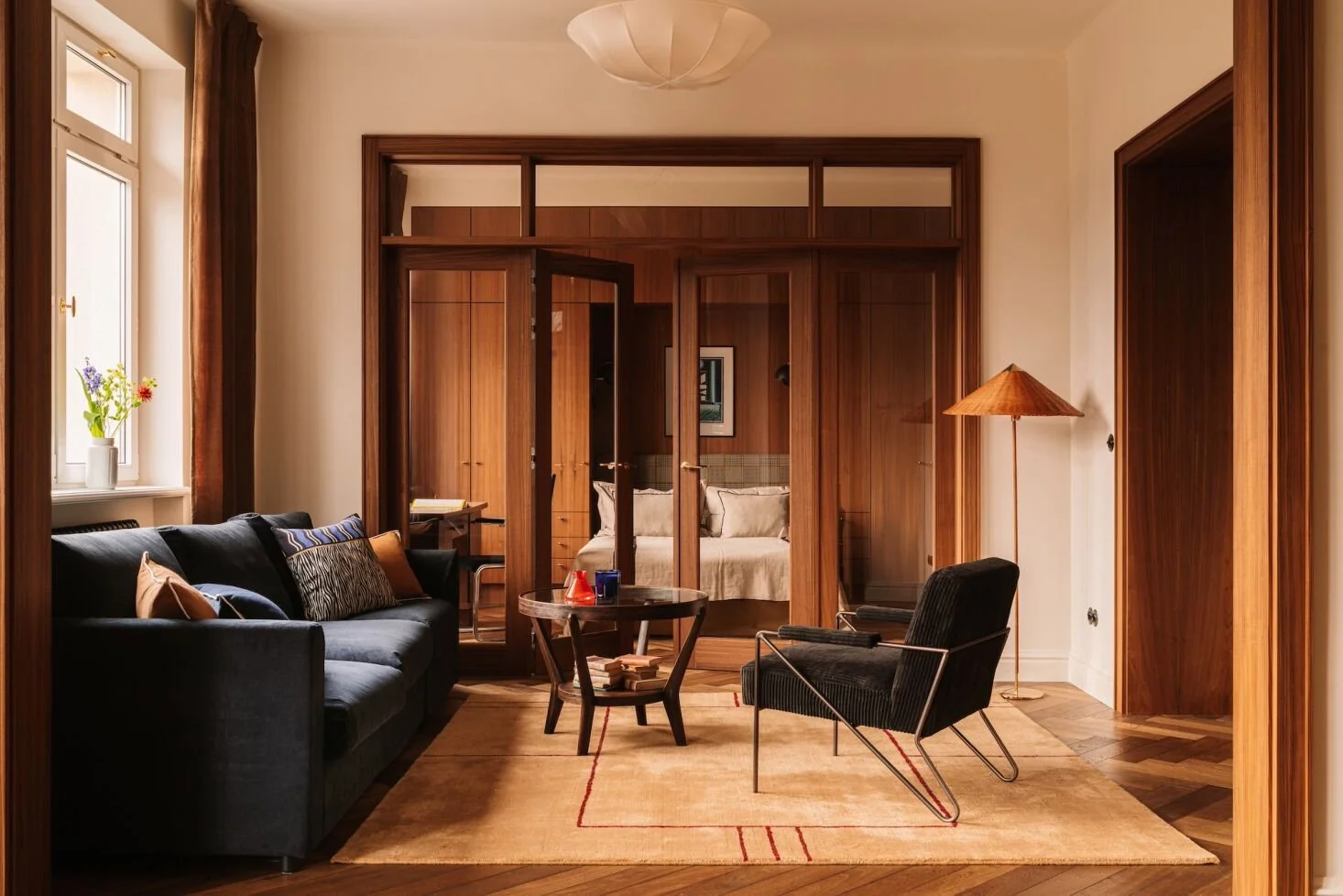
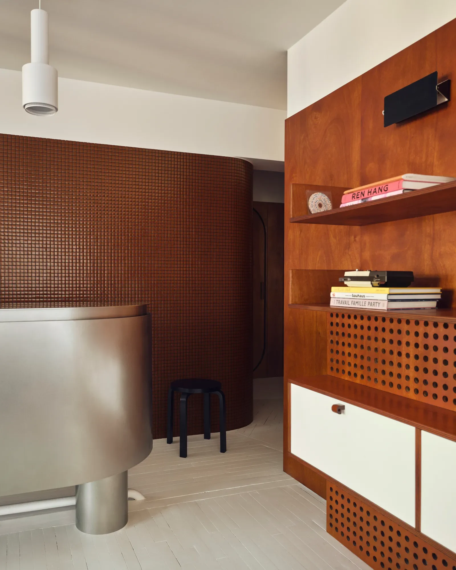
Colombe Studio Apartment - Warsaw, Poland
Marta Chrapka of Colombe Studio was given exactly one instruction by her clients, a pair of lawyers: “Just do what you usually do.” The result is a 64-square-meter apartment in a 1930s modernist building in the Powiśle district, redesigned with dark teak wood, rounded cabinetry corners, a multifunctional joinery box that functions as both wall and storage, and a palette that leans Bauhaus without waving a flag about it. What I keep returning to is how much restraint it takes to make this design happen. Every corner rounded on purpose, and every material chosen once and committed to. That’s the confidence of someone who knows what she’s doing. → Via Remodelista
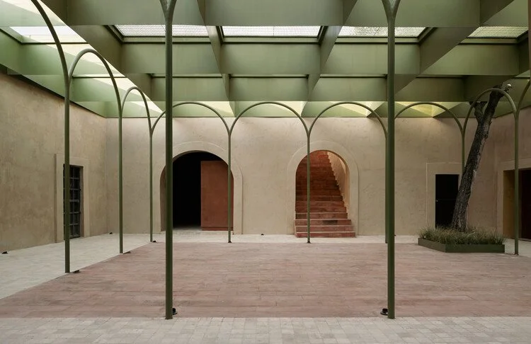
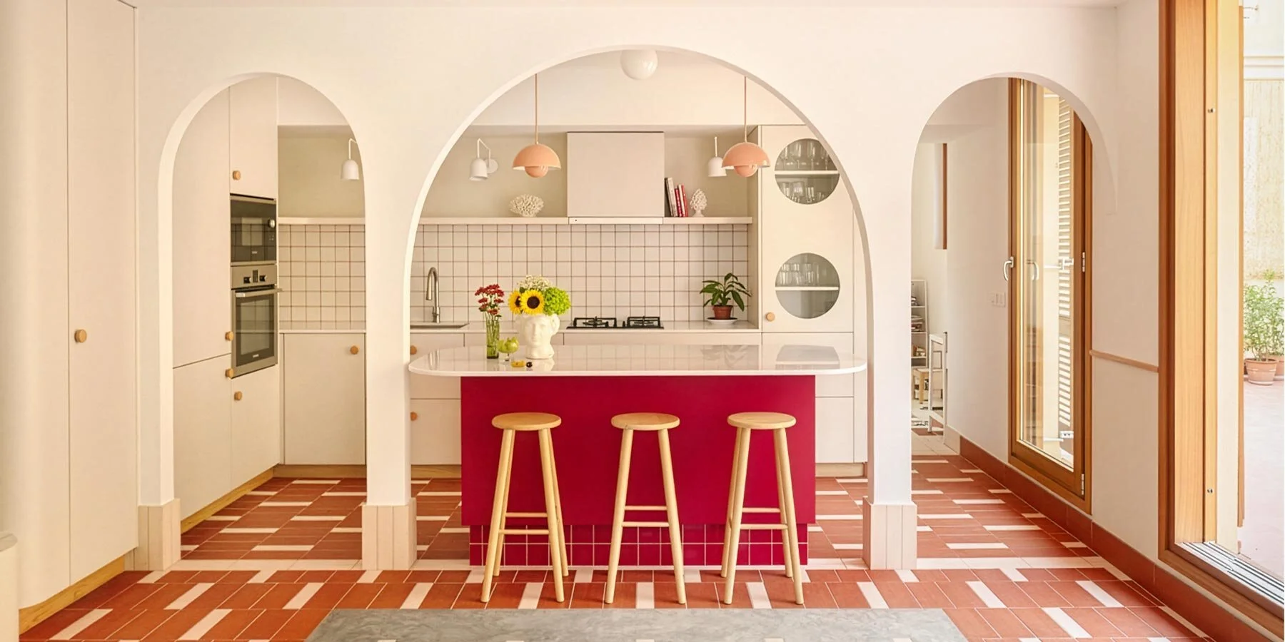
JGG-I Shopping Center - Bernal, Mexico
OMAC Arquitectos restored a 19th-century commercial building in the Querétaro town of Bernal and reorganized the whole thing around its original courtyard. The courtyard was always the heart of that architectural era, but had been slowly edited out over time, so putting it back as the core of a contemporary shopping space is both historically sound and genuinely good design. The result is a 420 square meters that reads like a public square that happens to have shops surrounding it. More shopping should feel like this and less like a fluorescent hallway.
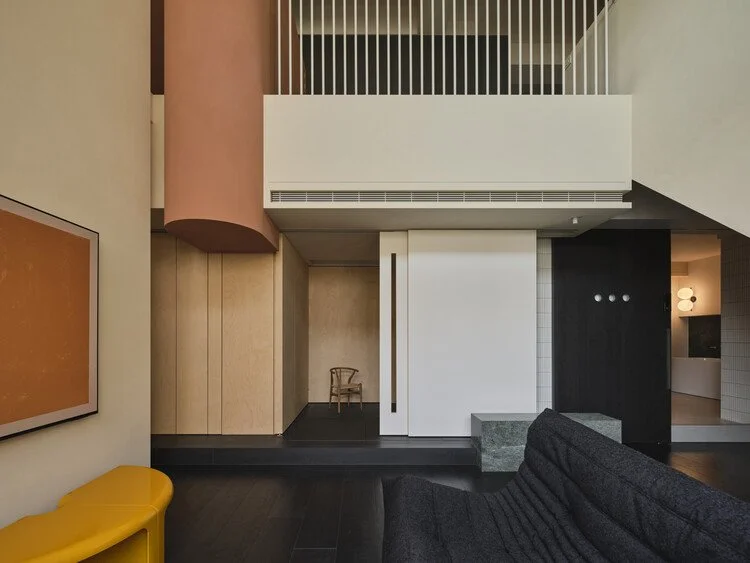
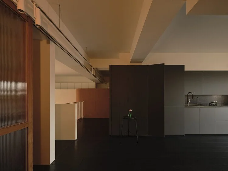
Project E Apartment - Tainan, Taiwan
The thing that got me about this one wasn’t only the aesthetics. It was the logic. The 150-square-meter penthouse has two floors with independent access, so Longwave Studio made the primary entrance the upper level and completely rethought what a front door is supposed to do. Storage became the architectural facade. A semicircular volume was built specifically to house camping equipment, positioned so that leaving and returning home flow as one continuous act. The TV wall is raised and set back to create an entirely gear-organized zone behind it. Skateboards, sports equipment, outdoor layers - all accounted for, all architectural. The point of view here isn’t “how do we make this look good” but “how does this person actually live?” → ArchDaily
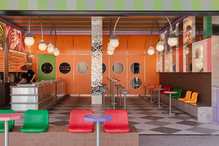
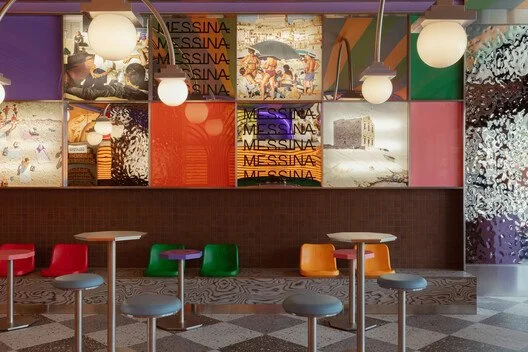
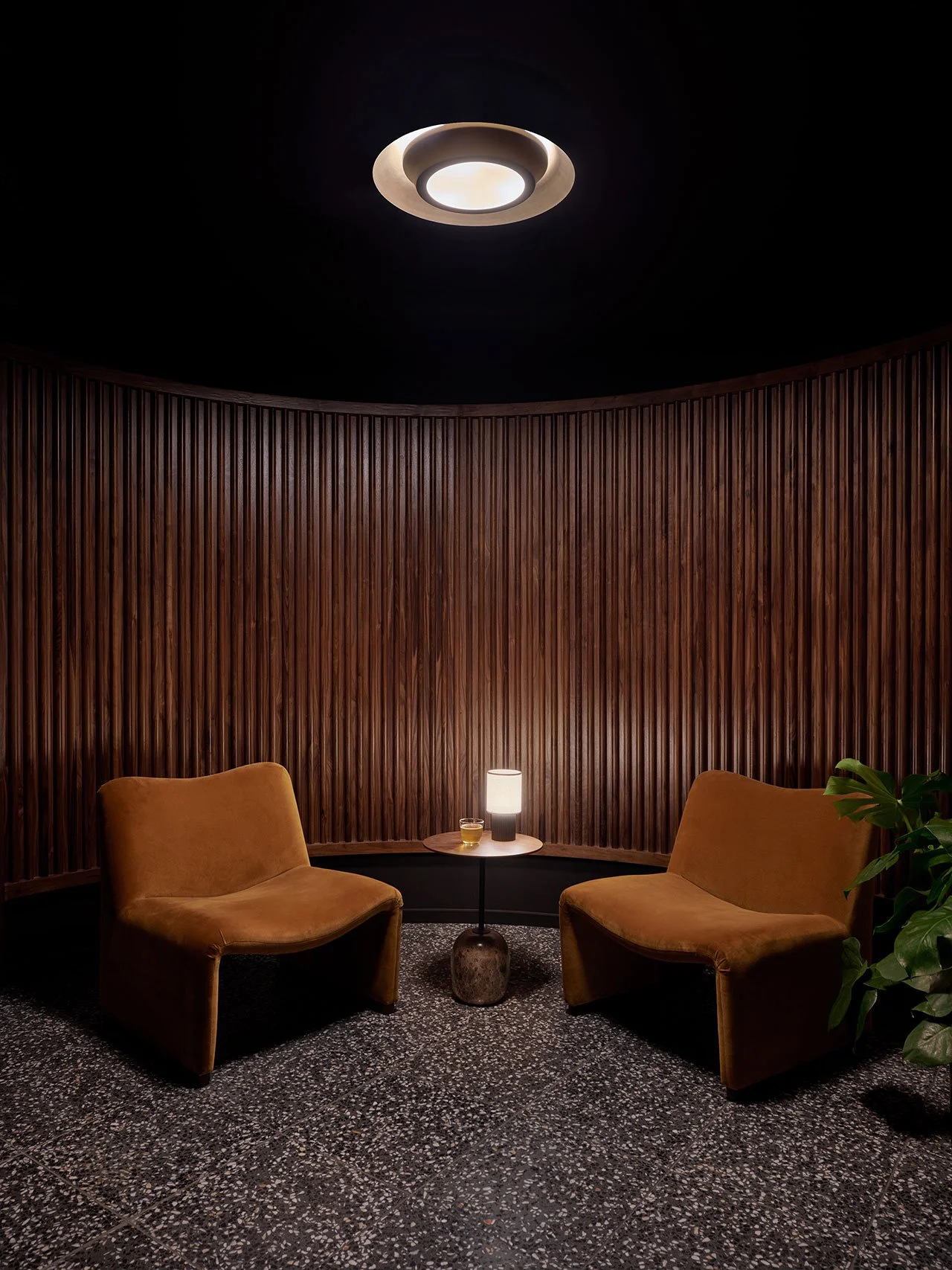
Gelato Messina Glenelg - South Australia
Sans-Arc Studio has now designed five Messina locations, and this is their most unapologetic one yet. The brief was essentially: gelato is invisible inside the freezer, so the space has to do the selling. What they built on Jetty Road in Glenelg is loud, saturated, open to the street, and committed to the idea that a gelato shop should feel like a communal event, not a transaction. The director of Sans-Arc called it their most “out there” project. I believe it. It reads like a space that knows exactly what it is and refuses to be subtle about any of it. The best retail design tends to work like that. → ArchDaily
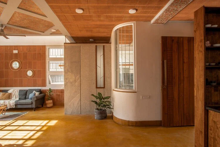
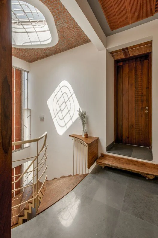
Arth Home - Bengaluru, India
This is a 1,950-square-foot Bengaluru residence built on one premise: only build what is necessary, and build it well. Frank Lloyd Wright inspires the design of this home for a couple with that intention front and center - no excess and no decorative elements that don’t earn their place. The name is doing some work here too. Arth means “meaning” in Sanskrit, and the studio itself invokes Wright’s organic principles. Luckily this space delivers on both. It’s quiet and deliberate in a way that is genuinely hard to pull off at any scale. Restraint is a skill afterall.
The Common Thread
It started to occur to me while putting together these Design Diary’s is there is usually some pattern I unintentionally curate that sometimes holds and sometimes doesn’t. I started this edition with a vague idea about hotels and ended up with a dental clinic, a shopping center in a Mexican colonial town, and a gelato shop that functions like a party. The thing they all share is that someone made a decision and stuck with it. The collaborative curation at Hôtel Massé. The complete commitment to joy at Messina Glenelg. The inward-facing drama of Casa Ceniza. None of these spaces are hedging at all.