BRANDS & THE ‘AIRPORT TEST’

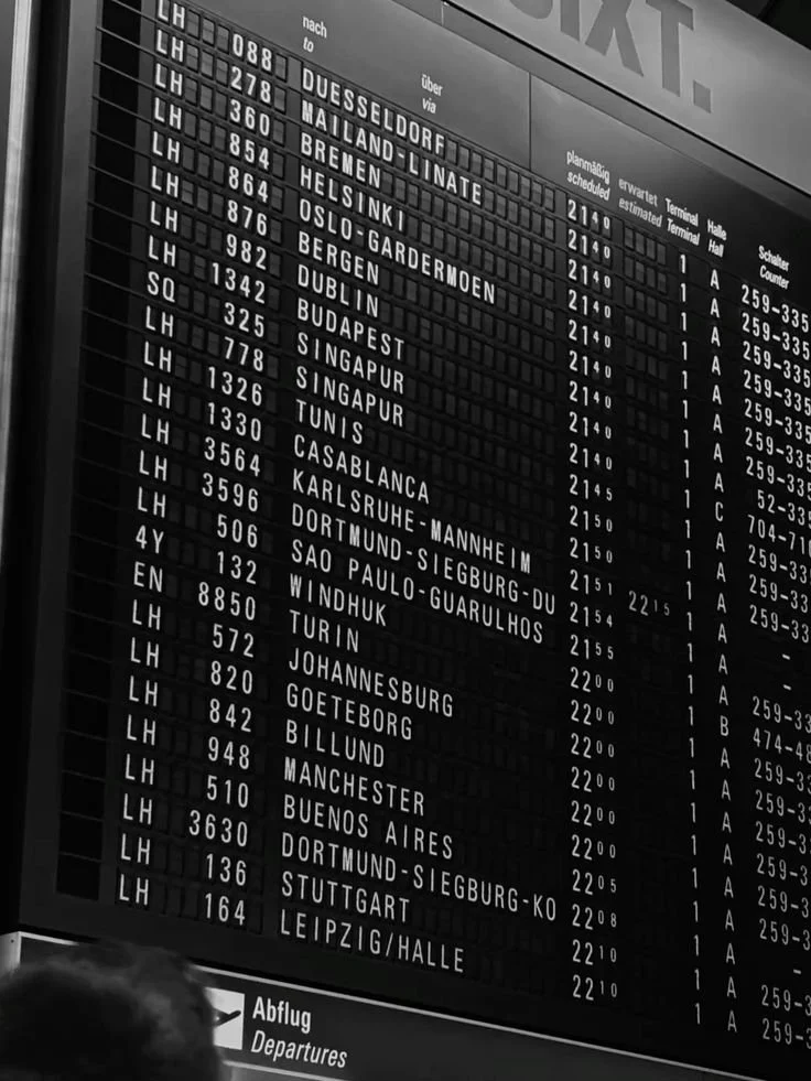
Honestly, even mentioning an airport right now is enough to send shivers down anyone’s spine, but try to picture an earlier, simpler time. You’re rushing through an airport. You’re late, your bag is heavy and probably about to be checked against your will, your coffee isn’t working the way it should, and you have about four minutes to find your gate. You’re not reading anything. You’re scanning, moving, reacting to visual cues that tell you exactly where to go. A plane icon here, a number there, a color-coded sign that pulls you in the right direction. You don’t really think. You just go. Now ask yourself: Does your brand work like that?
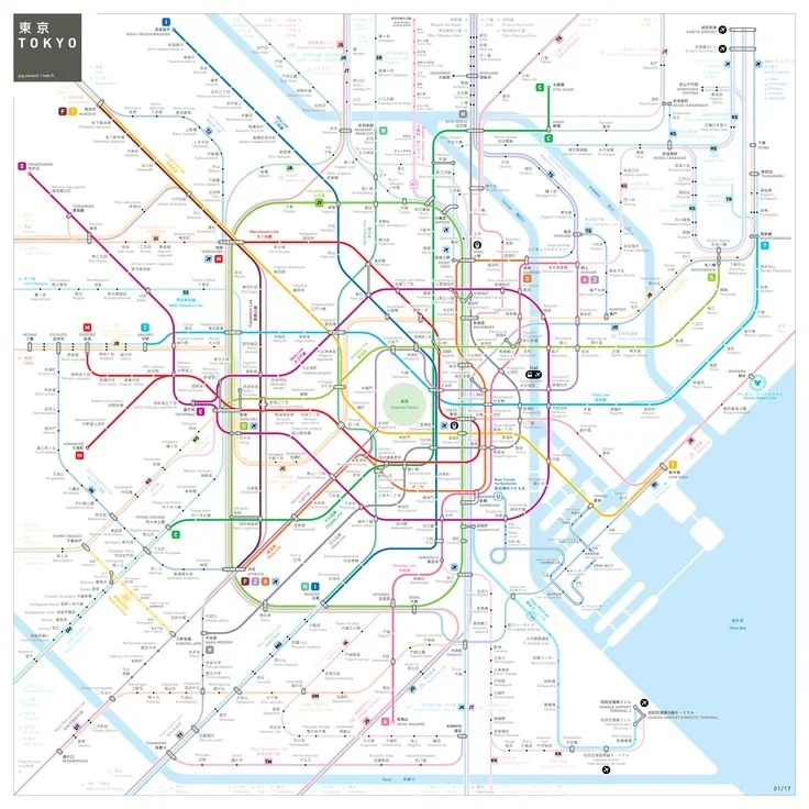
Global brand consultancy Siegel+Gale recently published a piece on what they call the “airport test.” A test that uses airports as the ultimate model for brand clarity. It’s a really interesting idea. Airports move tens of thousands of people in different directions, under extreme time pressure, across languages and cultures, and most people navigate them successfully without reading a single word. That’s not an accident. It’s the result of relentless and intentional design. Exactly what the best brands do.
I’ve been thinking about this concept non-stop since I read about it because it actually applies to every brand. Not just the Fortune 500 or large enterprise brands. Whether you’re building a personal brand, running a small business, or leading a marketing team, the airport test is the kind of gut-check that will make you confident or uncomfortable.

What Is the ‘Airport Test?’
Siegel+Gale boils it down to four questions:
Could someone navigate your brand the way they navigate an airport? In other words, is the path forward obvious without a guide?
Could a new customer understand where to go next without instructions? No onboarding email, no FAQ rabbit hole, just following intuition.
Could they recognize your key signals instantly? Colors, tone, logo, and the vibe of your content. Do all of those things land in under a second?
Could they move through the experience without needing explanations? Is discovering you to buying from you frictionless?
If you answered ‘no’ or ‘I don’t think so’, you have some work to do. That’s not a criticism. Most brands do, and clarity is learnable.

Why Stress Exposes Everything
Here’s the part of the piece that stopped me and got me thinking: airports are emotionally intense environments. People are tired, distracted, trying to manage logistics and other humans, and probably running late. That stress is exactly what reveals whether a design system is working. When conditions are calm, people can tolerate being confused, but when things are chaotic and stressful, they can’t.
Audiences tend to be operating under the same versions of stress. They are scrolling between meetings, making a purchase while half-watching something else, and comparing you to three other competitors in three open browser tabs. They don’t have the bandwidth for a brand that makes them think too hard. This is why brand clarity isn’t just a nice-to-have aesthetic decision. It’s a business decision. Confused people don’t convert. They bounce, and they probably won’t come back.


Simplicity Is a System, Not a Shortcut
One of the most important points in the airport test concept is this: simplicity isn’t simple to create. Airports look effortless to move through because of an enormous amount of design effort. An effort that is fairly hidden and that we don’t ever think about. Take Amsterdam’s Schiphol Airport. It is widely considered the gold standard of wayfinding. Their system has consistent yellow signage, clear typography, and logical gate numbering, which means that travelers understand the basic structure. Everything feels fairly predictable. The traveler doesn’t have to relearn the rules at every turn or terminal. For brands, this translates directly. If you Instagram sounds like one person, your website sounds like another, and your email newsletters are yet another, that’s not personality. It’s fragmentation. Fragmentation is an added cognitive load audiences didn’t ask to carry, nor should they have to.
The brands that pass the airport test aren’t simpler when it comes to what they do. Rather, they are simpler in terms of how they communicate what they do. The most obvious example is Apple. You can go from iPhone to Mac to walking into a store, and somehow you know and feel the same brand made it. The complexity of the system is invisible because the system itself is airtight. Now with smaller and personal brands, the version of this is: does your content, visual identity, messaging, and offer all feel like they came from the same brain? Because they definitely should.
Give them a Landmark
There was one detail of the Siegel+Gale piece I couldn’t stop thinking about. At Qatar’s Hamad International Airport, travelers navigating the gigantic terminal often say: “Let’s meet at The Bear.” The Bear is a 23-foot yellow teddy bear sculpture that has become a sort of unofficial navigation tool. So what? Well, in a building full of information, the most distinctive signal is often the easiest to remember. Every great brand has a version of The Bear. For example: Tiffany Blue or Glossier’s Millennial Pink. It might be a specific format you always use, a phrase that is unmistakably yours, or a type of content the audience has come to expect from you. Whatever it is, it’s the thing people can navigate by. The thing that people use to describe you to someone else. If you can’t immediately name what your brand’s "Bear” is, well, that’s your answer about passing the test right there.
The Bottom Line
The Airport Test isn’t asking whether your brand is pretty. It’s really asking if your brand is clear. If someone who’s distracted, busy, mildly overwhelmed (basically everyone these days) can figure out what you’re about, where to go, and what to do next without having to try. Simplicity as a stylistic preference is optional, but simplicity as a standard way of operating certainly is not. The brands that get this right aren’t just easier to understand; they are easier to trust. And that’s just it. Trust is the whole game.
So run the test on yourself. Walk through your brand like a stranger who just landed and has four minutes to figure it out. What do they understand immediately? Where do they get lost? Where’s the sign missing? That gap between where they are and where they need to go is your next brand project.