OBSESSED & DISTRACTED: GUILTY BY DESIGN
You know that feeling when you see something, and you think, Okay, I need to talk about this immediately? That’s basically my personality, for better or worse. I collect things that catch my eye. A light fixture, a pet bowl, a typeface, and then I can’t stop thinking about them and sharing them. Most often, no one really cares all that much, but that is why this post exists. A round-up of all the design-centric things that have been living rent-free in my mind lately, ranting from beautiful home objects to branding that made me put my phone down. Just pure, unfiltered design obsessions. You’re welcome.
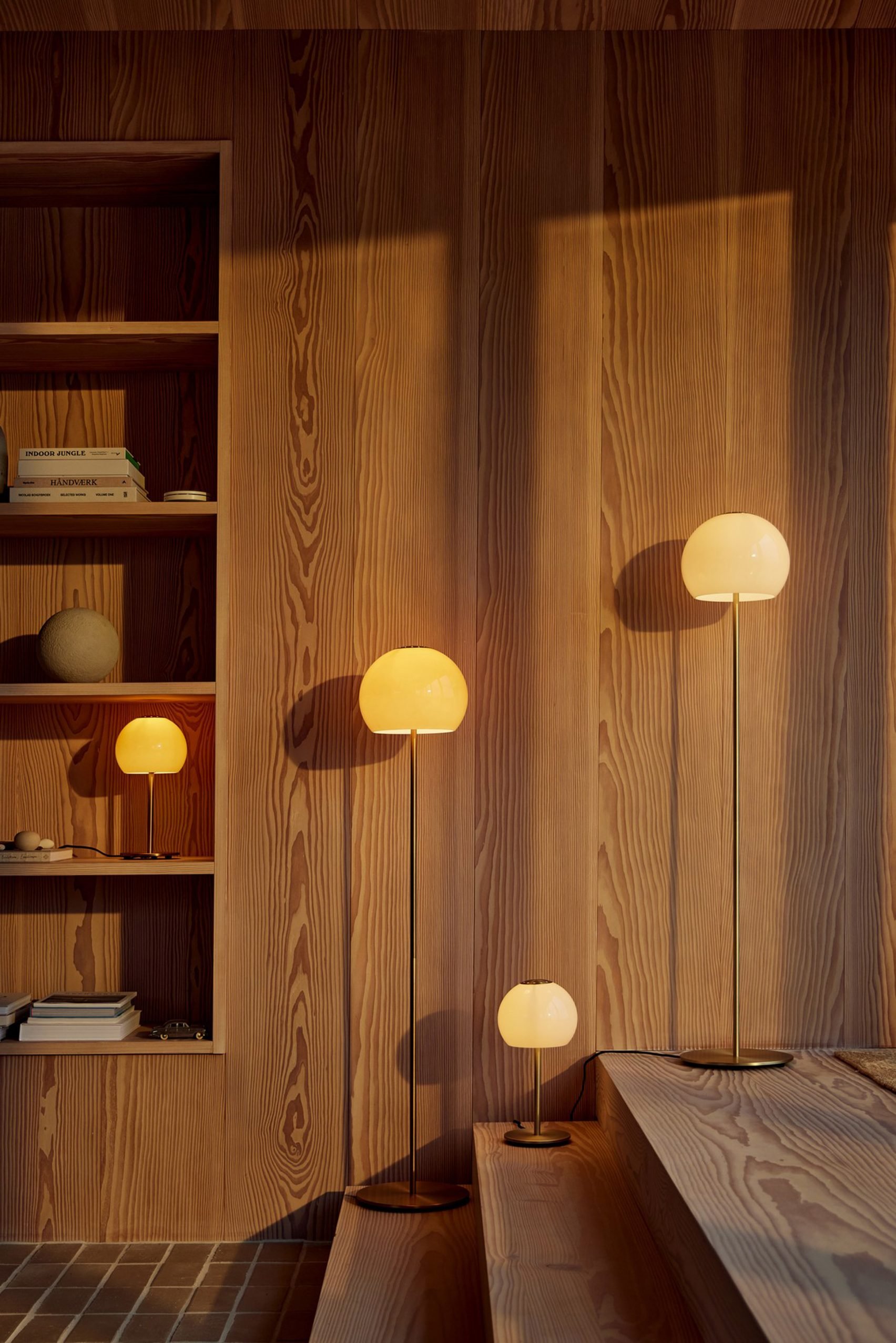
Ball Glass Lights by Frandsen
Frandsen’s Ball Glass collection deserves a long, lingering look. The series builds on the original 1968 Ball pendant lamp, a nearly complete metal sphere with a circular opening at the base, which has since become one of those quietly iconic pieces you see everywhere, but don’t always clock. The new Ball Glass table and floor lamps echo the same satisfying silhouette as the original but introduce new, fresh materials and sizes that feel trendy right now. The outcome is a lighting setup that’s calm and refined without being cold, which, if you ask me, is exactly the vibe right now. The wider Ball series spans over a dozen designs, including metal, glass, and wood, meaning there’s an entry point for every space and every budget. Exactly what good design longevity looks like.
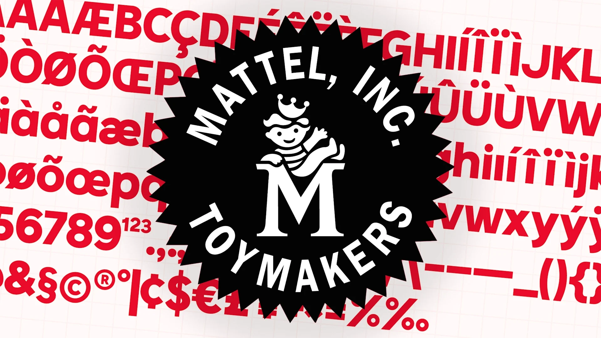
Mattel’s New Custom Font
Fellow typography nerds, this one’s for you. Everyone else, give it a chance because it’s actually fun. For the first time in 80 years, Mattel has created its own proprietary typeface. Previously, the global giant had been licensing a variety of existing fonts across their many product lines. A practice that had to be expensive, not to mention inconsistent, and the opposite of brand cohesion. The result of lassoing Mattel’s corporate identity is Matty and Belle Mattel Sans, two complementary fonts inspired by two sibling characters from the Mattel archives. Matty and Bell first appeared in the brand’s illustrations and ads from the 1950s to the 1970s, and you’ve probably seen them without realizing it. The fonts are designed to work globally, hold up in fine print, and translate from digital to packaging. They’re also riddled with Easter eggs and nods to Mattel’s history, which is exactly the kind of detail that makes something as simple as a font part of the larger brand story. I also just love their guiding principle in designing the typeface was “fun in a library.”
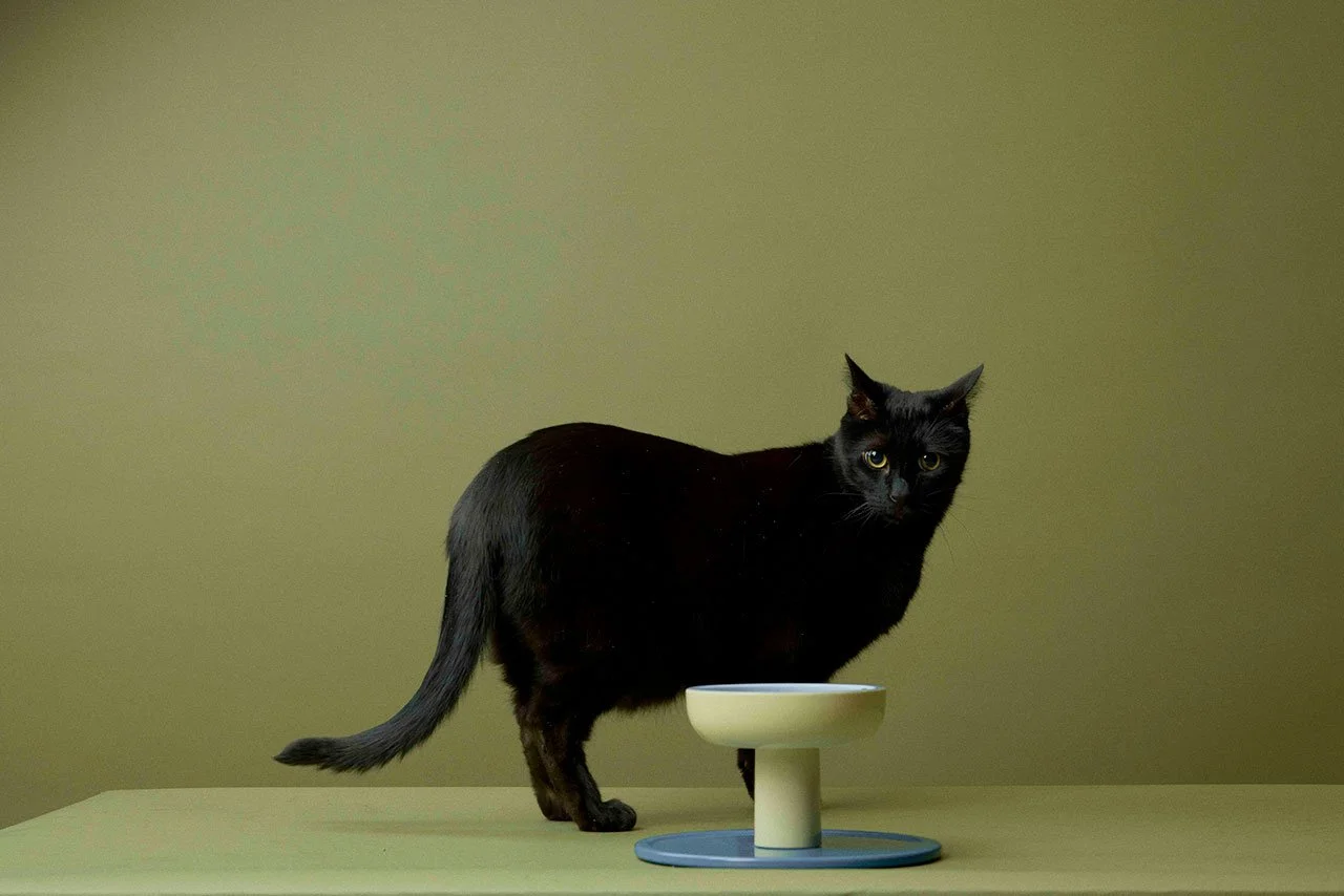
Smallserve Bowl by Smalls
Okay, I’ll admit it: I didn’t really expect to be writing about a cat bowl. I don’t even have a cat. Yet, here we are. Smalls is a fresh pet food brand focused on high-quality, minimally processed cat food, so naturally, they created a bowl that cats deserve. Smallserve comes in two clean colorways and is designed to fit into your home rather than fight it. So many pet bowls are aesthetic eyesores that are just tolerated in the name of convenience. Beyond how the Smallserve looks, Smalls is doing something smart: pairing elevated design with better cat nutrition. Cats get fresh, nutrient-dense food on a delivery schedule that works for their owner, and owners reap the benefits of better cat health, including softer fur and stronger bones. Clean food served in a clean design with easy cleanup. Even as a non-cat owner, I can respect the move.
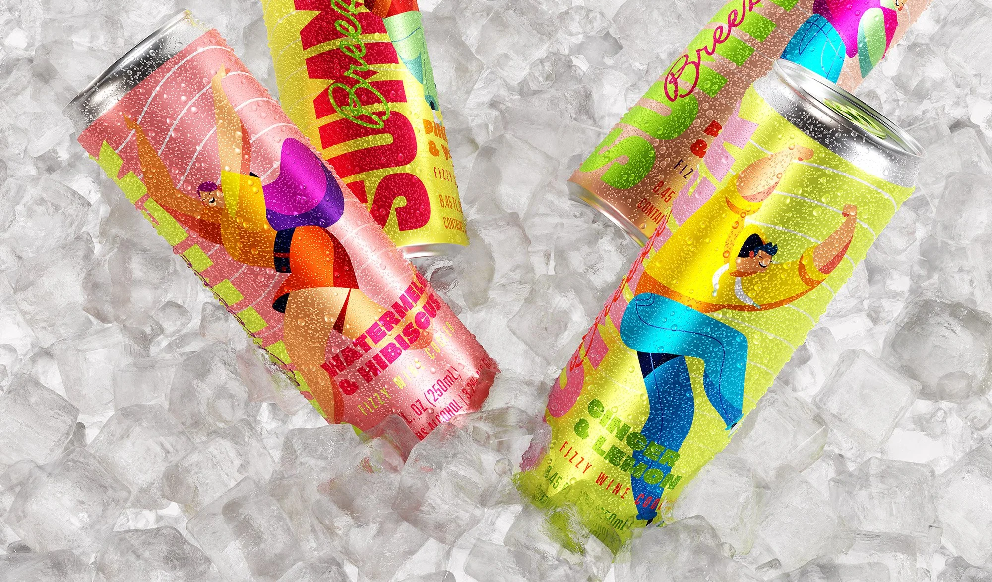
Summer Breeze Branding by We&Co Creative Studio
Tell me if you saw this can you wouldn’t immediately stop and pick it up. There’s a very specific mood I’m loving in brand design right now, and Summer Breeze has it. It’s the kind of project where every single element feels well thought out, from the palette to the typography and how the way things sit together. The overall effect is something that feels gorgeous and still effortless. The packaging and identity work leans into a warm, sun-soaked sensibility that doesn’t tip towards kitsch. It’s nostalgic without being retro, fresh without being cold, and perfect for summer. When I look at it, I immediately know what kind of brand this is, what it feels like, and who it’s for - and that’s the real measure of great visual identity work. Branding that communicates clearly while still setting a vibe? We&Co nailed it.
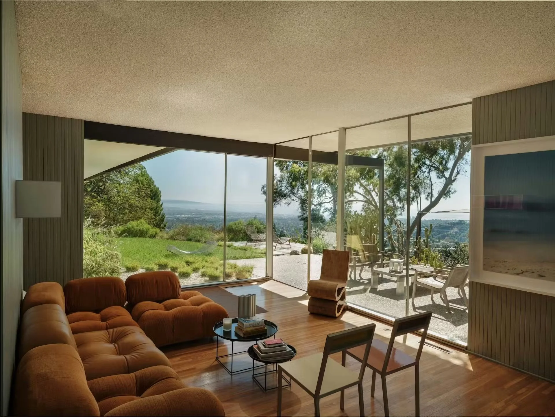
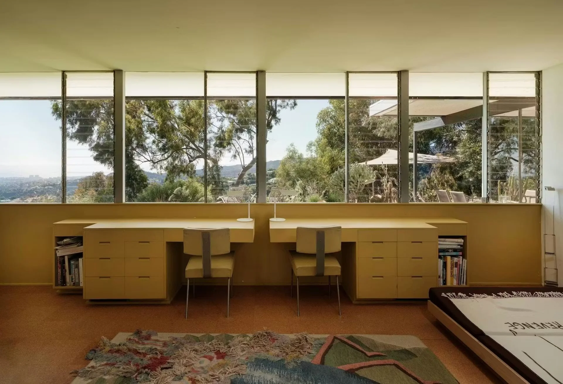
Richard Neutra’s is Up for Sale
No, I’m not in the market for a $5.3 million home in Brentwood, Los Angeles. Granted, if I were, this 1960 Richard Neutra house would be it. Perched at the top of Tigertail Road, with views of the city and the Pacific Ocean, was made by Robert and Elsa Sale and designed by the legendary Richard Neutra. It was sensitively restored in 2021 by GuneWardena Architecture and GW Design while preserving the original built-ins, a mosaic by Elsa Sale, the pool, and even the original diving board. Something is moving about a home being this beloved to be preserved this carefully. Neutra believed that architecture should heighten your relationship to nature, and as you can see from the images, this house being surrounded by mature trees and the Pacific off in the distance, you can feel exactly what he meant. It’s not just a beautiful place. It’s a philosophy made physical.
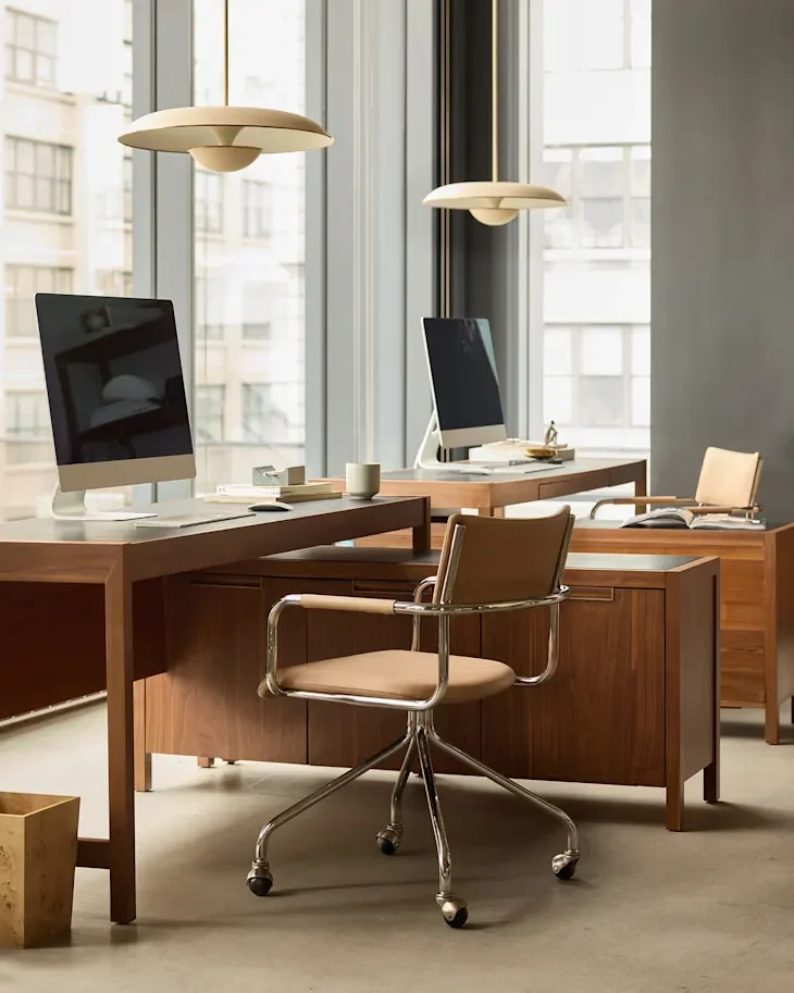
West Elm Office
The home office era is not over, and your desktop still matters. West Elm’s new Office collection is making an absolutely compelling argument for finally investing in your workspace. Made up of six collections starting at $199, the line features modular silhouettes with modern finishes. It feels genuinely sophisticated, not “corporate chic”, but refined and actually translates well on a Zoom call. According to West Elm, it’s “office furniture you’ll want to unblur your background for.” Everything is contract-grade, so it’s built to last. I think that’s the major selling point. The investment makes sense when the quality holds up. If you’ve been putting off an office refresh, consider this your sign. How can you go wrong with an office chair named after Colombo?
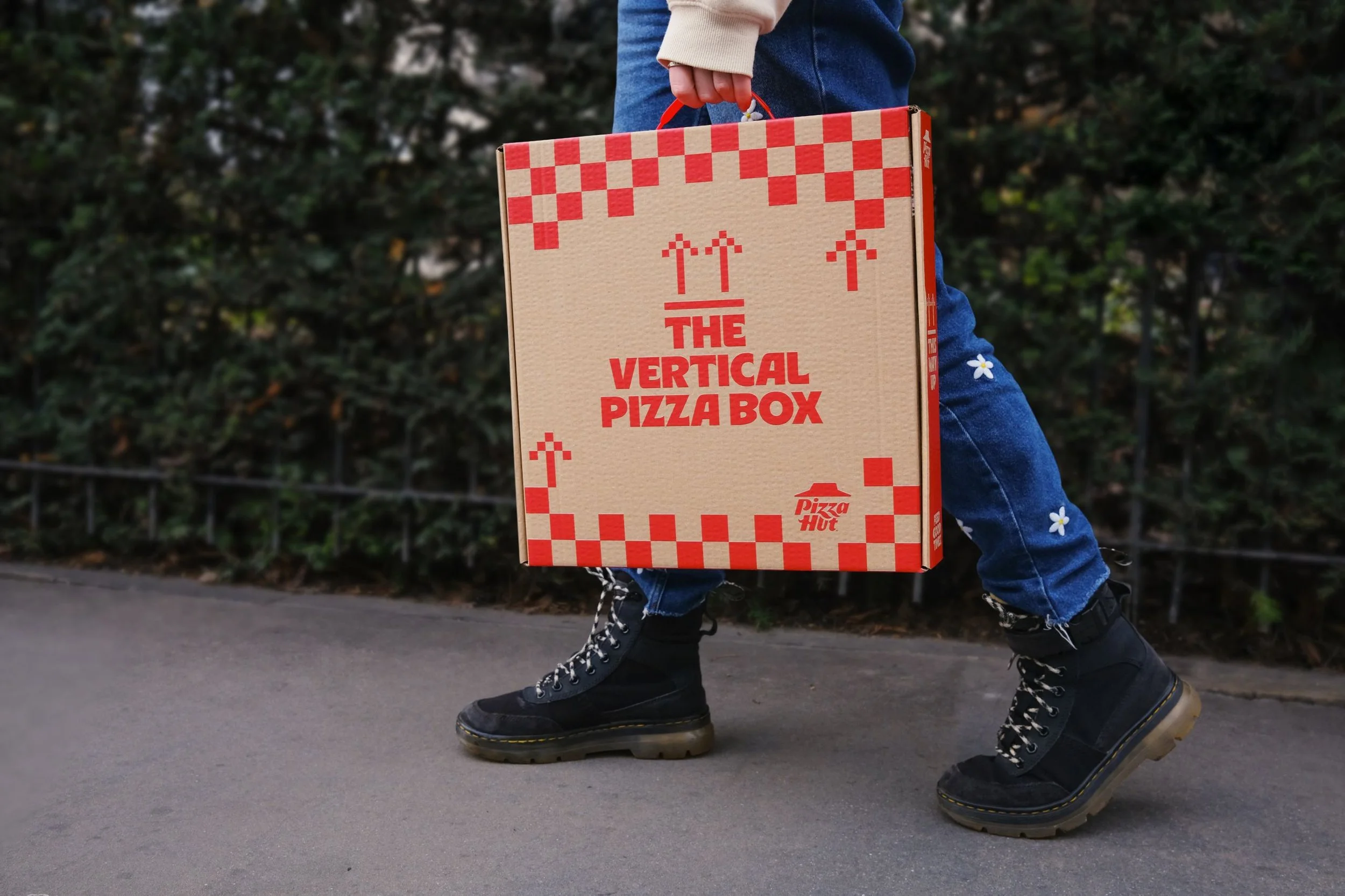
The Vertical Pizza Box by Pizza Hut
This is absolutely unhinged, and I can’t stop thinking about it. Is it practical? Debatable. Is it memorable? Absolutely. Pizza Hut, in partnership with the agency Iris, launched a vertical pizza box as part of a campaign designed to spark conversation and get people engaging on the streets of London. Honestly, it worked. The design is exactly what it sounds like: a pizza box oriented vertically, like a book you’d pull off a shelf. It’s a deliberately provocative object that invites you to question how you’d interact with it. And while I’m not exactly sure I’d be down to carry a pizza like a briefcase, I respect the audacity. In a world where advertising noise can be deafening, sometimes the best strategy is just to do something that makes people stop and ask, “What?”
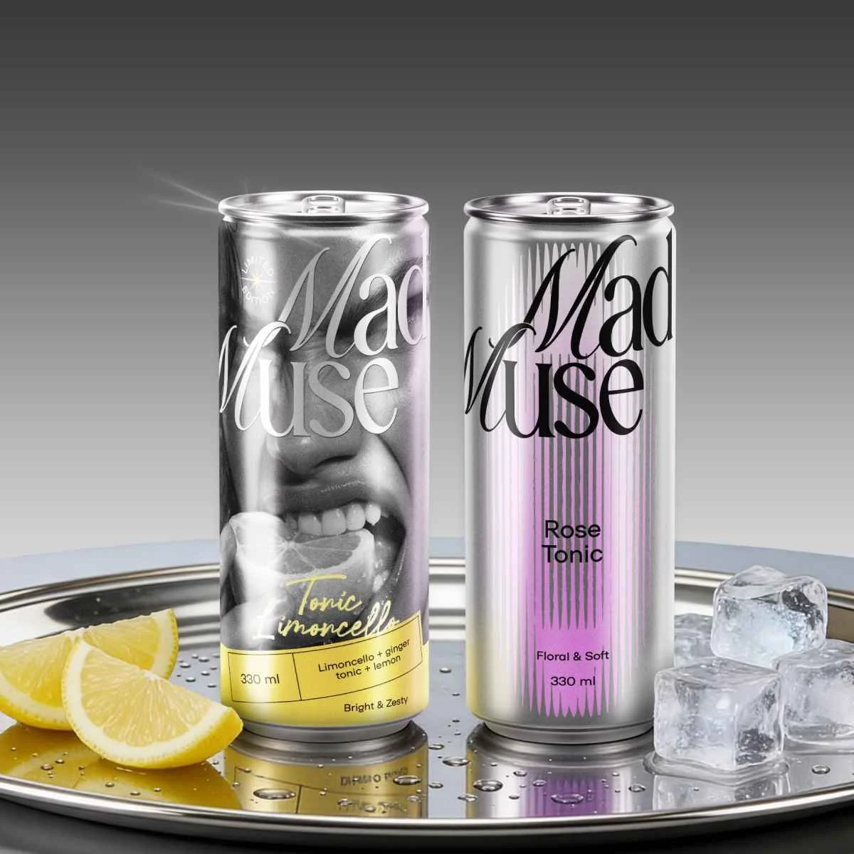
Mad Muse Branding by Bloom Büro
Tonic is usually the most forgettable part of the drink. A supporting act, the thing you grab off the bottom shelf without thinking. Mad Muse, a new tonic brand with branding by Bloom Büro, is done with that narrative. Their brand strategy is clever: instead of competing on taste (because, as they rightly noted in their research, most people think “tonic is just tonic”), they leaned into emotion and positioned themselves as the ingredient that sparks experiments. The muse isn’t soft or obedient. She’s bold, unpredictable, and a little chaotic. The branding reflects that: it’s visually striking, culturally loaded, and not like anything else on the crowded tonic shelf. The project covers two lines: a core flavored tonic range and a limited-edition ready-to-drink cocktail collection. They manage to give each line a distinct personality while keeping them clearly part of the same world. This is exactly the type of brand work that makes seeing what’s possible in the world of packaging design just exciting.