THE ‘70S ARE BACK
A few weeks ago, I was reading an Architectural Digest article about WSA and how its design was bringing back the best of 1970s-era style. I was enamored with it, but shortly started to realize more and more of my design saves were channeling that exact same spirit. Everything feels like it was shot in the same amber light. There is always a curved banquette somewhere, and, of course, a lamp that dramatically arcs over a conversation pit. It’s a vibe that I recognized without quite being able to name it until now.
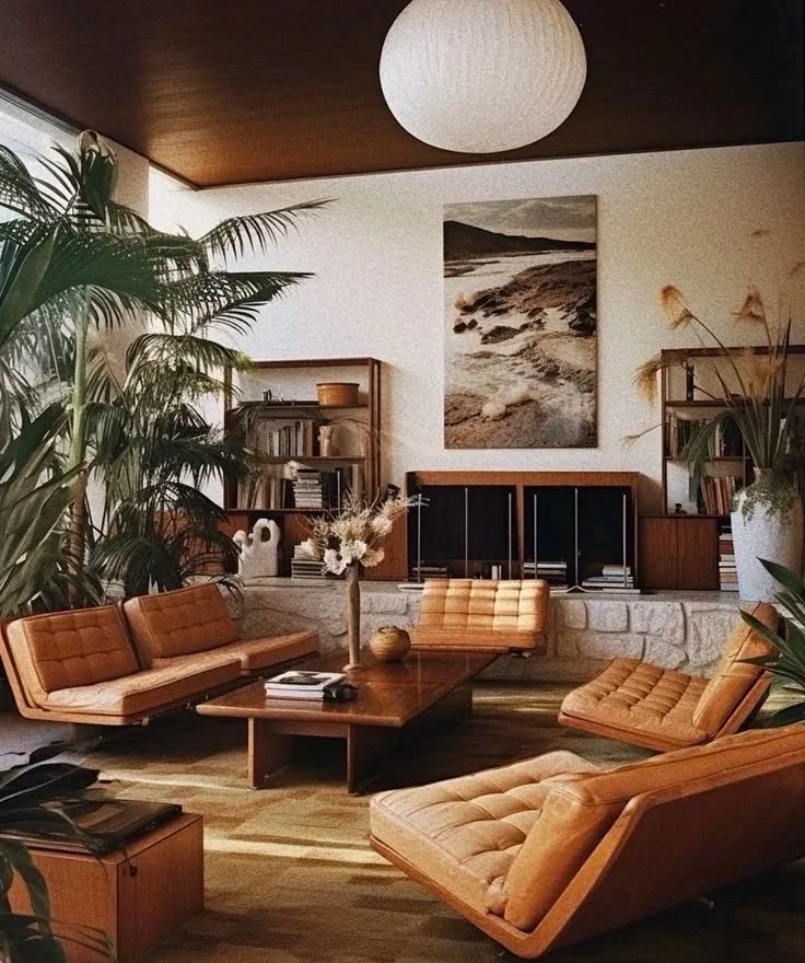
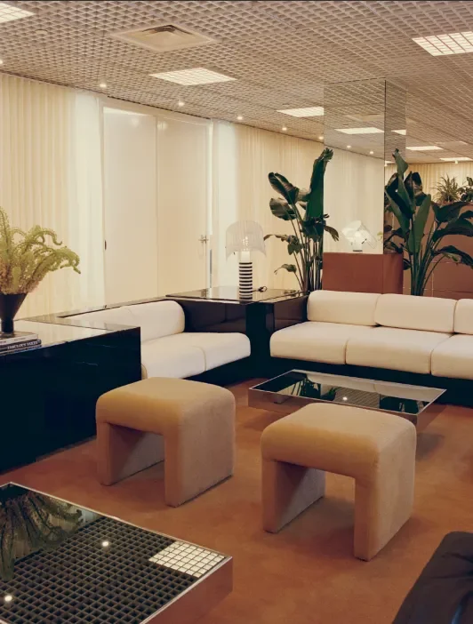
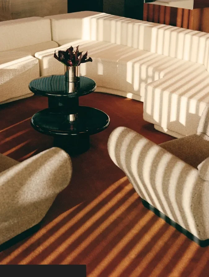
Clearly, I was not around in the 1970s, but I’ve seen enough design and culture of the time to know that our version is definitely romanticizing the 1970s, and that’s perfectly fine with me. We don’t necessarily need avocado green appliances, but if that’s your jam, more power to you. I’m talking more of a polished restraint that the latter part of the decade presented, which included lacquered furniture, moody lighting, and spaces that invited people to linger. You know, the vibe that most definitely hosted a swingers party or two.
This isn’t a sudden swing. It’s been building quietly, and now it’s reached the point where you can definitely spot the same visual logic playing out in hotel lobbies, private clubs, restaurants, and living rooms all at once. The palette has shifted: beige is out, and chocolate brown is in. Sheer brightness has given way to more warmth, and the general impatience with interiors that felt bland has pushed people back toward spaces with actual personality.

The room you want to stay in
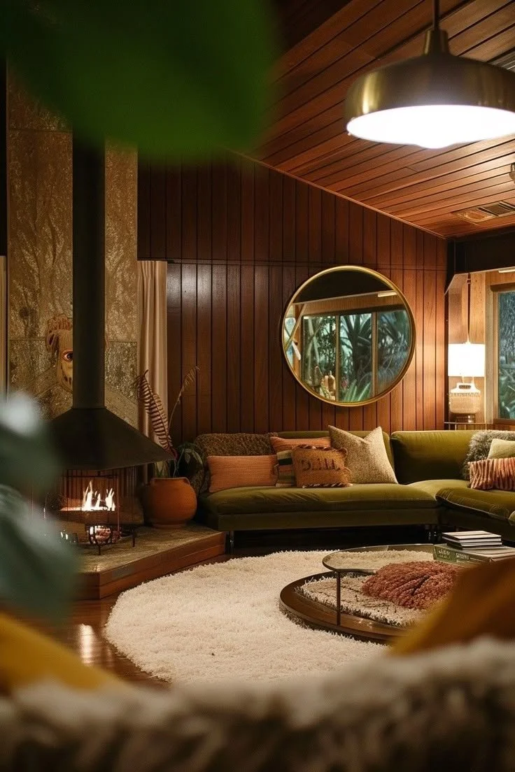
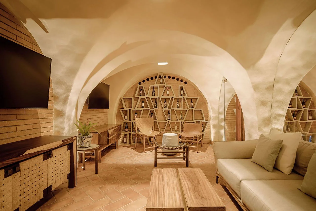
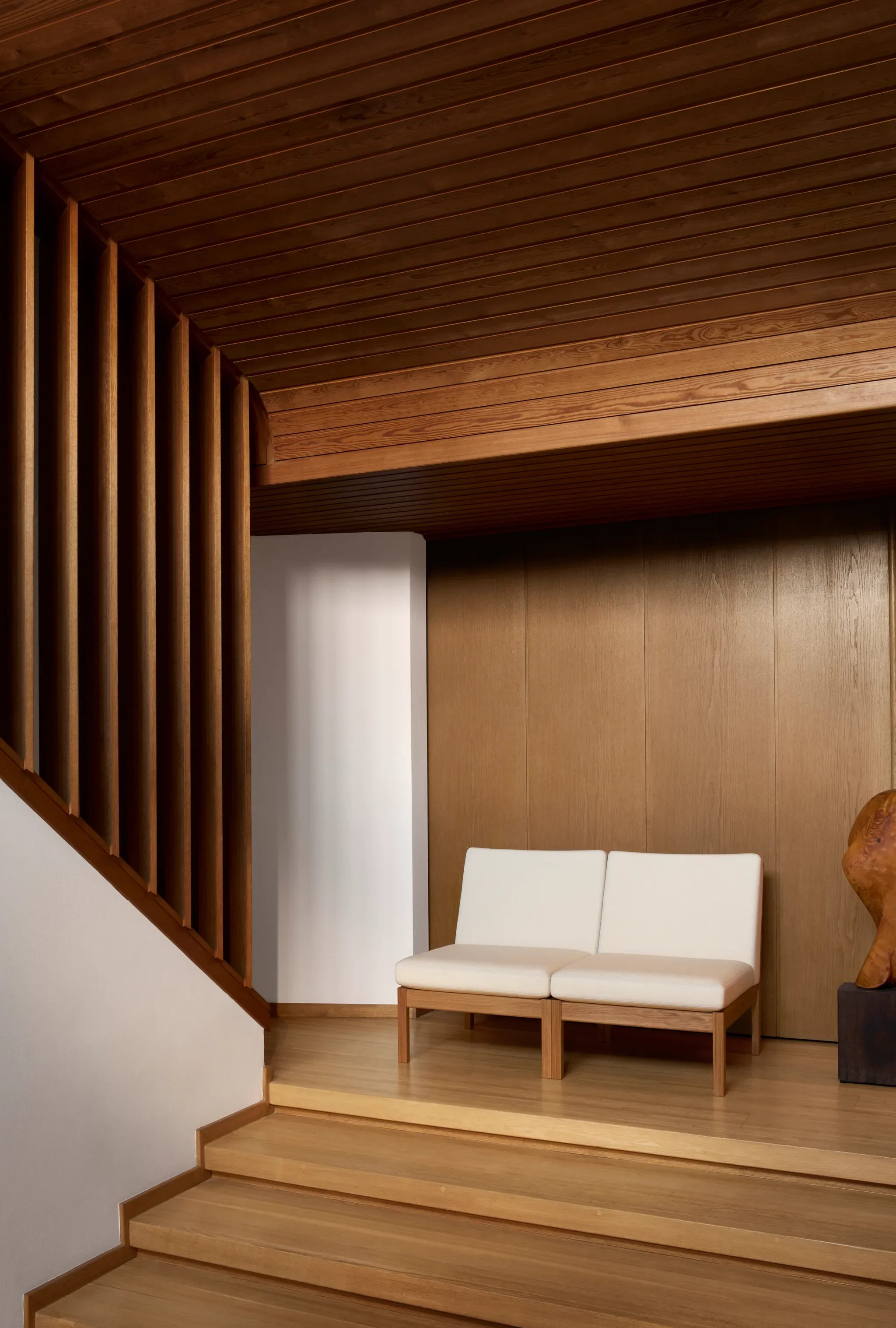
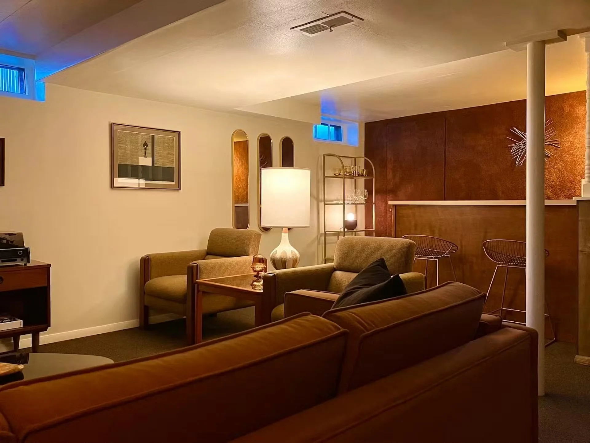
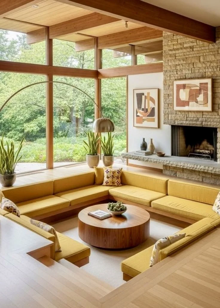
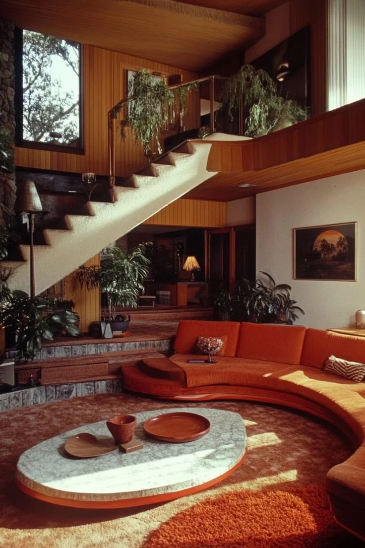
What the 70s got right, and what’s getting revisited right now, is that a room should have atmosphere. A room that isn’t just a place to sit, but has a reason to stay seated. Think about what types of interiors are getting the most attention right now. Dark woods with grain you actually want to touch. Those lacquered banquettes, arched lamps, and everything with sculptural curves that could have come right off a film set. These aren’t just aesthetic choices made in isolation. They are almost a specific argument about what spaces are for. The ultimate counter-argument to the open-plan, all-white, Scandinavian minimalist grip that has dominated our lives for the last…decade.
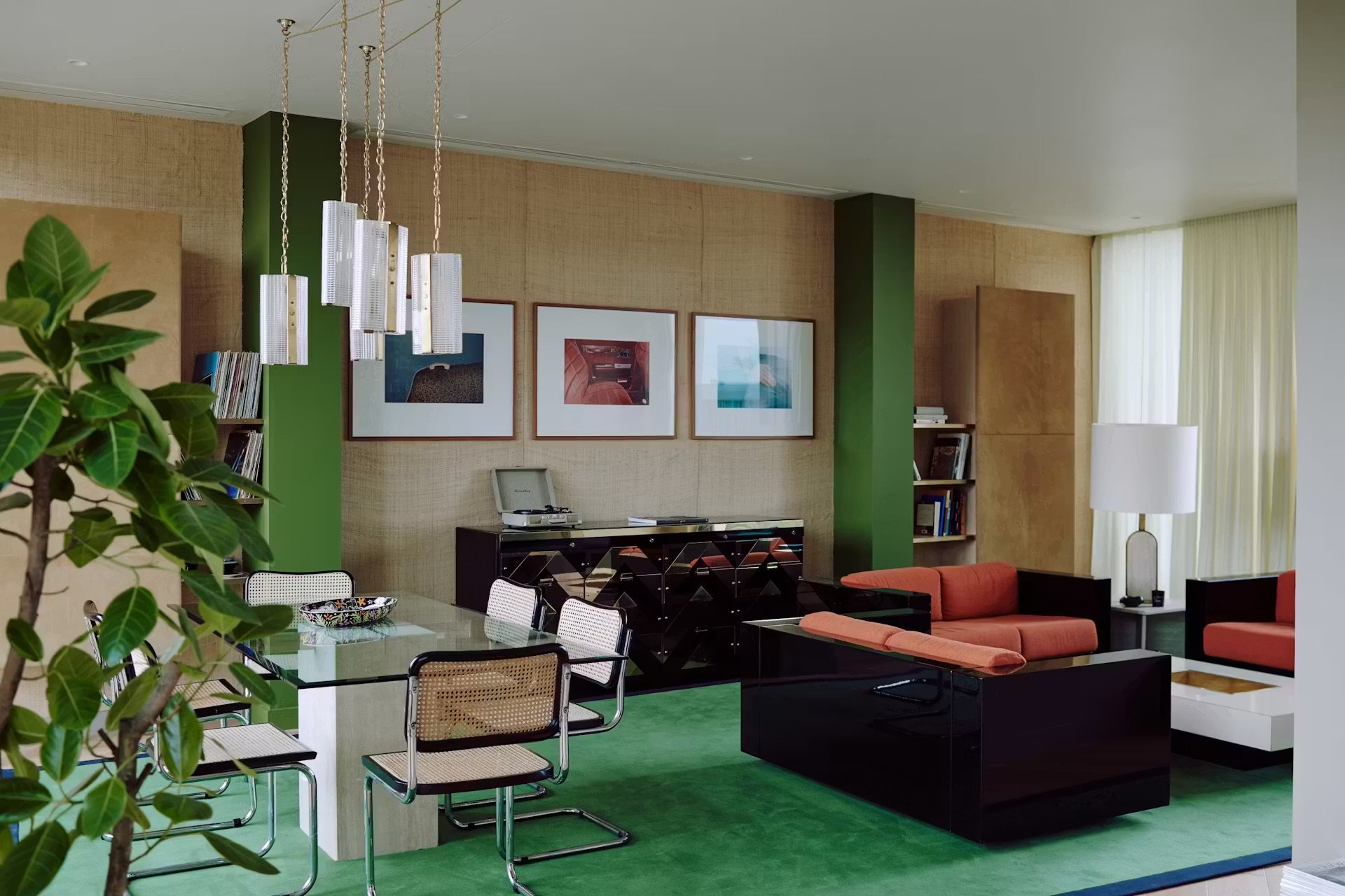
Getting back to WSA. WSA is a downtown creative hub that has been called the first building of its era, and is possibly the clearest example of what this revival looks like when it’s done right. Designer Gabriella Khalil drew from the late-modern interiors of the 70s and 80s like Milanese furniture design and Hollywood Regency glamour, and translated that into a space that feels completely of the moment without feeling nostalgic. The building looks like it was designed for a martini with marble tables, burl wood, and vintage magazine covers propped on chocolate brown rugs. The fact its become the de facto backdrop for GQ parties and Kendall Jenner shoots is almost beside the point. The point really is the feeling it creates.
Architectural Digest
Architctural Digest
Khalil has talked about modeling her projects after the office spaces of that era, where mood lighting softened rather than interrogated and where conversation was encouraged. I particularly love the influence of an open layout that prioritizes lounging and a community feel rather than whatever open plan is happening in offices today. It should feel like work and gathering aren’t treated like opposing forces. It’s something more people should be chasing.


It’s not nostalgia. It’s a craving.
There is a difference between recreating the past and selectively borrowing from it. The designers leaning into this moment aren’t trying to build time machines. They’re using the emotional logic of the era with tactile materials and warmth and applying it to spaces that need someting especially a bit of intimacy. Architect Billy Cotton put it plainly: American architecture doesn’t have a lot of history baked into it, so atmosphere becomes the substitute. When a space can’t rely on centuries of character, it has to build it. Dark wood and low lighting aren’t decorating choices; they’re a type of emotional architecture.
That framing clicked something into place for me. We’re not in a 70s revival in a way that, say, mid-century modern was a revival. It seems more specific than that. It’s a direct response to interiors that have leaned too cold, too bright, and too committed to looking good on Instagram rather than being a space to be in. The craving is for depth and a room with a point of view.

DWELL
How to pull it off without a full redesign
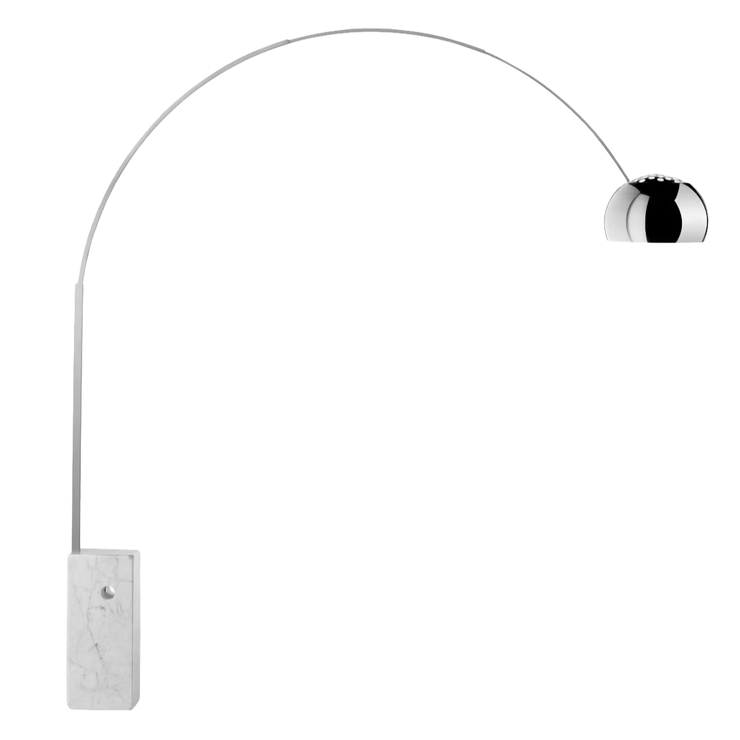
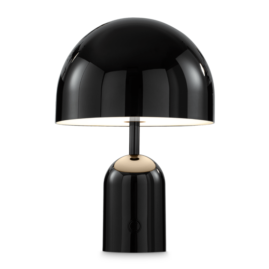
You don’t have to tear anything down because, luckily, this aesthetic is incredibly mix-and-match. A few well-chosen pieces in the right combination do all the work. The easiest entry point is lighting. One good arc floor lamp changes the entire register of a room. Take the Flos Arco. It is the reference and the lamp that practically defines this era of design. It’s been in MOMA’s permanent collection since the 1960s for a reason. The principle of it - overhead warmth without ceiling suspension that is soft and dramatic - is what you’re actually after, and sure, there are other ways to get close to it for much less.
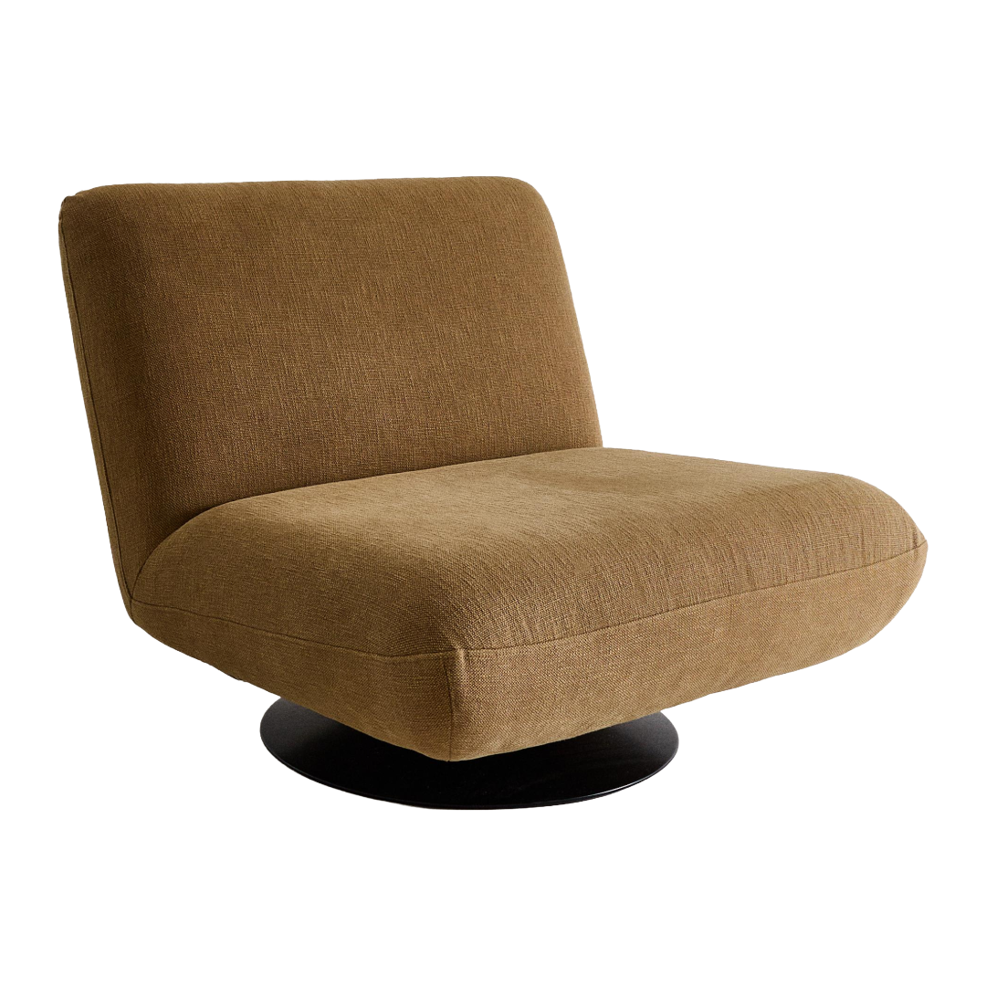
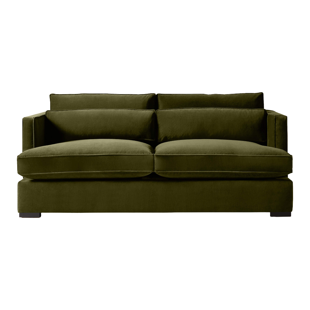
Texture is your next stop. Obviously, velvet is the move, but not in blush or oatmeal. Something with color and ideally something dark. Like a plush green velvet can do a lot of things. The CB2 Eastman sofa is tailored, and it’s cotton velvet with actual depth to it. It’s the kind of piece you know looks better with a drink resting on the arm. Then there is the swivel chair. A piece that genuinely defines furniture shapes of this moment. It swivels, which signals the room is built for conversation, not just for looking at.
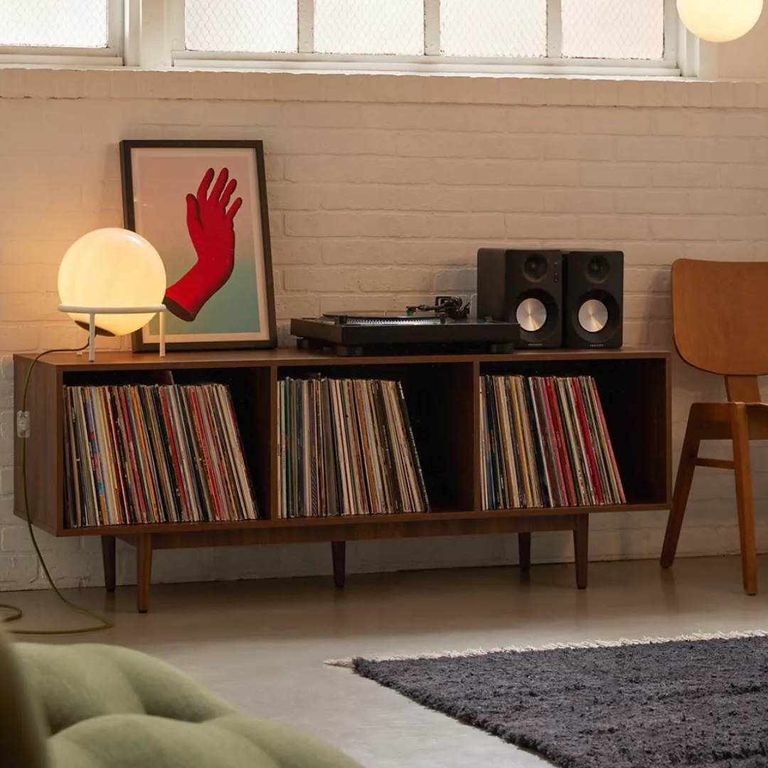
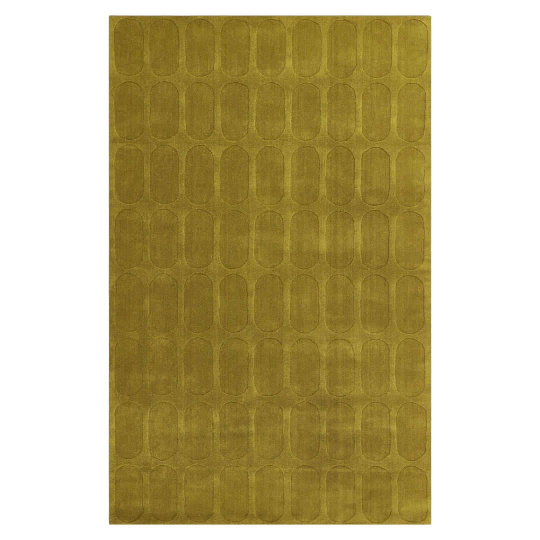
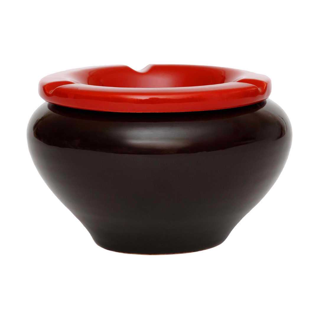
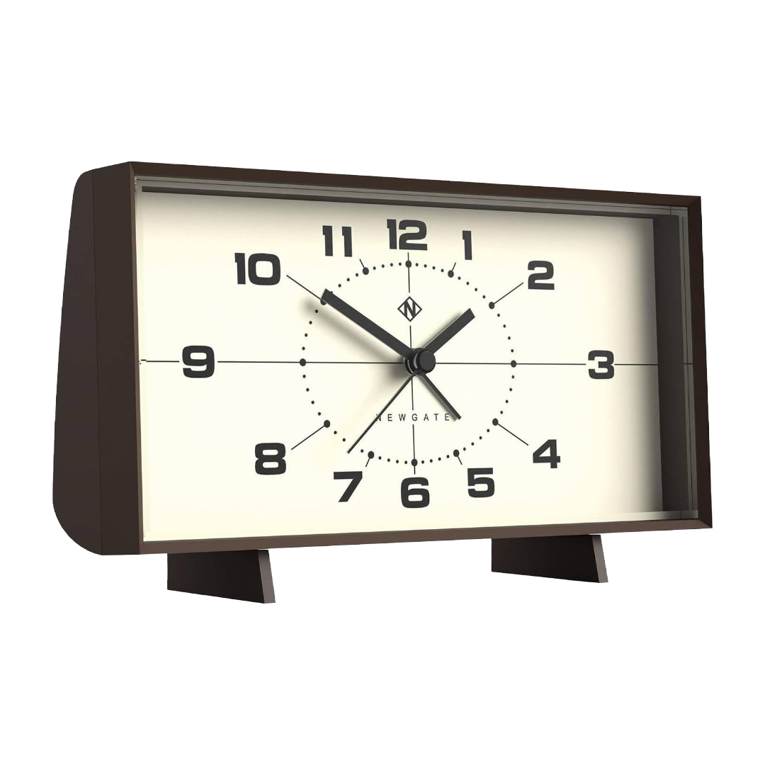
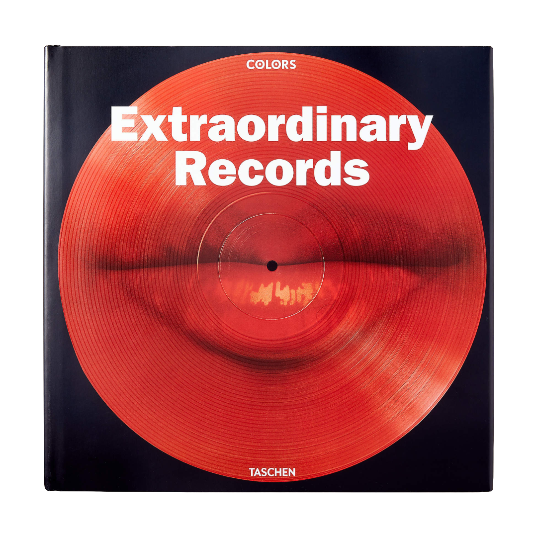
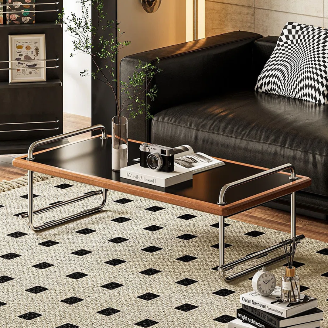
Of course, the record console is a must. Record consoles always signal the ‘70s to me. Urban Outfitters always has good ones, but of course it has to be something that compliments someting geometric on the floor in a deep color like olive or brown, and then something small and slightly odd on the surface. Think a heavy ashtray (decoration only, duh), a clock with analog vibes, or my personal favorite, a coffee table book about music. The Extraordinary Records coffee table is your best bet here, and what I personally would go with.
The whole effect relies less on matching pieces and more on a consistent mood. It’s warm, dark-adjacent, and just vibey.
SHOP THE VIBE
Coffee Table Book
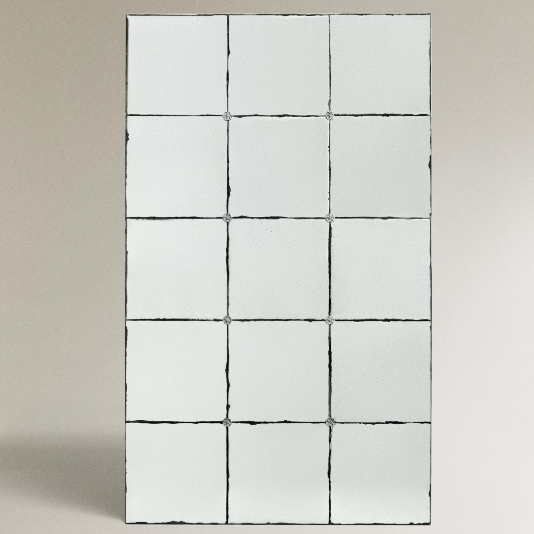
Full Length Mirror
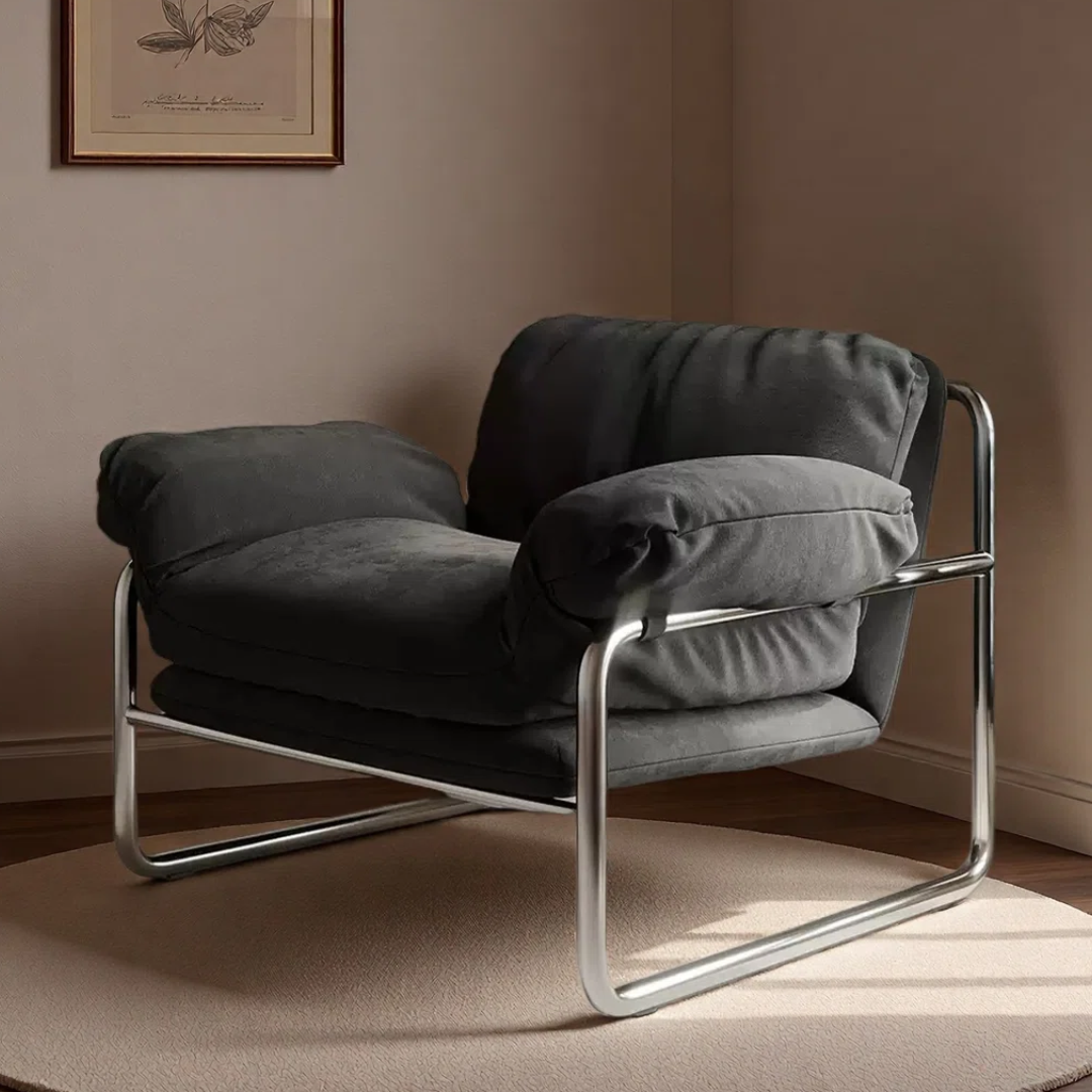
Leisure Chair
The Bigger Point
Interiors are always responding to something. The sterile, white era was a response to visual noise. The reclaimed wood wave was a response to that sterility. This 1970s pull is a response to spaces that have been optimized for photography and Instagram instead of occupation. What’s interesting about this particular moment is that it’s not prescriptive. There’s no single “70s look” dominating. It’s more like a shared set of instincts. More warmth over brightness. Materiality over surface. Ultimately, a room that feels like it belongs to someone. It’s an instinct worth trusting.